The Paper Project – Introduction

I’m sure there are many paper projects but this one is specific to testing Copic markers on the various papers available. Like most of you, I started on a quest to find the best paper to color on. Therefore, I hope to perform various experiments on each brand to see how they measure up. If you want to follow along, feel free to grab the Badge from the sidebar and display in on your blog!

Welcome to the Paper Project!

With the help of a few friends, I’ve gathered several different papers so far to test on. Sending out a huge thank you to Annika, Beccy, Donna, Peggy, Ruby, Vicky and Zoe for building my paper supplies. *Thanks!*  Below is the list of papers that I’m working with.

  1. Stamping Bella‘s Bestest Paper White
  2. Copic Beedproof Markerpad 70g/m2
  3. Stampin’ Up! Whisper White Card Stock 80#
  4. Bright White Shimmer Card available in UK (heat emboss image)
  5. another pearlescent (textured, heat emboss image)
  6. Papermill Super Smooth Bright White Card 300 gsm (140#)
  7. Daler Rowney Bristol Board* available in UK
  8. Bristol Board* #2
  9. Rey Printer Card Paper 160 gsm
  10. Xerox Colotech Paper 250 gsm
  11. Georgia-Pacific Copy & Print Paper 20# (standard printer paper)
  12. Neenah Solar White Super Smooth Crest 80#
  13. Curious Metallic Cryogen White Card Stock 89#
  14. Gina K. Pure Luxury Card Stock Pure White 120#
  15. Neenah Solar White Smooth Crest 80#
  16. X-Press It Blending Card Bright White 92#
  17. Make ‘it’ Colour Blending Card 250 gsm
  18. Georgia-Pacific White Card Stock 110#
  19. Stampin’ Up! Shimmery White Card Stock 80#
  20. Copic Papercrafting Stamping Paper – Natural White
  21. Bee Paper Company Heavyweight Marker Paper 110#
  22. Beckett Card Stock Radiance 80#
  23. Q-Connect White Wove 100g
  24. Hammermill Color Copy 80# Photo White

*Bristol board (also referred to as Bristol paper) is an uncoated, machine-finished paperboard. It is named after the city of Bristol in the southwest of England. It provides two working surfaces, front and back. This quality separates it from illustration board, which has only a front working surface.

Each brand was assigned a random letter to keep track of them during the testing. Testing will be done on an irregular bases but I you can find them under the tutorials label to each post so they’ll be easy to find. Here are also some quick links to the experiments:

  1. Ink Drop
  2. Basic Coloring
  3. Blending Out Colors
  4. Paper Attributes
  5. Blending Red
  6. Blending Added Depth
  7. Paper Purities
  8. Transparency
  9. UV Rays
  10. Paper Comparisons
  11. Marvy Le Plume Alcohol Markers

When all of the papers are tested together in the same experiment then after looking at the results I recommend the best papers. This recommendation is based on that test only so a specific paper may go in and out of favor. Below is sort of a chart that shows how many times each paper was recommended and is indicated by a triangle. Of course the more triangles listed the better the paper has performed overall.

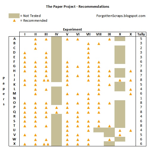
On two of these tests I show that we can achieve amazing results by altering our techniques to fit the paper attributes. (See Experiments IV and X.)  Thus this rating of recommendation gives an overall indication of which papers are more durable and suited for a higher variety of techniques and skills.

I hope you’ve enjoyed The Paper Project and I will continue to update these posts as I get more information. Until then… happy coloring!!

(Last updated on August 11, 2013.)

Gracie’s Roses

The challenge this week at Make it Colourful is to blend the colors yellow and green and is sponsored by Crissy’s Art & Heart. I tried to blending the two colors together and see how that turned out. It was actually more difficult than I thought. I think if I had started with the green then added the yellow that it might have been worked out better, however, the result I got is still good.


The sentiment is by Helen Keller and says “The best and most beautiful things in the world cannot be seen or even touched. They must be felt with the heart.”

DT Challenge: Make it Colourful Challenge #11 (blend green/yellow)
Main Stamp:
Gracie’s Roses (CAH), Ornate Floral Scroll (MiC) and The Best (Penny Black sentiment)
Patterned Paper: Lemonade (BG)
Chipboard: Swirly Corners (MiC)
Copic Markers:
E40, E41, E42, E43, E44, E47, 0, B0000, B00, G20, G21, G24, G28, W5, W8, Y11, Y21, Y23, Y35, Y38, R20, R21, R22, R24, YG93, YG95, YG97

Did you know? Helen Adams Keller (June 27, 1880 – June 1, 1968) was an American author, political activist, and lecturer. She was the first deafblind person to earn a Bachelor of Arts degree. The story of how Keller’s teacher, Anne Sullivan, broke through the isolation imposed by a near complete lack of language, allowing the girl to blossom as she learned to communicate, has become widely known through the dramatic depictions of the play and film The Miracle Worker.
[Helen Keller, Wikipedia.org]

Lantern Rin

Today was my daughter’s first lesson coloring with Copic markers and she was so excited! Check out her card, also using Lantern Rin. She got to pick the challenge blog from a handful I showed her and was totally into the zone. It was fun and I’m sure the next lesson isn’t too far away. ;D


Challenge: Sparkle Creations Challenge #34 (photo inspiration)
Main Stamp: Lantern Rin (SCRS)
Patterned Paper: TC Blossomwood (K&C)
Chipboard: Frame Corner Flourishes (MiC)
Copic Markers

Did you know? The Power of Half is a book written by Kevin Salwen and his 14-year-old daughter Hannah in 2010. It describes how the Salwen family came to decide to sell its home, so that it could donate half the proceeds to charity. The family then bought a new home for itself, half the size. It also discusses what the family went through in selling its home, donating half the sales price, and down-grading to a smaller home, and what they learned in the process.
[The Power of Half, Wikipedia.org]

Lantern Rin by Cassandra

“I made this card for the picture challenge. The girl looks like she lives in China or Japan. I colored the girl with the colors pink, blue, brown, skin pink, and green. I add another stamp that says ‘You make me smile all over my face’ and I put two different colors behind it. And behind the girl I put flowers. I made this card with my Mommy. And I got a little leaf from my Mommy’s desk and painted it.” -by Cassandra (age 7)


Challenge: Sparkle Creations Challenge #34 (photo inspiration)
Main Stamp: Lantern Rin (SCRS)
Patterned Paper: scraps
Chipboard: Frame Corner Flourishes (MiC)
Copic Markers

Did you know? Dinosaurs lived a long time ago. The world was one big continent but today it is separated into seven continents.
[by Cassandra]


Update:
Cassandra was the winner at Sparkle Creations for this challenge!

Shy Sammy

Welcome to another challenge at The Stamping Bazaar where this week’s theme is “Anniversary.” I made this card using Shy Sammy and chose a more masculine theme for a “his” card. After all, I can always make several cards for myself later. ;D


DT Challenge: The Stamping Bazaar Challenge #20 (Anniversary)
Main Stamp: Shy Sammy (TSB) by Marina Neira
Patterned Paper: Oliver (BG)
Metal Die: Spellbinders Nestabilities Labels Eleven
Copic Colors:
E50, E51, E53, E55, R12, G21, G24, G28, R37, R59, C1, C3

Did you know? Julie Powell (born April 20, 1973) is an American author best known for her book Julie & Julia: 365 Days, 524 Recipes, 1 Tiny Apartment Kitchen. While working for the Lower Manhattan Development Corporation in August 2002, Powell began the Julie/Julia Project, a blog chronicling her attempt to cook all the recipes in Julia Child’s Mastering the Art of French Cooking. The blog quickly gained a large following, and Powell signed a book deal with Little, Brown and Company.
[Julie Powell, Wikipedia.org]

Lucky Dog

Happy St. Patrick’s Day! It’s a busy day for posts so scroll on down and catch all the inspiration. ;D I made this card using Lucky Dog for the Little Miss Muffet Challenge and in honor of today being “green day” too.


DT Challenge: Little Miss Muffet Challenge #5

(brads, gems, pearls)

Challenge: AllSorts Challenge #94 (luck ‘o Irish)
Challenge: If The Show Fits Scrap It Challenge #70 (St. Patrick)
Main Stamp:
Lucky Dog (LMMS)
Patterned Paper: Kioshi (BG)
Metal Die: Spellbinders Nestabilities Labels Ten and My Favorite Things Die-namics Cloud Trio Die
Copic Colors:
-dog: E40, E41, E42, EE43, E44, E47, E49
-other: YG91, YG93, YG95, YG97, W00, W2, W4, W6, W8, G20, G21, G24, G28, Y11, Y35, Y38, C1

Did you know? Cheque fraud refers to a category of criminal acts that involve making the unlawful use of cheques in order to illegally acquire or borrow funds that do not exist within the account balance or account-holder’s legal ownership. Most methods involve taking advantage of the float (the time between the negotiation of the cheque and its clearance at the cheque-writer’s bank) to draw out these funds. Specific kinds of cheque fraud include cheque kiting, where funds are deposited before the end of the float period to cover the fraud, and paper hanging, where the float offers the opportunity to write fraudulent checks but the account is never replenished.
[Cheque Fraud, Wikipedia.org]