

 For this test I used the same sheet I colored last time using the little fairy stamp from The Greeting Farm, Neverland. I had actually gone back in to add gray tones to see how a second application of color would work but the image was too small to get any benefit from the test. So moving right along to the next one…
The purpose of this experiment is to use the Blender marker and find out how much color can be removed. I used the lower right corner of each square where I could work out three colors at once … peaches, blues and reds.
To help expedite the process I used three droplets of Blender ink refill. Yes, I said three for that little area! After each drop I would work in the excess ink with the Blender marker before adding the next drop. If anything was to be removed, this would do the trick!

It is easy to spot which ones are which. For example, in papers where the colors are pushed around you’ll notice a nice pinkish circle in the are I worked in. To demonstrate this, I think the worst ones are B, C, K, S and V.
Unfortunately, none of the papers were able to remove ALL of the colors. I wish one of them had, however, the ones I think did average were A, D, E, F, G, H, I, J, L, O, P, Q, R, T, W and X. Overall, I think J and X performed the best in this test and should receive an extra gold star.
As for the third category, I didn’t see much happening on M and especially N and U. I promise I didn’t skip those. ;D
The papers are identified in the Introduction and here is the backside:
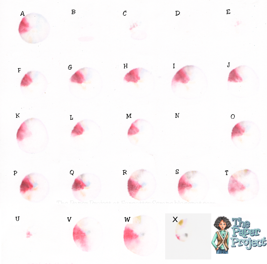
Three drops of ink is a lot for this small area and you can see how each of them worked its way towards the back. It was interesting that they all looked the same except for A, B, C, D, U and X which only just began to show up; and N which never even made it to the back of it’s own layer.
The colors which were being removed were E000, E11, R43, R46, R59, B21 and V12.
That concludes this test and I’m off to replenish my Blender ink refill. ;D But before I leave, are you developing a preference yet? Which ones do you think is best?

Thank you for doing this. I am learning alot about the paper.
LikeLike
I just now noticed your experiments and I've been reading through the lot. Very cool to see the different way the different papers show the colors used. I myself use Gina K at the moment but looking at all those little squares it wasn't the paper that I thought showed the colors the prettiest. What I think is interesting about this experiment is not so much how well the Coper blender removes the colors but more how much the paper absorbs the ink. When I saw one square without any ink on the back I knew it had to be Gina K because I have never been able to get a drop through but I don't know if that's a bad thing. It also means the ink won't run as much as it would on other papers and since I love to blend blend and blend some more I hate papers that absorb a lot of ink and won't let it stay within the lines of the image. A long story but I guess I'm just going to follow your upcoming tests and find out if I should try another sort of paper. Thank you so much for doing these tests!!xxxMariska
LikeLike
Hmm, it was N previously that did not bleed through. During your fist basic colourig test did it colour less easily?
LikeLike
To answer your question, 'N' colored as well as any other in the first basic coloring test, however, the colors were washed out so that's why it didn't get the recommendation in Experiment II.
LikeLike
To answer your question, 'N' colored as well as any other in the first basic coloring test, however, the colors were washed out so that's why it didn't get the recommendation in Experiment II.
LikeLike