 Ready for another paper test? This one has a focus on blending and some colors are easier to blend than others. Red is usually one of the harder colors to blend for some because it requires more ink and so I wanted to put it to the test. The image I used is Muffy Ketto from Stamping Bella, because, frankly, the world could use more red dogs. ;D
The purpose of this experiment is to blend with red to find out which papers can achieve a perfect gradation from the darkest to the lightest color. I used R22, R24, R27, and R29 and blended the main part of the dog while timing how long each sample took. I started with the darkest color and worked towards the lightest, then worked my way back down to the darkest and finally up again to the lightest; approximately three layers of blending. The head and ears were quickly colored in after the clock stopped.
The purpose of so much blending is two fold; first to use a lot of ink in one area like most of us do and second to get the most vibrant results in the hues. When applying the darkest color first a lot of that will be blended out as lighter colors are applied; then when applying the darker colors again sometimes the blending is removed so applying a third lighter coat of the lighter colors helps to smooth it all out.
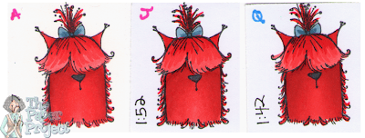
For the most part, I was able to get smooth blending on all the sample with few exceptions. I had timed myself coloring in the main body of the dog hoping it would indicate how difficult it was to blend. However, it just shows that I was getting faster as I progressed and doesn’t appear to reflect anything else. Below shows a closeup of A, J and Q with the typical smooth blending I achieved.

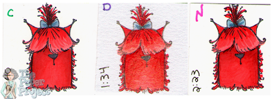
The exceptions were B, C, D, E, and N, where perfect blending was difficult, if not impossible. I had to stop on D and E after coloring only one layer because it already started to pool on the paper. The other three, B, C, and N, started pooling after the second layer and blending became difficult as well. Below shows a close up of a few of these in close up.

Looking at C, you can see it getting blotchy and in the dark shadows there are spots where the ink no longer stayed put. The next one, D, you can see the darker reds have built up and started to become tacky which shows up as splotches. On the last sample, N, you can see how all the ink stayed on the surface of the paper so the brush strokes are noticeable as the ink was just moved around.
After air drying for a day, C, D, E and N are the most tacky; and B, G, L and R are slightly tacky only in the darkest shadows.
Based on this test only I would recommend A, F, G, H, I, J, K, M, O, P, Q, S, T, U, V, W and X as being the good papers to color on.


Thank you for the time you put into this. I really enjoy it and have learned a lot about paper.
LikeLike
I have had the tacky build up myself, on Xpress It. Usually when i am doing hair or clothing. If I have let the area dry and go back to it, I sometimes have the tacky on the surface splotches that won't absorb.
LikeLike
I've had that tacky problem before too with reds… I currently use a 250gsm colour laser printing card. Thanks for great info!Arabella
LikeLike