Happy Bee Day

This is a card I created using Happy Bee Day clear stamp from Tiddly Inks and the hexagon punch from Stampin’ Up.  The image was one I actually colored at the coloring retreat with Christy, Zoe and a bunch of new friends.  I stamped it a lighter color ink instead of black and was able to play around with Creative Color Placement.  Basically I colored a nose and some eyes on the face, plus added sleeves and created a shirt under the costume.   This was a card I had made together with my Mom and we had fun with the new punch.  Thanks Christy!  And thanks Mom! 

I’d like to enter it into the following challenge:

Cleopatra in the Ancient Egyptian City

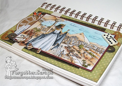
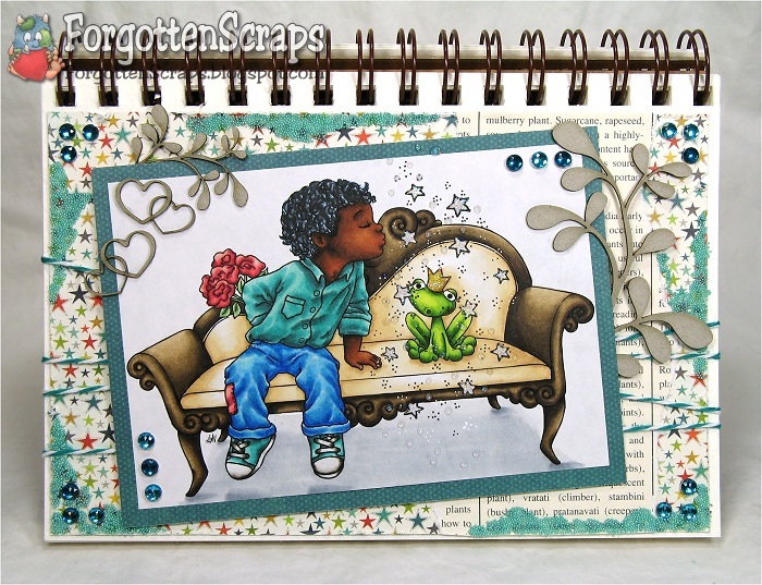
Make it Crafty this week is having a “Walk Like an Egyptian” theme which matches perfectly with the latest release.  If you haven’t seen all the fun images you need to check them out! I’m joining in on this week for fun because I was lucky enough to have two projects using those image and wanted to share them both.  This time I created a journal page.

Many time on my journal pages I color the background and the characters separate.  Then I cut out the characters and place them on the side of the image or next to the background image.  However, this time I wanted Cleopatra to be standing in the center of the action and didn’t feel like fussy cutting.  So I merged the images before printing then only had to fussy cut part of the character. 

On the journal page, I switched things up a bit and add my ribbon vertically instead of the traditional horizontal.  I think it helps with the illusion of the pillars being tall but in reality, it just looked better to me.  😀  Then the rest of the embellishments were grabbed here and there and added.  Not sure that there is much meaning into it other than my thought process was … old, Egyptian, collections, then trinket box.  Does it work?!  LOL

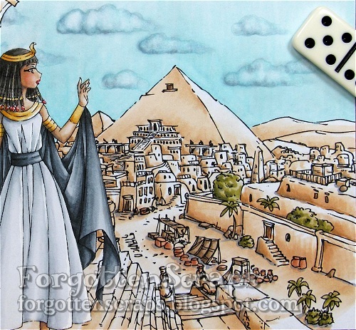
The sky was colored with blues then I went back in with grays and darker blues to color in clouds.  Finally the blender marker was used to take away those colors in the clouds and this is the effect that it creates.  They’re kinda fluffy looking and I liked how they turned out.  It was pretty easy so I’ll be trying that again!

I debated how to color the city and finally decided to color it all the same to look like sun-bleached sand on a dry desert day.  Then I added some shadows with BV23 and a little color here and there on the greenery, baskets and market stands.  For the most part, the sun is shining down from the upper right corner of the image so I could have Cleopatra’s face stand out more.  This was a different spot from where I normally put the sun (upper left) so there are a few mistakes – lucky for me, none of them stand out.  he he he

I was able to contrast Cleopatra in a white and black dress with lots of gold.  Compared to the town, I really wanted her to stand out like royalty would have.  The dress uses cool gray colors and I used warm grays for her hair.  The shadows were added with BV23 which seems to be working out with most colors.

This project was colored with Copic Markers on printer paper.  Thanks for checking out my project and I hope this has given you some inspiration to play along with us this week!  Here are the images I used…
Make it Crafty Images:

Jackie and the Egyptian Pyramids

Come join the celebration with a combined release!!  Make it Crafty and Tiddly Inks have joined together to bring you an Egyptian theme!!  Everyone has done a fabulous job with their projects and you don’t want to miss out on the games with lots of prizes too.  You have arrived on Day 2 of the hop and for all the details on the hop visit the main site HERE.  But before you go, check out this project…

For my project I merged together Jackie and Jackal from Tiddly Inks with the Egyptian Pyramids in the background from Make it Crafty.  I brought Jackie up into the foreground because I really wanted to focus on her and get some details colored in her face.  Then I also wanted to do something different in the background and settled on a pink sky instead of the traditional blue.

For the card I didn’t want to add too much to distract from the main image so I found a good decorative paper that worked out to take the place of embellishments.  Then I added a clock face to fill in an empty space and some ribbon to complete it.  Oh, and yes, I had to use the sewing machine around the border too.  ;D  Here’s the image up close…

Thanks for dropping by and I hope you’ve enjoyed my project!  If you haven’t already you’ll want to be sure to hop around and check out what everyone else has created too!  Remember, this is Day 2 of the hop and for all the details on the hop visit the main site HERE.  See ya later!

Precious & Aidan

Today at Make it Colourful we have a fantastically fun challenge for you!! We want you to color a sunset with clouds!! Now, it’s really not that hard and there is plenty of inspiration provided from the Design Team … so you should give it a go! And um… in case you’re ready to throw something the shoe… is this when I mention it was my idea?

For my project I used the Big Steampunk Treehouse from Make it Crafty to set the mood. Then complemented it with two images from Tiddly Inks… Precious and Aidan to come up with my scene.

When I colored Precious… I coudn’t help but to use Annika‘s hair color combination for red. ;D It’s been one of my favorites lately! I gave Aidan a pinstriped suit to help brighten up all that black. I would have liked to have a fine-tipped white gel pen but the idea has come across. Then to compliment each other, I gave Precious white stripped elements to match.

The sunset was an interesting experience… and one that I had to use lots of photo inspiration from Google. I narrowed one down and started at the bottom with the yellows the gradually worked my way up to the blues. Between the two I added some purple for the transition. Once that part was done I went back in with a deep purple color and added the clouds. At that point it looked a little flat so I added some white acrylic paint to the clouds then went back in and colored in some oranges and yellows.

I honestly didn’t know if it was going to turn out and even amazed myself. I really liked how it turned out and hopefully will be brave enough to try it again! 😀 The colors I used are: BV23, BV25, BV29, V20, V25, V06, B000, B60, B63, B91, B93, B95, Y32, YR02, YR07, YR09, YR21, YR30 plus the white acrylic paint. Hope you like it and hope you’ll come play along with us this week!

Annie’s Prezzie

This is a project I made for a class I was teaching at my church group. I had three cards that they made with three different techniques – this one was more simplified for the class and didn’t include the chippies or image and I was demonstrating that a card without an image is just as fun. ;D I only cautioned them on which page from the dictionary they ripped out.


After the class was finished I added the image and chippies to finish the card with an extra touch. The image I used is Annie’s Prezzie from Tiddly Inks and the chippies are from Make it Crafty. I kept with a basic color scheme of the paper then added purple as a coordinating color which also tied in the flower.


The class was successful and the gals learned the basics of card making and a variety of simple techniques. The other two cards that we made were Riley and From the Desk Of that I previously posted.


Finally this is another card that my daughter created and she we wanted to enter it into the Simon Says Stamp Summer Holiday Kids Challenge for this month. Lydia used the image Adela and Dida Inventing from Little Miss Muffet Stamps and created everything on her own. Enjoy!

Can I Kiss You?

It’s Saturday and you know what that means…. another Make it Colourful challenge!! This week’s challenge is sponsored by Crissy’s Art ‘n Heart and our challenge is to color dark skin. This one is going to be a simple one but if you looking for color choices, make sure you visit the challenge blog for several other combinations.


For my project I merged three images… and yes, I merged instead of cut! LOL My inspiration is centered around Can I Kiss You from Whimsy stamps (also one of Crissy’s images) and thought he would be perfect sitting on the Victorian Chaise from Make it Crafty. Now the next thing I needed was a sweet girl for her to kiss…


… but as you can see, as soon as he kissed that sweet girl she turned into a frog!! (Froggy Thoughts from Tiddly Inks.) They’re too young to be kissing so it’s all his fault that happened. 😀 Now they’ll just have to wait until they’re both much, much older to break the spell. So if my daughters are reading this…. better watch out and save those kisses for later!!


To give this image the magical effect I tried drawing in some pixie dust and stars. Then I colored them with my white gel pen and squeezed some glitter glue in the area for some sparkle. I’d probably do it differently next time but this at least conveys the story well enough that I left it be.


The skin tone combination is E00, E11, E13, E25, E29, E59 and E49 and I like how it turned out. I was also trying for extreme lights and darks in the clothes and frog but gave up on that idea by time I started coloring the chaise. I need to practice more with that but luckily that wasn’t *this* challenge. ;D Have a great weekend!