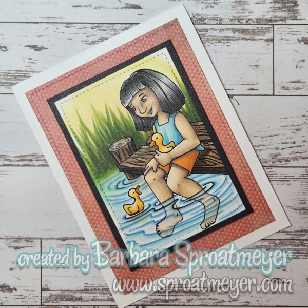
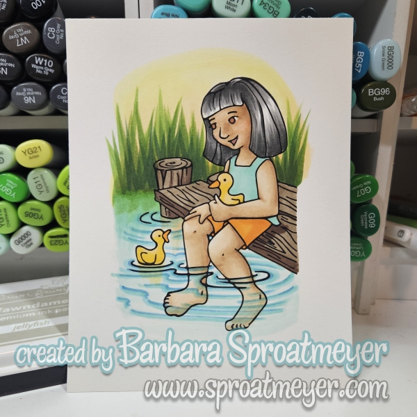
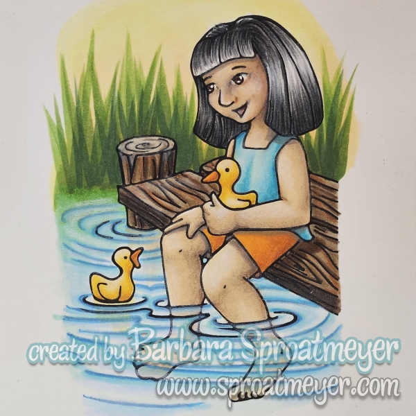
Here’s my latest stamp and coloring – this is Girl with Ducks on Dock. She was originally going to be holding a fishing rod but then I thought the ducks would be more fun to color. Speaking of coloring – this one I started with blocking in colors with Copic markers. I tried really hard to resist the temptation to blend and add shadowing. I succeeded in some areas but failed in others. However, my next step was to use Prismacolor pencils and color on top. I can see a bigger difference in this transformation than with my last project. I’m not sure I like the results but that may be because I was staring at it too long. So what do you think? Does Copic then Prismacolor pencils work out?
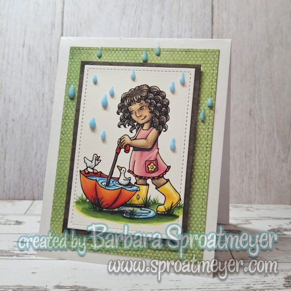
FREEBIE alert! – This stamp is currently available as a freebie in the shop when you use code “quack” at checkout.
This is Girl with Umbrella Ducks. I colored this card with Copic markers then wanted to try out adding details with colored pencils. I recorded the process and posted them on Instagram if you want to check them out. I think I added too much details with the markers so there wasn’t much to do with the pencils. So I’ll be giving this a try again and start out with blocking colors.
While out camping with the fam, I took the opportunity to get some coloring in and use my Faber-Castell Polychromos coloring pencils since I store them in the camper. With the sun shinning, out in the country and the cool weather, it was a perfect setting for Polka Dot Pals Nour.
I rummaged around in my old stamped and pulled out Polka Dot Pals Lisa to color. This is a retired rubber stamp from Little Miss Muffet Stamps. She’s one of my favorites and is signing “Thank you” in American Sign Language (ASL).
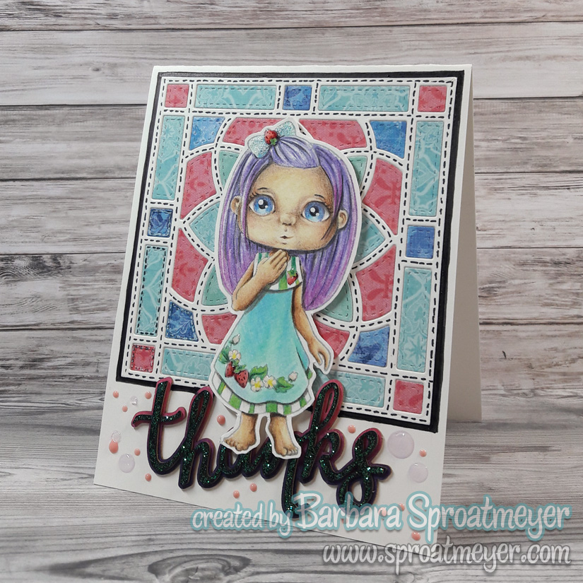
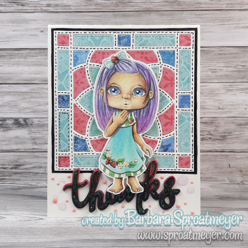
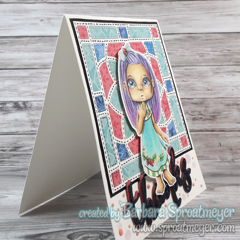
The background is a die from Gina K, I think. Long ago when I organized, I erroneously didn’t label my dies so they’re hard to identify. So this is just my best guest. The sentiment is a Make it Crafty chipboard embellishment and was colored with Copic markers and Stickles Glittler Glue.
Instead of using an add-on face from a Polka Dot Pals set, I decided to color in one of my own and try a new shape. This is how I come up with faces to add into new Polka Dot Pals sets. So if you see one that you love, hint, hint, then give me a shout out.
Here’s a progress photo. The only paper I had at the time was heavy, maybe 120# weight, and I thought it was for alcohol markers. Boy was I wrong! I don’t what know what it was but even colored pencils didn’t apply well. So this was a difficult and patience testing project. I wasn’t able to go as dark as I wanted but at least I was still able to get some shading and depth included.
For my project, I’ve used Annabel Haines’ fur tutorial and colored up this raccoon. I’m always impressed with her textures and would love to color like that someday. So I’m learning, practicing and learning more. I’m getting there. The stamp is Great Catch, a retired set from SugarPea Designs.
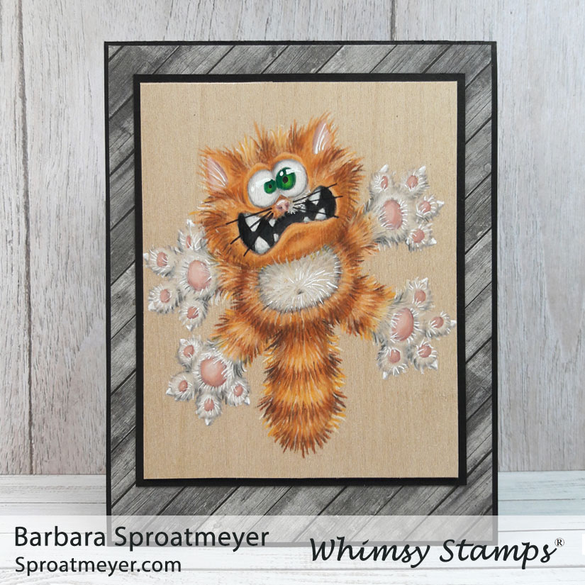
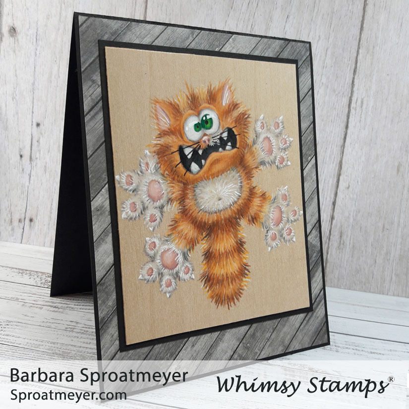
I enjoy coloring on Balsa wood with Prismacolor Pencils. They go on smooth and blend well. The only down fall is that once all that color is built up, it’s near impossible to add anything else. So planning the colors and layers is important.
I’ve been studying Annabel Haines‘ style on fur because she does an incredible job. In fact, she does amazing on all her projects with added textures and details. So over the years, I’ve been working up the courage to give it a try. I practice here and there but this was the first time I’ve gone full furry on an image. It was good first attempt but I still have more to learn. The image I used was a retired Scaredy Cat rubber stamp which is now available in the Going Catty clear set by Whimsy Stamps.
Annabel has a fur coloring tutorial which shows step by step on how she colors the fur. It’s a great tutorial and is a lot easier than how I did mine. Plus hers turns out better so take your tips from her. 😀
For those who were looking for an eye tutorial on the dragon… well, here it is. Even though this is with colored pencils and not markers, the idea is the same. (1) First, the image’s eyes are usually white (if stamping on white paper) or you should color them white. (2) Then, since eye are not actually pure white, I add shading around the edges to make them look found. On a person, I add shading going from top down. But on this image, and the dragon image, I really wanted the eyes to bulge so I went with a round shape for shading. (3) Next is to color the irides. I like to have some dark at the top and light nearer the bottom. For this image and the dragon, I chose to have one large and one small. (4) The final step is to add black for the pupils and white for the highlight.
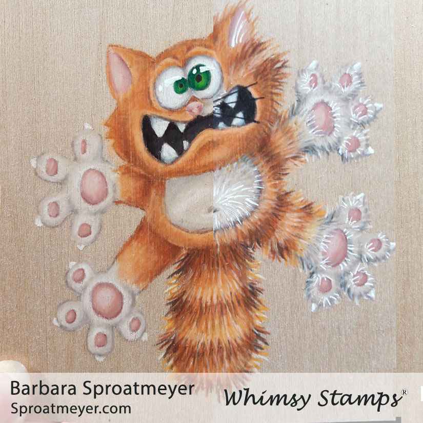
My coloring plan was to lay down a base of color for the cat, which you can see on the left side, then add all the fur texture, which you can see on the right. It worked ok but after having so much color down with the pencils, it was very difficult to get a sharp noticeable line for the fur. In some areas, especially the lightest and white areas, it didn’t look like I was adding any coloring at all. For the white, I decided to add more details with the white gel pen. Did it work? Eh, I’m not sure.