Swings ‘n Slides Fairy

Here’s Swings ‘n Slides Fairy from Little Miss Muffet Stamps that I used on this project. I also used this one for a step-by-step tutorial, which I added below so you can pin or bookmark it if you’d like. 

The Snowflakes Chipboard are from Make it Crafty and are always fun to add to a project.  I tried to color these white with the Faber-Castell Gelatos Double Scoop stick but that stuff smeared and got all over.  I don’t know what that is actually used for but not what I was expecting.

Here’s the side-by-side that you can see the colored version and non-colored version. I stamped it in gray and then I was able to change the eye a little so I could add more color.  This also shows the fur vest and shoes, which has a how-to down below. 

Polka Dot Pals Chrissie

This is Polka Dot Pals Chrissie from Little Miss Muffet Stamps which is the one that I used for the face tutorial.  I included that at the bottom so you can pin or bookmark it if you’d like.

For this image I tried to change the light source to come from the lantern.  The clothing was essay to manage but the face was the most difficult.  I pulled up a few images in Google and then tried my best to go against habit and change the way I colored the nose. It isn’t perfect but I like how it turned out. 

Come enter in one of your projects into the Anything Goes challenge at Little Miss Muffet Stamps.  Any stamp, any theme, any project!

Coloring the faces is the best part about these Polka Dot Pals for me and it give me an opportunity to experiment.  Here you can see the side-by-side of the before and after.  The Polka Dot Pals also have ready-made faces that you can add if coloring the whole face is a bit scary.  (the Add-On Faces come in both rubber and digital too!)

https://www.splitcoaststampers.com/gallery/photo/2847567

Pot Plants and Wooden Stools

Sometimes I color an image and I just don’t like how the coloring turned out and this was one of those instances.  I thought the colors were ok and even some areas the texture was good… but I just had too much ink!  But I was prepared to continue on and proceeded to create a card.  Then one of those happy accidents happen occurred and what once was bleah is now oh’yeah!

Make it Crafty Images:

Check out the Make it Crafty blog for all sorts of inspiration!
Here’s the original side:

The scene was created using an image from Pot Plans and also Wooden Stools from Make it Crafty.  When I was applying the sticky tape to adhere it to my card, I saw how the back of it turned out and decided I liked it much better!

So this is actually the reverse side of the image I colored!  I went back in a few areas that didn’t have any color, but for the most part, I kept it as-is.  And it even looks like I went through the effort to color with no-lines.  Who knew?!

Waterfall Tutorial with Ivy Swing

I have a background tutorial that I wanted to share on coloring a distant waterfall on a tropical world, far, far away!  The planet of Avatar to be exact, however, you can use this same technique for a waterfall on any of your projects.  First of all, my project uses the Ivy Swing rubber stamp from Make it Crafty plus a Sugarplums Cherry Emma from CC Designs.  The character was stamped first and masked with a sticky-note then the Ivy Swing was stamped on top of that.  The positioning was tricky but I was lucky this time.

I started with the Ivy Swing and colored the leaves, flowers and birds.  The colors are actually listed down on my paper if you’re able to see them but you’re going to need better eye sight than me at the moment.  LOL  Unfortunately, I don’t have the originals either.   But the tutorial is more about the technique than the colors so you can substitute for the colors that you like.

The next plan of action was to sketch in where the water would be falling.  I looked at waterfall pictures and thought it would be something like this.  Next time I would watch the direction of the splashed a little more but this works for now.  I used a lighter color for this step and will bring in the darker colors later.

Here’s the darker colors I was talking about!  I went all the way to the darkest color in the spectrum and then I’m going to work back to the lightest color.  I wasn’t sure what I was doing at this point and was starting to get second guesses – I thought for sure I messed it up.

For the next couple of steps, the basic idea is to work from the darker colors into the lighter colors.  I’m not going to worry about blending at this point and I just want to layer in the colors.  I used colors from dark blue, gray to light blue and light turquoise.


The final step was to use the blender pen and the lightest colors to blend in all the layers.  The lower part fades off but when I get that cut off it actually looks better.  That’s the end of the tutorial – the next steps are the finish coloring the character and make a card… to be continued!  But you can find the end of that story on another day!  😀

Cheeks and Nose Tutorial

I should be doing a million other things at the moment but I finished the tutorial I was working on and couldn’t resist sharing the step by steps and colors!  I have the full image colored and can’t wait to get it on a card so I can share that as well but in the mean time, I hope this proves to be handy.

The image I used is Polka Dot Pals Leilani from Little Miss Muffets Stamps.  It has a typical dot-for-eyes face and I’ve colored it in using Copic markers.  The colors are listed on the image for each step and shows how to shape and form the cheeks and nose area.  I also have another tutorial for the face that you can see HERE; it uses a different image and different skin colors.

They say pictures are worth a thousand words so I’m not going into detail on each step.  However, with that said, just leave a comment if you have questions on a particular step and I’ll respond with more details.  😀  Thanks for dropping by and have a great Wednesday!

The Paper Project – Experiment XI

It seems that there are an increasing number of alcohol marker choices on the market which gives us crafters a great selection when coloring.  This makes me wondered if all alcohol markers are created equal, however, that question will have to be answered another time and another experiment!  But another question to ask, which is easier for me to answer, is how to the papers handle a different type of marker?

Experiment XI – Marvy Le Plume Alcohol Markers

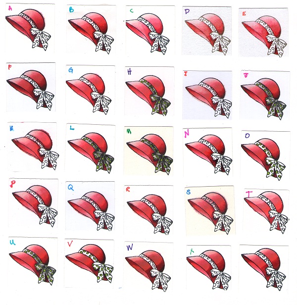
The purpose of this experiment was to use the same paper swatches that I tested the Copic markers on, except this time, use the Marvy Le Plume Alcohol Markers.  I wasn’t concerned with the differences in the markers, so my focus was on how well the different paper could handle intense blending techniques.  My secondary purpose was to determine which papers I would recommend for this brand of marker, which means most samples were colored three or four times for maximum blending testing.

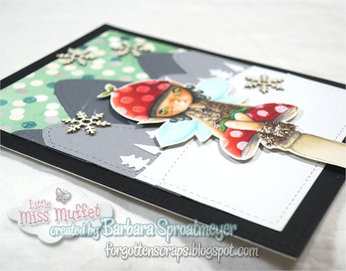
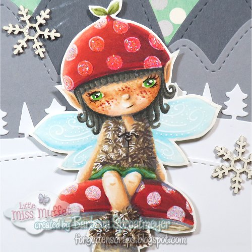
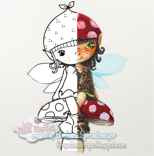
For this test I used the hat accessory stamp in Taylor from Little Miss Muffet Stamps.

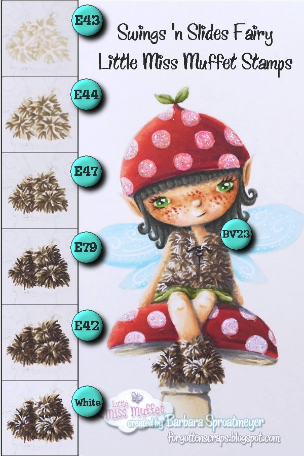
These are the main Le Plume colors used:
P782, P785, P786, P797, PV78 and AG877.

The papers are identified in the Introduction and here are the results:

(Click on the picture for a zoomed look.)

And the results?  It was interesting to discover there were a few papers I would have recommended for Copic markers but they didn’t stand up to the Marvy Le Plume markers very well.  For example, papers  GI,  P and Q scored high on the other tests but with this test showed bleeding; and T also did well on previous tests but on this one the colors wouldn’t blend.  Below is a close up of those swatches along with J, one that did well:

As you’ve probably already guessed from the example above, J is one of the papers I would recommend.  I was looking for a paper that I could build up many layers of colors and blend easily from one color to the next, going from a dark gray to a light pink, using six different markers.  It was also important that the paper would accept a lot of ink without bleeding.

Based on this test alone, I would recommend HJ, L, M, and U as being the best papers to color on with the Marvy Le Plume markers.  As secondary choices, if you had them on hand or if they were readily available, would be OV and Z.  (Z is the unlabeled paper swatch, Bazzil Basics Ultra Smooth.)