The Paper Project – Experiment V

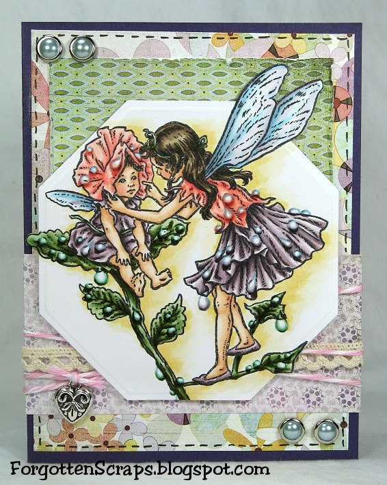
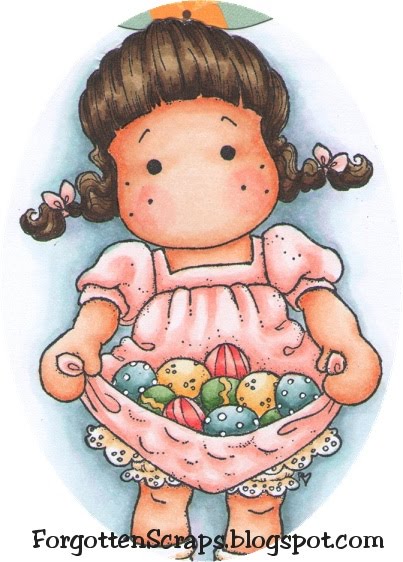
Ready for another paper test? This one has a focus on blending and some colors are easier to blend than others. Red is usually one of the harder colors to blend for some because it requires more ink and so I wanted to put it to the test. The image I used is Muffy Ketto from Stamping Bella, because, frankly, the world could use more red dogs. ;D

Experiment V – Blending Red

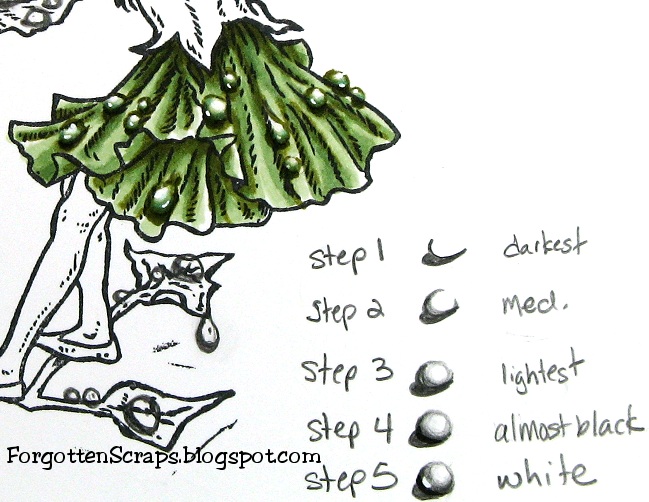
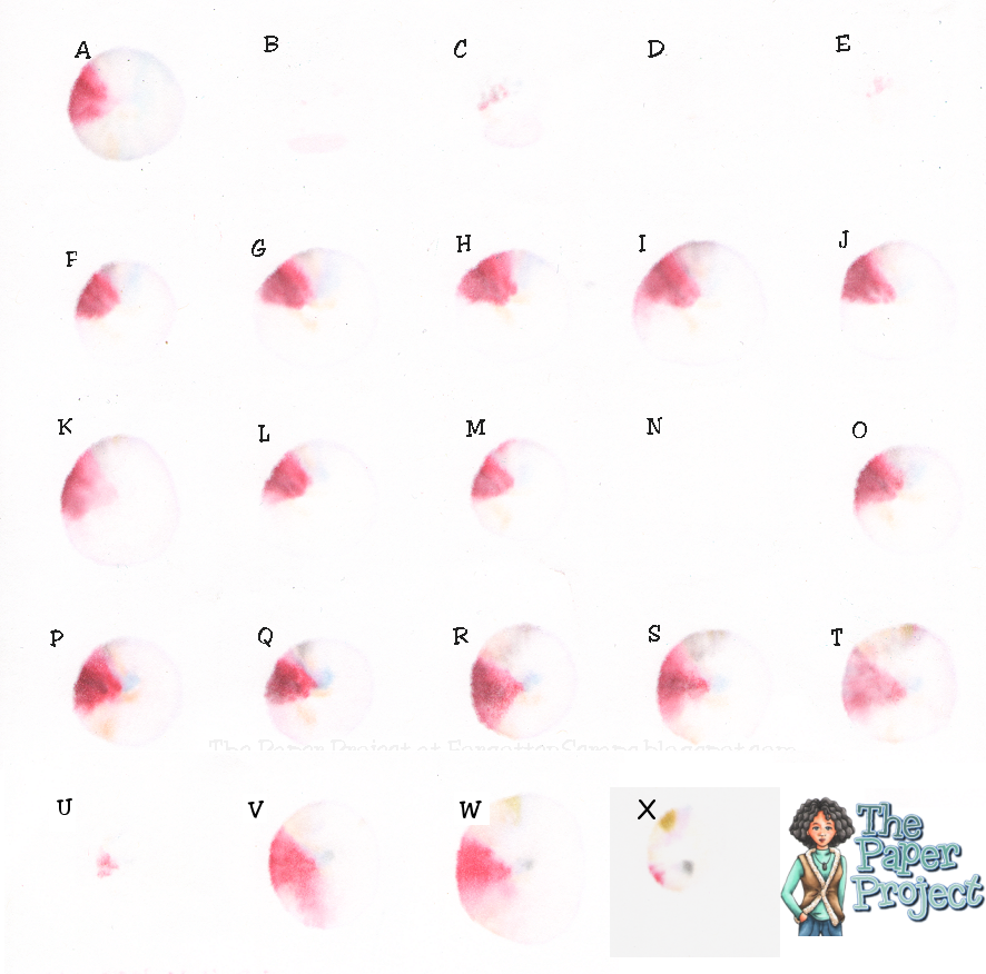
The purpose of this experiment is to blend with red to find out which papers can achieve a perfect gradation from the darkest to the lightest color. I used R22, R24, R27, and R29 and blended the main part of the dog while timing how long each sample took. I started with the darkest color and worked towards the lightest, then worked my way back down to the darkest and finally up again to the lightest; approximately three layers of blending. The head and ears were quickly colored in after the clock stopped.

The papers are identified in the Introduction and here are the results:
(Click on the picture for a zoomed look.)

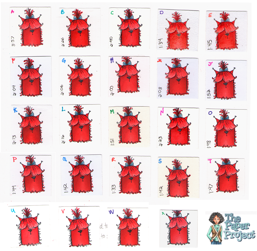
The purpose of so much blending is two fold; first to use a lot of ink in one area like most of us do and second to get the most vibrant results in the hues. When applying the darkest color first a lot of that will be blended out as lighter colors are applied; then when applying the darker colors again sometimes the blending is removed so applying a third lighter coat of the lighter colors helps to smooth it all out.

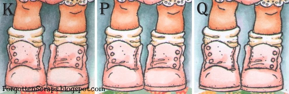
For the most part, I was able to get smooth blending on all the sample with few exceptions. I had timed myself coloring in the main body of the dog hoping it would indicate how difficult it was to blend. However, it just shows that I was getting faster as I progressed and doesn’t appear to reflect anything else. Below shows a closeup of A, J and Q with the typical smooth blending I achieved.

(Click on the picture for a zoomed look.)


The exceptions were B, C, D, E, and N, where perfect blending was difficult, if not impossible. I had to stop on D and E after coloring only one layer because it already started to pool on the paper. The other three, B, C, and N, started pooling after the second layer and blending became difficult as well. Below shows a close up of a few of these in close up.

(Click on the picture for a zoomed look.)


Looking at C, you can see it getting blotchy and in the dark shadows there are spots where the ink no longer stayed put. The next one, D, you can see the darker reds have built up and started to become tacky which shows up as splotches. On the last sample, N, you can see how all the ink stayed on the surface of the paper so the brush strokes are noticeable as the ink was just moved around.

After air drying for a day, C, D, E and N are the most tacky; and B, G, L and R are slightly tacky only in the darkest shadows.

Based on this test only I would recommend A, F, G, H, I, J, K, M, O, P, Q, S, T, U, V, W and X as being the good papers to color on.

Tips, Tricks & Techniques 0x023

I needed a revamp of my craft area because I was literally being “pushed off” my own desk by two up and coming hobby enthusiasts! (See previous post.) ;D So I recently moved everything around to provide a better space for us all… and when I say everything, I mean everything that could possible move was moved!

So how do you get a craft room? Squeeze all the kids’ beds into one room then take over the extra space and fill it floor to ceiling. Make sure it’s organized enough so the kids “think” they got an playroom out of the deal too. ;D


I’ve set up the right side of the room with my desk and the left side with a table for the kids plus all their toys accessible from the shelves. With the new setup, we can get Grandma, all three misfits and myself together on special days and still get a little crafting done. It’s hard to see from the angle but there is actually two 4-feet tables arranged perpendicular to each other.


For extra, extra storage I’ve had these two large …. cabinet things… ok, I confess, wardrobes from Ikea. (You see, in Texas we have massive closets that are the size of spare bedrooms so we wouldn’t really know what a wardrobe is! LOL) These were the only two things I couldn’t move, mainly because I didn’t want to empty the shelves and also because they’re freakin’ heavy. The picture only shows one unit and just the edge of the second unit – together they’ve doubled my closet space.


Now on to some details. This is an ink pad storage shelf that I used for my Copic Various refills. It will hold about 160 in the top portion and I’m sure I can squeeze a few on the bottom row. The shelf is now provided by Organize More and I like the sturdy yet lightweight feel so it can be mounted on the wall. They even come in colors!


For my rubber stamps, I use the cling mount storage cases from Stampin’ Up! They’re the same size as DVD cases so I bought a cheap shelf at Walmart and filled it. Eventually I’ll get all the labels on the sides and alphabetize them! Yeah!! LOL I set up another DVD shelf on the other side of the closet door where I hold my Cricut cartridges.


Many years ago when a local scrapbooking store was going out of business, they put everything up for sale and I scored this awesome paper rack! (This is hard to find but it’s a Paper Station Merchandiser which is currently found at Display Dynamics.) It’s for 12×12″ paper but I’ve doubled up on each tray and store my 8.5×11″ cardstock. For labels, I cut a small sample from each cardstock color and added a label with the color name, then taped that to the front of the trays so I know which colors to reorder.


So the side of the paper is where the desk starts and that’s where I keep my decorative paper. The 12×12″ paper is in the white box (I think it’s a Jetmax Modular Storage) and the 6×6″ and smaller paper is right next to it in and in the green box (an office box from Walmart). Next to that are my book boxes – boxes that look like books – where I keep some ebellishments such as pearls, brads, tags, metal and and so on. The rest of my embellishments are up in the hutch and most of my tools are stored under the desk.


Continuing left, I have my cubbies for the Copic markers. I got these from Studio3Solutions and I love them! I have three units and each shelf cubbie is slightly slanted back so when I pull one out all the others stay in. When I first purchased them I didn’t have very many markers and now I wish I had at least one more shelf to add to it. Next to the shelves is a pencil sharpener (for those Prismacolor Pencils I’m afraid to use), a lamp that used to be my Grandmother’s, and then just out of view is my paper cutter leaning against the hutch edge.


My newest addition is how I store my cuttting dies. I got this idea from a fellow design team member and had to put one together. Excpet when I purchased the “Magnetic White Board” I didn’t realize it wasn’t actually magnetized so I had to use strips of magnets to actually get the the final result. If I need to upgrade, then next time I’m going to look for a “Magnet Board.”


That’s about it for this revamp and hopefully you got some ideas as well. Good luck!

Sweet Pea

You know that yesterday Zoe and I shared our attempts at coloring dew drops using only Copic markers. Well, it was actually my third attempt so today I wanted to show the first two. ;D Here’s a card I made using some sweet flower fairies.


I added blue to these raindrops to see if it would help make them stand out more. On some it worked ok but on the majority I think I have too much blue, especially on the pink ones.


The first thing I did was draw in all the water drops in the image using a pencil. Make sure to go about this lightly because you’ll need to erase each drop just before coloring. Some pencil marks can be erased after coloring but in general one it’s colored with a Copic marker it doesn’t come off.


I enjoyed working with the darker colors and I think that will be a key to success. On this image below, I went back in and used the white gel pen for some much needed highlights.


I would like to work on the shading a little more and add a refraction on the opposite side of the drop. However, in the mean time, here are the basic steps I took to making these drops. Remember to keep your light source in the same direction for all droplets – something I let my mind wonder on in the below sample.


Here is a close up of the various water drops. “A” was my first attempt and I like the color and color depth. “B” and “C” are from this card where I tried to add blue to the mix. (“A” and “B” both use the white gel pen.) “D” and “E” are from yesterday where I did not use the gel pen and had to leave the white areas completely uncolored.


I’d like to enter into the following challenges:
Sir Stampalot Challenge – May (magical worlds)
Emerald Faerie First Challenge (anything goes)
Crafter’s Companion Monthly Challenge – May (girl’s birthday)
By the Cute and Girly – May Challenge (anything goes)
Bling it On Challenge – May (inspirational photo – flowers)

Main Stamp: Sweet Pea (Crafter’s Companion Flower Fairies Friends)
Patterned Paper: Kioshi (BG)
Metal Die: Spellbinders Nestabilities Hexagons

Copic Markers colored on Georgia Pacific Card Stock:
-skin tone: E000, E00, E21, E11
-browns: E43, E44, E47, E49
-pinks: R11, R12, R14, R22
-yellows: E50, YR30, YR31
-greens: YG61, YG63, YG67, YG99
-blues: BG01, BG000
-purples: V91, V93, V95, V99

Did you know? Sonic Drive-In is an American drive-in fast-food restaurant chain based in Oklahoma City, Oklahoma, complete with carhops who sometimes wear rollerskates. As of Aug 31. 2010, there were 3,500 restaurants in forty-three U.S. states. Sonic serves approximately 3 million customers daily. “Service with the Speed of Sound.”
[Sonic DriveiIn, Wikipedia.org]

The Paper Project – Experiment IV

Happy Easter everyone! Today I’m using a fun new stamp, Tilda with Eggs in her Apron, given to me from a friend Maria – thanks Maria! 😀 This was a fun Tilda to color and I ended up making monogrammed tags for the Easter Baskets … and I was able to refrain from adding a nose and mouth on Tilda this time. LOL

Experiment IV – Paper Attributes

The purpose of this experiment is to show any paper can be effectively used for coloring as long as you know the individual paper’s attributes. For those starting off and worried about finding the “perfect” paper right away, then worry no more and start out with something convenient and readily available.


For this test I used three of the paper samples and colored the images using the same techniques. I started with the darkest color then blended up to the lightest color. They were all colored with the same markers except for Tilda’s hair.

I didn’t want you to be confused with the monogram above so here are the three papers used along with their assigned letter:

Below you can compare these images side-by-side and see close up areas of the shoes and eggs, as well as a full view of all three tags.

Introduction post found here.
(Click on the picture for a zoomed look.)


My techniques changed depending on the paper I used. For example, when coloring on K I had to use quick light strokes to keep the bleeding maintained. Even so, when looking at the eggs, you’ll notice the edges are not as clean and it looks slightly more blurry than in P or Q. However, this problem isn’t as noticeable in larger areas such as the shoes.

When coloring on P and Q, I often went back in with the darker colors to keep the depth. I didn’t need to do this with K, however, there were other advantages to P and Q that K doesn’t have. For example, I could take my time blending and come back with additional colors building layer upon layers much easier.

For the purpose of this test, P and Q didn’t have very many differences. However, in some areas that already had a lot of ink, I noticed when I applied a wet layer on top of a dry layer the texture was a little different and became grainy.

Lastly, you’ll notice that K is so thin I should have used an additional white layer before placing it on the card so the decorative papers wouldn’t show through.

I’d like to enter in the following Easter themed challenges:


Main Stamp:
Tilda with Eggs in her Apron (Mag)
Patterned Paper: Togetherness (CC)
Metal Die: Spellbinders Nestabilities Labels 8, Spellbinders Nestabilities Labels 17, and Magnolia Doohickey Vintage Lace

Copic Markers:
-skin tone: E000, E00, E11, R11, R12
-hair: E50, E51, E53, E55; E43, E4, E47, E49
-clothes: R000, R00, R11 R12, E50, E51, E53
-eggs: R11, R12, R14, R17, BG70, BG72, BG75, YG61, YG63, YG67, YR30, YR31, Y35
-background: BG72, C3, BG11, C1, BV31, BG70, 0

The Paper Project – Experiment III

For this test I used the same sheet I colored last time using the little fairy stamp from The Greeting Farm, Neverland. I had actually gone back in to add gray tones to see how a second application of color would work but the image was too small to get any benefit from the test. So moving right along to the next one…

Experiment III – Blending Out Colors

The purpose of this experiment is to use the Blender marker and find out how much color can be removed. I used the lower right corner of each square where I could work out three colors at once … peaches, blues and reds.

To help expedite the process I used three droplets of Blender ink refill. Yes, I said three for that little area! After each drop I would work in the excess ink with the Blender marker before adding the next drop. If anything was to be removed, this would do the trick!

The papers are identified in the Introduction and here are the results:
(Click on the picture for a zoomed look.)
 

Overall this was a great test and I noticed the effects with the first drop. By time I got to the third drop, I didn’t see any additional benefit compared to the second drop but kept the test the same for all samples. In general I found that most of the paper fit into three categories… (1) the colors would only get pushed around, (2) some colors would be blended out, or lastly, (3) nothing really happened.

It is easy to spot which ones are which. For example, in papers where the colors are pushed around you’ll notice a nice pinkish circle in the are I worked in. To demonstrate this, I think the worst ones are B, C, K, S and V.

Unfortunately, none of the papers were able to remove ALL of the colors. I wish one of them had, however, the ones I think did average were A, D, E, F, G, H, I, J, L, O, P, Q, R, T, W and X. Overall, I think J and X performed the best in this test and should receive an extra gold star.

As for the third category, I didn’t see much happening on M and especially N and U. I promise I didn’t skip those. ;D

Finally, I thought it was interesting to see what was happening on the back side of the paper. These squares are adhered on their top edges with glue onto a sheet of card stock. (If your curious, I used a full sheet of R for the base on which I applied all the test squares onto.)

The papers are identified in the Introduction and here is the backside:

(Click on the picture for a zoomed look.)

Three drops of ink is a lot for this small area and you can see how each of them worked its way towards the back. It was interesting that they all looked the same except for A, B, C, D, U and X which only just began to show up; and N which never even made it to the back of it’s own layer.

The colors which were being removed were E000, E11, R43, R46, R59, B21 and V12.

That concludes this test and I’m off to replenish my Blender ink refill. ;D But before I leave, are you developing a preference yet? Which ones do you think is best?

Tips, Tricks & Techniques 0x022

Ever wonder what the difference is between all the Copic gray colors? My friend Ruby had the same question and I decided it would be fun to have a side-by-side comparison! So here it is using four of the new Suger ‘n Spice Dolls from Little Miss Muffet Stamps.


So which color is which? Starting from the top left and going clockwise here are colors used, colored on Copy Paper:

Pepper: C00, C1, C3, C5, C7, C9
Peppermint: 0, N1, N3, N5, N7, N9
Nutmeg: T0, T1, T3, T5, T7, T9
Cinnamon: W00, W1, W3, W5, W7, W8

The top two are the cool-tone grays and the lower two are the warm-tone grays. I have found uses for each of them and select my gray-tone based on other colors on the card. However with that said, my favorite is C tones for metal and W tones for black.