Miss Anya Hats Off

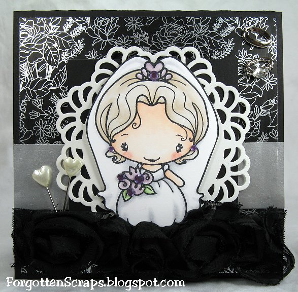
Today I’ve got some exciting news to share AND a give away! I made this card using one of my favorite characters from The Greeting Farm, Miss Anya, which is part of the trio set Miss Anya Hats Off. How would you like to win this very set? Read on for the details. ;D


Today I was featured in The Greeting Farm‘s newsletter and because of it they have generously offered this 4×6 set as a freebie!! The newsletter features my paper expirements, The Paper Project, plus there are previews of their new releases! So if you haven’t received it yet, head on over and sign up for it.

** Give Away Details **

Here’s the details – For a chance to win this set, all you have to do is leave a comment on THIS post! You have from now until this Wednesday night at 11:00 pm Central Time and a random winner will be posted on Thursday! And speaking of freebies – you can also head on over to Little Miss Muffet’s Challenge blog for some delicious Blog Candy!


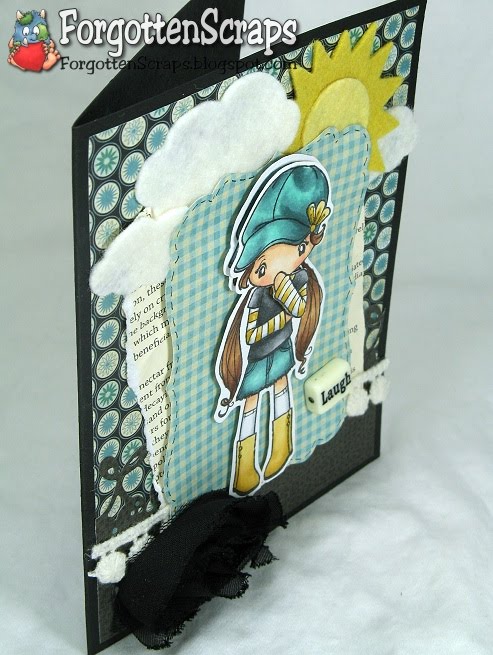
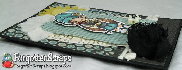
I started this card over at my Mom’s house and snatched up some of her paper scraps – I loved the blues and blacks she was working with and I couldn’t resist. ;D So when I got home I finished it up with some felt embellishments and a cheery yellow sun for contrast.


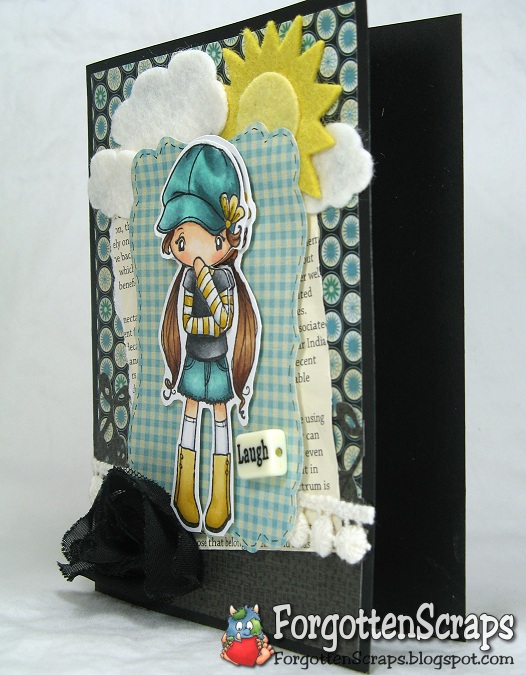
When I started stamping Miss Anya I was working on an uneven surface so I didn’t get the whole image. Then thinking I could get the better of my work desk I tried it again in the same spot pressing harder – but this time I ended up with the other half of the stamp missing! LOL Little did I know that my stubbornness to clean off my desk would eventually lead to this enjoyable technique of raising a portion of the image with foam dot – unfortunately, I haven’t a clue what it’s called but I love the effect! ;D Her hat, head and fore arm were raised.


I’d like to enter into the following challenges:
Crafty Ann’s Challenge #40 (happy birthday)
Joyful Stamper Inspire Me Fridays #6 (anything goes)
Stamp Something Challenge (anything goes)
Craft Us Crazy Challenge #8 (favorite embellishment – felt diecuts)
Rainbow Lady’s Challenge #152 (texture – felt)
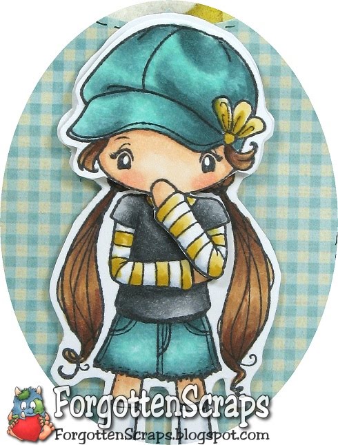
Main Stamp: Miss Anya Hats Off (TGF)
Patterned Paper: scraps
Metal Die: Spellbinders Nestabilities Labels Seventeen, Magnolia Doohickey Cherry Lace Border, My Favorite Things Die-namics SunShine and My Favorite Things Die-namics Cloud Trio

Copic Markers colored on Georgia Pacific White Card Stock:
-skin tone: E00, E11, R11, R12
-browns: E33, E23, E27, E29
-yellows: YR31, Y32, Y26
-blues: BB70, BG72, BG75, BG11
-grays: 0, C1, C3, N2, N4, N6, N8

Did you know? A beanie is a head-hugging brimless cap with or without a visor that was once popular among school boys. However, a tuque is a knitted cap, originally of wool though now often of synthetic fibers, that is designed to provide warmth in winter. Most tuques are tapered; they sometimes have ear flaps, and may be topped with a pom-pom, this style of tuque is sometimes referred to as a boggan or sherpa. Tuques may have a folded brim, or none, and may be worn tightly fitting the head or loose on top although the latter is considered more standard.
[Beanie and Tuque, Wikipedia.org]

The Paper Project – Experiment III

For this test I used the same sheet I colored last time using the little fairy stamp from The Greeting Farm, Neverland. I had actually gone back in to add gray tones to see how a second application of color would work but the image was too small to get any benefit from the test. So moving right along to the next one…

Experiment III – Blending Out Colors

The purpose of this experiment is to use the Blender marker and find out how much color can be removed. I used the lower right corner of each square where I could work out three colors at once … peaches, blues and reds.

To help expedite the process I used three droplets of Blender ink refill. Yes, I said three for that little area! After each drop I would work in the excess ink with the Blender marker before adding the next drop. If anything was to be removed, this would do the trick!

The papers are identified in the Introduction and here are the results:
(Click on the picture for a zoomed look.)
 

Overall this was a great test and I noticed the effects with the first drop. By time I got to the third drop, I didn’t see any additional benefit compared to the second drop but kept the test the same for all samples. In general I found that most of the paper fit into three categories… (1) the colors would only get pushed around, (2) some colors would be blended out, or lastly, (3) nothing really happened.

It is easy to spot which ones are which. For example, in papers where the colors are pushed around you’ll notice a nice pinkish circle in the are I worked in. To demonstrate this, I think the worst ones are B, C, K, S and V.

Unfortunately, none of the papers were able to remove ALL of the colors. I wish one of them had, however, the ones I think did average were A, D, E, F, G, H, I, J, L, O, P, Q, R, T, W and X. Overall, I think J and X performed the best in this test and should receive an extra gold star.

As for the third category, I didn’t see much happening on M and especially N and U. I promise I didn’t skip those. ;D

Finally, I thought it was interesting to see what was happening on the back side of the paper. These squares are adhered on their top edges with glue onto a sheet of card stock. (If your curious, I used a full sheet of R for the base on which I applied all the test squares onto.)

The papers are identified in the Introduction and here is the backside:

(Click on the picture for a zoomed look.)

Three drops of ink is a lot for this small area and you can see how each of them worked its way towards the back. It was interesting that they all looked the same except for A, B, C, D, U and X which only just began to show up; and N which never even made it to the back of it’s own layer.

The colors which were being removed were E000, E11, R43, R46, R59, B21 and V12.

That concludes this test and I’m off to replenish my Blender ink refill. ;D But before I leave, are you developing a preference yet? Which ones do you think is best?

The Paper Project – Experiment II

We’ve made it to the second experiment in The Paper Project! For this test I used the little fairy stamp from The Greeting Farm in a set called Neverland.

Experiment II – Basic Coloring

The purpose of this experiment is to simply color the image with minimal blending to see how quick layer of color would apply. (A blending test will be done later on.) Each image was stamped with Memento Tuxedo Black Ink then left to air dry for several days.

I used the same colors and applied one color at a time – meaning, I colored all the fairies’ wings with B21 then went back and added V12 to each wing before moving onto the next color. I used the same brush strokes for each image as much as possible.

Here are the Copic Marker colors I used:
-wings: B21, V12
-hair: Y21, Y26
-face: E000, E11, R12
-dress: R43, R46, R59

The papers are identified in the Introduction and here are the results:
(Click on the picture for a zoomed look.)

From the start I could see there was a difference when I stamped each image. In general, the black was the same, however, it is bolder on C, J, M, and X; and yet the lightest on D and E.

Also the intensity of the colors varied and some papers made the hues darker or lighter. For example, the colors on D, E, N and U are washed out yet they show up the darkest on B, I, K, S, W, and X.

There wasn’t any obvious problems with any of them but based on this experiment I would say A, B, C, F, G, H, I, J, K, L, M, O, P, Q, R, S, T, V, W, and X are the better papers to work with.

I Do

I found some foil paper in the bottom of my stash and thought it would make a perfect elegant wedding card. I used Anya from the I Do set and embellished the card with black rosette ribbon, two heart head pins and two decorative wedding rings (in the upper right corner).


Challenge: Easy Craft Projects – Challenge #30 (Black & White)
Challenge: Kaboodle Doodles – Challenge #51 (Bling it up)
Challenge: Pollycraft – Challenge #77 (Black & White +one)
Challenge: Sketch N Stash – Challenge #53 (sketch)
Challenge: Play Date Cafe – Challenge #66 (Black & White + Lilac)
Main Stamp:
I Do (TGF)
Patterned Paper: scraps
Metal Die: My Favorite Things Die-namics Decorative Doily
Copic Colors:
-skin: E0000, E000, E00, R12
-hair: E40, E41, E42
-clothes: N0, N1, N3
-other: V91, V93, V95, G40, G82

Did you know? Temple Israel is a Reform Jewish congregation in Memphis, Tennessee. It is the only Reform synagogue in Memphis, the oldest and largest Jewish congregation in Tennessee, and one of the largest Reform congregations in the United States. It was founded in 1853 by mostly German Jews as Congregation B’nai Israel (Hebrew for “Children of Israel”).
[Temple Isreal (Memphis, Tennessee), Wikipedia.org]

Sweet Anya

It’s another Mystery Monday at Club Anya & Friends and today it’s my turn to host! I chose to CASE a great card by Claudine Poch that featured a versatile layout for any occasion. This is also my last challenge as the January Guest Designer and I had so much fun being on the team! So with big HUGS, I say “Thanks TGF and Club Anya!!”


I made this card using an all time favorite Sweet Anya, of course. I also wanted to use some cork and thought it would be fun to cut it out using the lace doily die – it turned out better than I had hopped so I’ll be borrowing that die from my Mom again! 😀 If you’re keeping track of my details on painting the chipboards, I covered this wing embellishment with Liquid Pearls again. It appears to be my favorite method but I have yet to get my embossing powders out of the closet. As a final touch, I added glitter to a few areas of the clothing and white polka-dots on the shirt.

DT Challenge: Club Anya & Friends – Mystery Monday
Challenge: Stampin’ Royalty – Challenge #55 (things with wings)
Challenge: Creative Inspirations – Challenge #95 (patchwork)
Challenge: Color Throw Down – Challenge #125 (green, pink, kraft)
Challenge: Truly Scrumptious – Challenge #49 (pink, brown, green)
Challenge: Flutter By Wednesday (open + fairies and wing)
Main Stamp: Sweet Anya (TGF)
Patterned Paper: Once Upon a Springtime (Graphics 45) and Vintage (CM)
Metal Die: My Favorite Things Die-namics Decorative Doily
Copic Colors:
-skin: E000, E00, E11, E13, R12
-hair: E42, E43, E44, E47, E79
-clothes: YG91, TG93, YG95, YG97, R01, R02, R05, E50, E51, E53

Did you know? The Low Head Lighthouse is Australia’s oldest continuously used pilot station and was the third lighthouse to be constructed in Australia. The original tower, 15.25 meters (50.0 ft) high, was known as the “Georgetown Station” but by the 1880s, the original stone tower had fallen into a state of disrepair. It was demolished in 1888 and replaced with the present double brick structure with a new lantern room and apparatus. This light is now unmanned and automated.
[Low Head Lighthouse, Wikipedia.org]

Miss Anya Dressy

Welcome to another day at Club Anya and Friends and today we have a perfect sketch to use for our Saturday Sketch challenge! I colored up another Miss Anya Dressy and cut her out to sit on a Park Bench for Two from Make it Crafty.


Because I wanted Miss Anya to stand out, I used neutral colors on the card and a simple layout with minimal embellishments. The Park Bench for Two was colored with earth tones which the mind usually reads as neutral colors.


DT Challenge: Club Anya and Friends – Saturday Sketch
Challenge: Sunday Sketch & Stamp – Challengr #45 (sketch)
Challenge: Quirky Crafts – Challenge #2 (garden, green & pink [coral])
Challenge: The Corrosive Challenge #99 (pearls and lace)
Main Stamp:
Miss Anya Dressy (TGF) and Park Bench for Two (MiC)
Patterned Paper: Vintage (CM)
Copic Colors:
-skin/hair: E11, E13, E15, E17, W1, W4, W6, W8
-clothes: E50, E51, YR01, YR02, YR09
-bench: E53, E55, E57, E59, C3
-greenery: G40, G82, G94, G99, YG91, YG93, YG95, YG97, BG93, BG96, BG99, G20, G21, G24, G28
-flowers: Y32, Y35, Y38, YR01, YR02, YR09, R24, R29
-ground: W0, W1, W2, W3, W4, W5, W6

Did you know? Lad: A Dog is a 1919 American novel written by Albert Payson Terhune and composed of twelve short stories first published in magazines. The novel is loosely based on the author’s real-life collie, Lad. Born in 1902, the real-life Lad was an unregistered collie of unknown lineage originally owned by Terhune’s father. Lad’s death at the age of 18 was mourned by many of the story’s fans, particularly children. Through the stories of Lad’s adventures, Terhune expresses his views on parenting, obtaining perfect obedience without force, and the nature and rights of the “well-bred”.
[Lad, A Dog, Wikipedia.org]

Update: I was the voted winner at Quirky Crafts for this challenge!