Agent Bubblegum

Welcome to another great challenge at Little Miss Muffet Challenges where the theme for this fortnight is “Numbers” – we want to see big ones or little ones on your projects. ;D Plus there is a new rules… IF you use a Little Miss Muffet Stamp then the theme is always Anything Goes! So let’s see what you’ve been making!


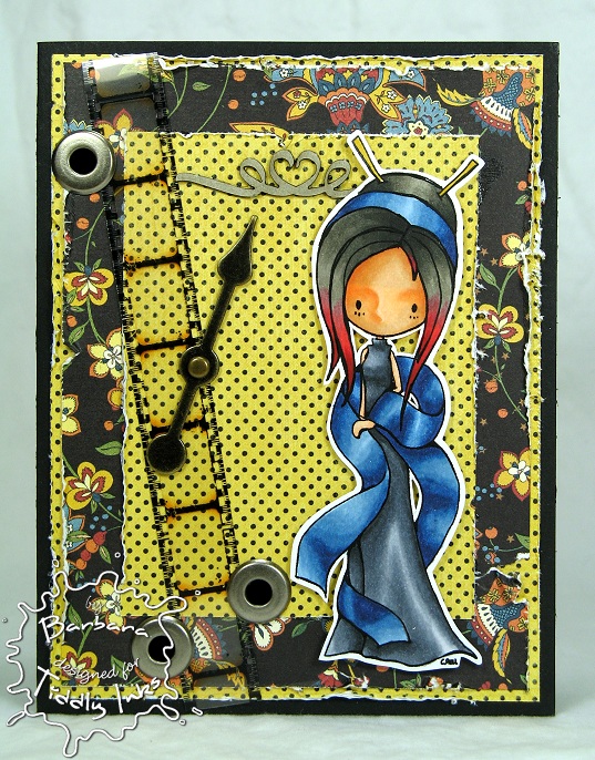
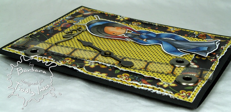
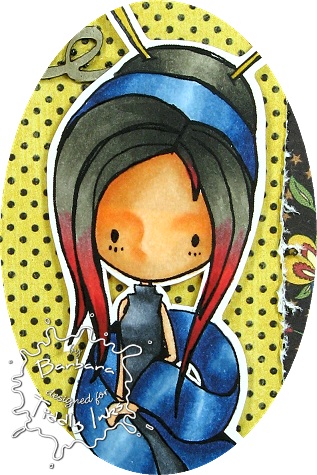
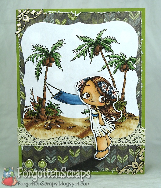
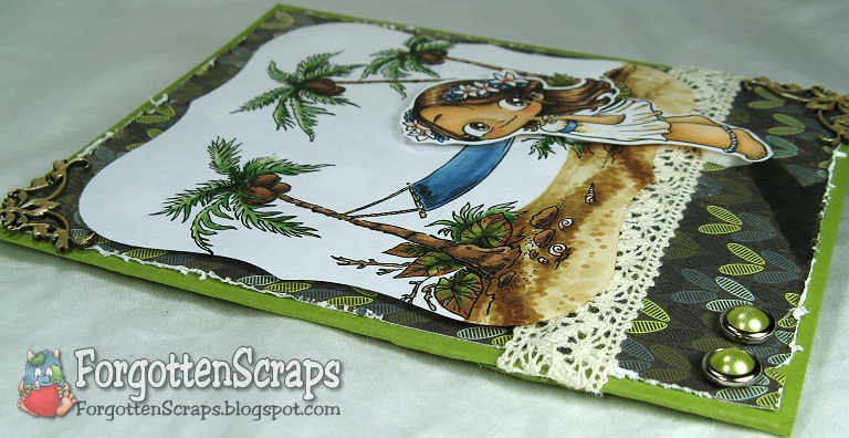
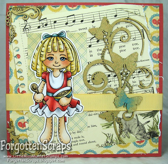
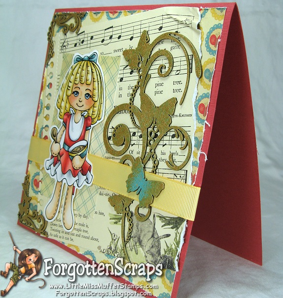
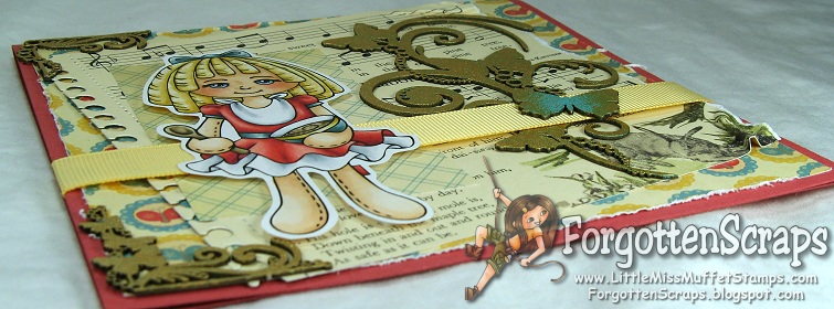
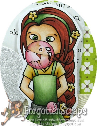
I used Agent Bubblegum for my project and wanted to create a grand birthday card for a special princess. So I found a large number eight chipboard and covered it using one of my paint daubers in a Pearl color. I think the white helps it stand out without distracting too much from the main image.


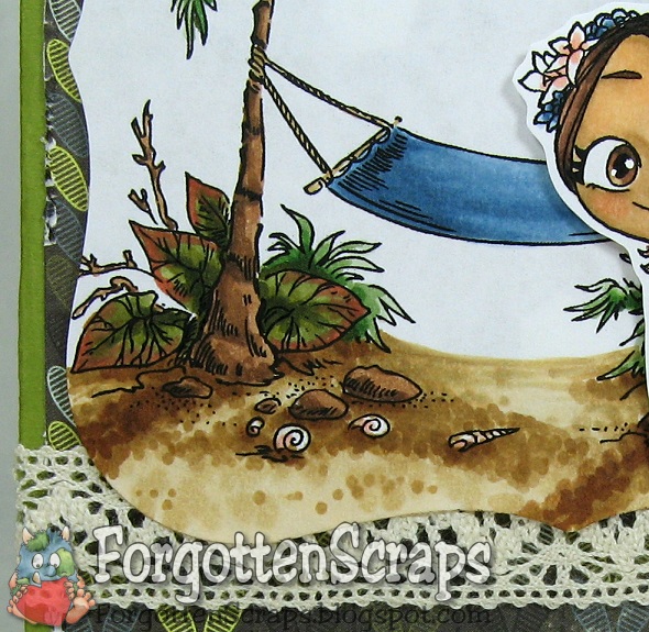
Because the background and main image were busy, I decorated the rest using solid colored embellishments including fabric flowers, laser cut chipboard corners and wide twill tape. The wording is from a Winnie the Pooh story book that I used for “scraps” and tear out pages from. This one had little Piglet and I made sure he wasn’t be covered.


I’d like to enter this into the following challenges:
Going Grey with Scrap-Creations Challenge (happy birthday)
Party Time Tuesdays Challenge # 19 (summer birthday)
Ooh la la Creations Challenge #81 (birthday)
There She Goes Challenge #110 (milestones)
Scrappy Frogs Challenge (birthday)

DT: Little Miss Muffet – Challenge #11 (numbers)
Main Stamp: Agent Bubblegum (LMMS)
Patterned Paper: Dutch Mustard Soup (JS)
Chipboard: Fine Swirls (MiC) and some numbers (SU) covered in Adirondack Acrylic Paint Dabber Pearl

Copic Markers colored on Copy Paper:
-skin tone: E000, E00, E21
-browns: E08, E07, E15, E18, E19
-yellows: YR30, YR32, YR21, YR26
-greens: YG61, YG63, YG67, G40
-pinks: R81, R83, R85
-grays: T2, T4, T6 T8

Did you know? Manoj Nelliyattu Shyamalan, born 6 August 1970 and known professionally as M. Night Shyamalan, is an Indian-born American film director, screenwriter, and producer known for making movies with contemporary supernatural plots that climax with a twist ending. He is also known for filming his movies (and staging his plots) in and around Philadelphia, Pennsylvania, where he was raised. Shyamalan released his first film, Praying with Anger, in 1992 while he was a New York University student.
[M. Night Shyamalan, Wikipedia.org]

Soooo Big

I’ve got some exciting news to share – today is the first challenge over at the Little Darlings Challenge Blog! You can use any stamp and we’re started off the challenges with a great theme… Summer!


I used the Little Darlings stamp called Soooo Big which is perfect to begin my summer with. ;D Now that the kids are out of school and the schedule it a little more relaxed it’s time to get the yard in shape the garage cleaned out!


I kept this card simple but used some of my favorite things … like the new Die-namics die Fresh Cut Grass and those laser cut embellishments from Make it Crafty! This is also one of my favorite color schemes, I just love greens and blues. Hope you like the card and come on over to play in our challenge!


DT Challenge: Little Darlings Challenge #1 (summer)
Main Stamp:
Soooo Big (LTS)
Patterned Paper: Marjolaine (BG)
Chipboard: Round Leaves (MiC)
Metal Die: Spellbinders Nestabilities Labels One and My Favorite Things Die-namics Fresh Cut Grass

Copic Markers colored on Copy Paper:
-skin tone: E000, E00, E21
-browns: E21, E23, E25, E27
-reds: E15, E17, E18
-yellows: YR21, YR24
-greens: G20, G21, G24, G28
-blues: B91, B93, B95, B97
-grays: C1, C3

Did you know? The Book of Kells is an illuminated manuscript Gospel book in Latin, containing the four Gospels of the New Testament together with various prefatory texts and tables. It was created by Celtic monks ca. 800 or slightly earlier. It is a masterwork of Western calligraphy and represents the pinnacle of Insular illumination. It is also widely regarded as Ireland’s finest national treasure.
[Book of Kells, Wikipedia.org]

Chi

It’s another challenge day for Tiddly Inks and our theme this week is Goth. I went with a lot of black, red tipped hair and metal embellishments for this sweet Gothic girl to be showcased on.


The image is Chi and I’ve been wanting to color her for a while. ;D So I image her all dressed up for a prom or something formal. Goth girls do that occasionally, right? I used a hodgepodge of embellishments and just grabbed things I thought would work. I also wanted to use a simple layout to give focus to the main image.


DT Challenge: Tiddly Inks Challenge #51 (goth)
Main Stamp:
Chi (TI)
Patterned Paper: Le Cirque (Graphic 45)
Chipboard: Love Heart Swirls (MiC)

Copic Markers colored on Copy Paper:
-skin tone: E000, E00, E02, E21
-reds: R24, R29
-yellows: Y26
-blues: B91, B93, B34, B37, B39
-grays: W4, W6, W8; C1, C3, C5, C7, C9

Did you know? Providence is the capital of, and the most populous city in, Rhode Island, and one of the first cities established in the United States. Located in Providence County, it is the estimated third largest city in the New England region and it anchors the 37th largest metropolitan population in the country. Providence was founded in 1636 by Roger Williams, a religious exile from the Massachusetts Bay Colony. He named the area in honor of “God’s merciful Providence”, which he believed was responsible for revealing such a haven for him and his followers to settle.
[Providence, Road Island, Wikipedia.org]

The Paper Project – Experiment V

Ready for another paper test? This one has a focus on blending and some colors are easier to blend than others. Red is usually one of the harder colors to blend for some because it requires more ink and so I wanted to put it to the test. The image I used is Muffy Ketto from Stamping Bella, because, frankly, the world could use more red dogs. ;D

Experiment V – Blending Red

The purpose of this experiment is to blend with red to find out which papers can achieve a perfect gradation from the darkest to the lightest color. I used R22, R24, R27, and R29 and blended the main part of the dog while timing how long each sample took. I started with the darkest color and worked towards the lightest, then worked my way back down to the darkest and finally up again to the lightest; approximately three layers of blending. The head and ears were quickly colored in after the clock stopped.

The papers are identified in the Introduction and here are the results:
(Click on the picture for a zoomed look.)

The purpose of so much blending is two fold; first to use a lot of ink in one area like most of us do and second to get the most vibrant results in the hues. When applying the darkest color first a lot of that will be blended out as lighter colors are applied; then when applying the darker colors again sometimes the blending is removed so applying a third lighter coat of the lighter colors helps to smooth it all out.

For the most part, I was able to get smooth blending on all the sample with few exceptions. I had timed myself coloring in the main body of the dog hoping it would indicate how difficult it was to blend. However, it just shows that I was getting faster as I progressed and doesn’t appear to reflect anything else. Below shows a closeup of A, J and Q with the typical smooth blending I achieved.

(Click on the picture for a zoomed look.)


The exceptions were B, C, D, E, and N, where perfect blending was difficult, if not impossible. I had to stop on D and E after coloring only one layer because it already started to pool on the paper. The other three, B, C, and N, started pooling after the second layer and blending became difficult as well. Below shows a close up of a few of these in close up.

(Click on the picture for a zoomed look.)


Looking at C, you can see it getting blotchy and in the dark shadows there are spots where the ink no longer stayed put. The next one, D, you can see the darker reds have built up and started to become tacky which shows up as splotches. On the last sample, N, you can see how all the ink stayed on the surface of the paper so the brush strokes are noticeable as the ink was just moved around.

After air drying for a day, C, D, E and N are the most tacky; and B, G, L and R are slightly tacky only in the darkest shadows.

Based on this test only I would recommend A, F, G, H, I, J, K, M, O, P, Q, S, T, U, V, W and X as being the good papers to color on.

Flower Girl Mae

Aloha! Our challenge this week at Make it Colourful is to “Cast your shadows” so we want to see your images’ shadows on the page. ;D Our sponsor this week is Some Odd Girl and I had the pleasure of coloring up Flower Girl Mae, which I thought looked perfect with the Island Hammock by Make it Crafty!


For this card I went back to the basics… which for me is one decorative paper, one ribbon (or lace), an embellishment or two and lots of coloring! I think the coloring is my favorite part and sometime the quicker the card the better. ;D


I colored the image as normal then went back in to add shadows. I imagined the sun coming down from the upper right corner so I placed my shadows dragging down to the lower left corner. I also added a shadow for the girl and colored it directly on the decorative paper.


DT Challenge: Make it Colourful – Challenge #21
Main Stamp:
Flower Girl May (SOG) and Island Hammock (MiC)
Patterned Paper: Marjolaine (BG)
Chipboard: Filigree Borders (MiC)
Metal Die: Spellbinders Nestabilities Labels One

Copic Markers colored on Copy Paper:
-skin tone: E000, E00, E30, E31, R12
-hair: E21, E23, E25, E27, E29, E59, E49
-browns: E23, E57, E59; E30, E31, E55
-greens: YG61, YG63, YG67, YG99; YG93, YG95, YG97, YG99
-blues: B91, B93, B95, B97; B000, B00, B01
-pinks: R12
-grays: W7

Did you know? National Doughnut Day is on the first Friday of June each year, succeeding the Donut Day event created by the Salvation Army in 1938 to honor the women who served doughnuts to soldiers during World War I. The holiday celebrates the doughnut (a.k.a “donut”) — an edible, torus-shaped piece of dough which is deep-fried and sweetened. Many American doughnut stores offer free doughnuts on National Doughnut Day.
[National Doughnut Day, Wikipedia.org]

Coriander as Goldilocks

Here’s one of the newest releases at Little Miss Muffet Stamps… meet Coriander all dressed up as Goldilocks! 😀 She’s part of the Sugar ‘n Spice Dolls and one that I was kindly “instructed” by my Mom to finish up! LOL But it’s nice to show her off and I already have another one in the works.


I had the hardest time with this card so I’m excited to get it finished. This is actually my third image on this card if you can believe that! But I decided it had to be used, so after finding some new laser cut chipboard embellishments from Make it Crafty, I was finally able to complete it.


There are two other images also released today so I hope you get a chance to check them out over at Little Miss Muffet Challenges! I’ve even included a new Agent in the Operation TREEHOUSE theme! 😀


I’d like to enter this into the following challenges:
Digi Stamps 4 Joy – Challenge #20 (wings)
My Mum’s Craft Shop – Challenge #8 (wings)
Flutter By Wednesday’s – Challenge #157 (open theme + wings)
Party Time Tuesdays – Challenge #18 (anything goes)

DT Release: Little Miss Muffet Stamps New Releases
Main Stamp:
Coriander as Goldilocks (LMMS)
Patterned Paper: Togetherness (CC)
Chipboard: Butterfly Swirls (MiC) covered with Adirondack Acrylic Paint Dabbers
Metal Die: My Favorite Things Die-namic Notebook Edge

Copic Markers colored on Copy Paper:
-skin tone: E000, E00, E21, E11, R11, R12
-browns: E42, E43, E44
-reds: R20, R32, R22, R17, R37, R39
-yellows: Y23, Y26, E50
-greens: BG70, BG72, BG75
-blues: B91, B95, B97
-grays: 0, C1, C3

Did you know? “Pangur Bán” is an Old Irish poem, written about the 9th century at or around Reichenau Abbey. It was written by an Irish monk, and is about his cat. Pangur Bán, “white fuller”, is the cat’s name. Although the poem is anonymous, it bears similarities to the poetry of Sedulius Scottus, prompting speculation that Sedulius is the author. In 8 verses of four lines, the author compares the cat’s activities with his own scholarly pursuits.
[Pangur Ban, Wikipedia.org]

Update: I was featured at Flutter By Wednesday for this challenge!