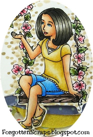
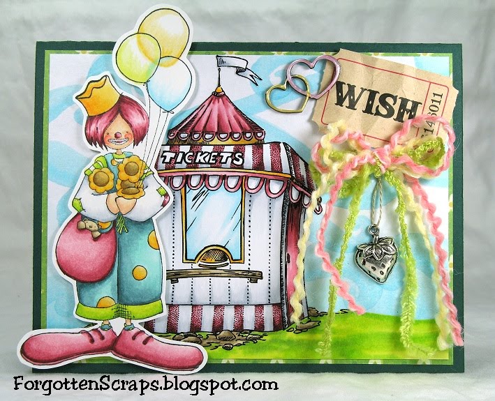
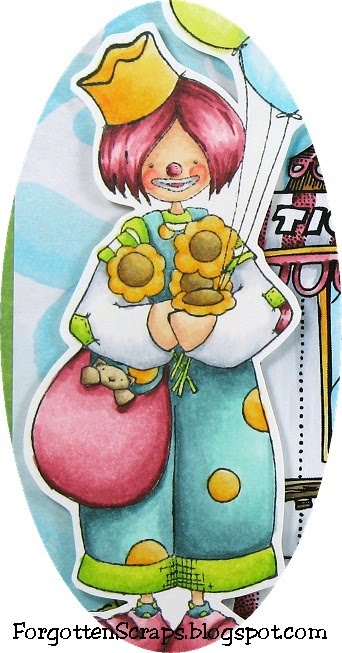
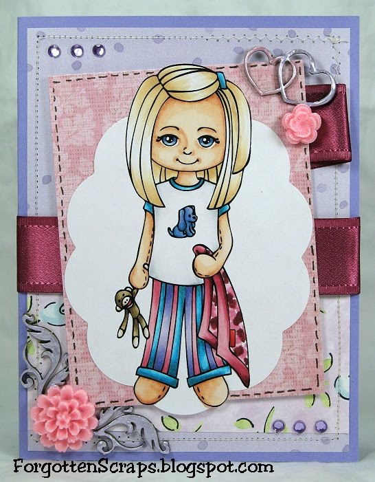
On this card I wanted to try out coloring large areas of fabric so I printed out this Simply Betty Stamps image extra large and went to town! It was perfect, she has a long skirt with plenty of folds to work with. I also took this opporunity to use some freebies that were generously sent my way. ;D

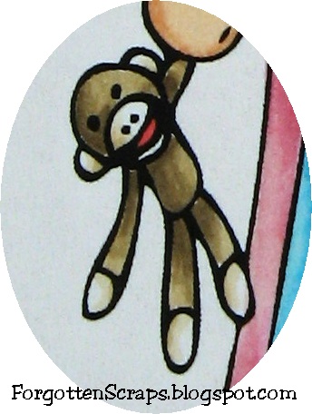
Here’s a close up of the skirt. I used the basic YG color range of YG91-YG99 and worked from the darkest color the lightest. Then I went back in and added some of the darker colors that were blended out.

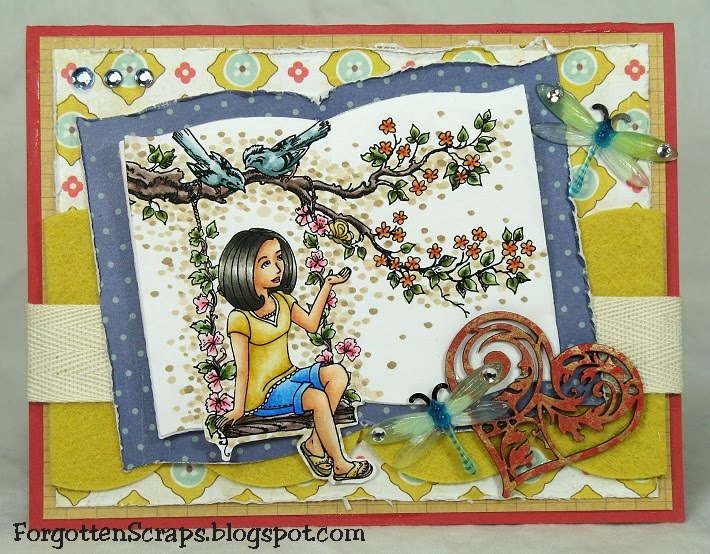
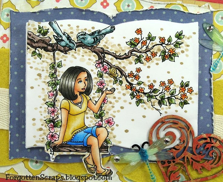
 Main Stamp: Steampunk Gang Grace (SBS)
Patterned Paper: Vintage (CM)
Metal Die: Spellbinders Nestabilities Eight
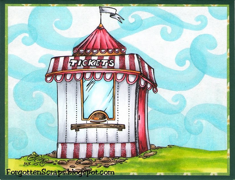
Copic Markers colored on Copy Paper:
-skin tone: E000, E00, E11, E13, R12, R14
-hair: E53, E55, E57, E59
-browns: E25, E27, E29
-creams: E50, E51, E53
-reds: R52, R35, R39
-oranges: Y32, Y38
-greens: YG91, YG93, YG95, YG97, YG99
Did you know? Puppetry is a form of theatre or performance which involves the manipulation of puppets. It is very ancient, and is believed to have originated 30,000 years BC. Puppetry takes many forms but they all share the process of animating inanimate performing objects. Puppetry is used in almost all human societies both as an entertainment – in performance – and ceremonially in rituals and celebrations such as carnivals.
[Puppetry, Wikipedia.org]