Pergamano Fairies 2

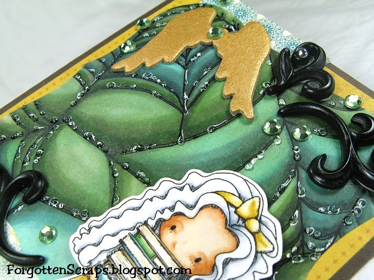
I don’t even know where to begin with this story but I’m so excited to share my card with you today! It all started with a the illusion of rain drop created on the School Girl card I colored last week. Then one thing led to another and before we know it, Zoe and I had challenged each other to a super duper double dog dare!


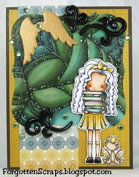
The dare was color raindrops or dew drops using ONLY Copic markers… no masking and not even the use of a white gel pen! It’s about time a challenge was actually challenging and this one tops the cake! I loved the excitement and I have been on edge with anticipation to see Zoe’s card. The hardest part was figuring out the refraction and where to keep the white spots open.


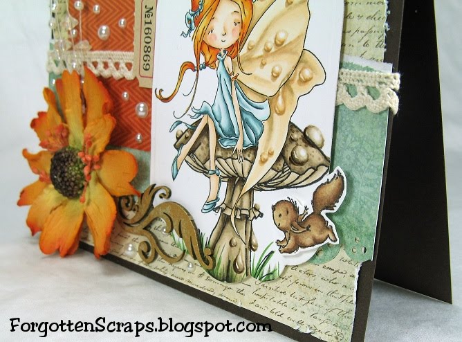
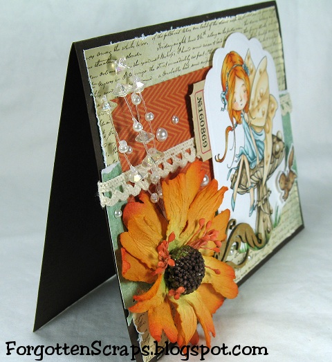
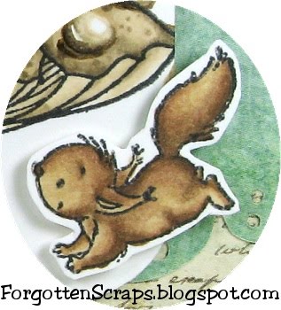
Here’s a close up of the results. I used a fairy stamp from Pergamano and sat her on top of a mushroom from Whiff of Joy using a mask to get one stamped on the other. I first colored the dewdrops then went back in and colored the rest. You can click on the picture for a larger view… but I cross my heart I didn’t use the gel pen. ;D


I have another one finished using a different technique and I’ll post that one tomorrow along with a few tips on how I colored them. Even now, I see a few things I can do differently and and need to study more. I need to work on the light source and color. For example, the drops on the edges of the images should be a different color. I might try another one before the week is over. ;D Hope you enjoyed it and don’t forget to check out Zoe‘s amazing creation!!


I’d like to enter into the following challenges:
Everybody Art Challenge#138 (fairies)
Going Grey with Scrap Creations Challenge #26 (flowers)
The Stamping Boutique Challenge #5 (winged things)
My Mum’s Craft Shop Challenge #3 (flowers)
Stampavie and More Challenge #139 (pearls)

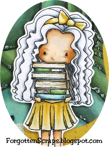
Main Stamp: Fairies 2 (P) and Large Mushroom (WoJ)
Patterned Paper: Stella & Rose Mabel (MME)
Chipboard: Flower Leaf Swirls (MiC)
Metal Die: Spellbinders Nestabilities Labels Eleven and Magnolia Doohickey Vintage Lace

Copic Markers colored on Neenah Super Smooth Paper:
-skin tone: E0000, E000, E00, E21, R11, R12
-squirl: E31, E23, E25, E57, E59
-mushroom: 0, E1, E42, E43, E44, E47
-hair: YR12, YR15, YR18, YR21
-wings: E50, E51, E53, E55
-dress: BG70, BG11, BG72, BG75, BG78
-grass: BG99, YG61, YG63, YG67

Did you know? Dew is water in the form of droplets that appears on thin, exposed objects in the morning or evening. As the exposed surface cools by radiating its heat, atmospheric moisture condenses at a rate greater than that at which it can evaporate, resulting in the formation of water droplets. When temperatures are low enough, dew takes the form of ice; this form is called frost.
[Dew, Wikipedia.org]

Cocoa

Do you remember my Monster Pains card from just a little while ago? It was a top pick at {Cupcake Inspirations} and they’ve asked if I could be their Guest Sweetie for this week. Of course, they send the inspirational cupcake picture as a preview and I loved the color combination – so I had to play along. I used Cocoa from Little Miss Muffet Stamps and Kissing Booth from Make it Crafty.


I took inspiration from the bold bright colors of the cupcakes, trying to use the pinks, blues, greens, and oranges; and added it to the overall feel of a spring weekend! The images on the cupcake reminded me of Saturday activities and going to a carnival or fair is always a fun day.


I’ve been wanting to make this card for a while and combine the two images of Cocoa leaning over the Kissing Booth. I also tried out a new skin tone color combination of E000, E01, and E02 on Cocoa. Here’s what the kissing booth looks like before Cocoa was added:


I used Flower Soft on the ground and covered up the flowers on the Kissing Booth image too. I got this idea from the Mo & Zo’s Carnival Blog Hop and had to try it.


Cocoa was cut and placed on top of the Kissing Both after they were both colored. I fussy-cut close around the edges on the girl then glued her directly to the paper at the bottom near the table. To give it dimension I added foam dots behind her head to she looks like she’s actually leaning out of the booth.


Guest Designer: Cupcake Inspirations Challenge #109

I’d like to enter into the following challenges:
Creatalicious Challenges #21

(pink, green, yellow, blue)

Party Time Tuesdays Challenge #13 (anything goes)
Amber’s Crafts and stuff Challenge #7 (use digital)
Papercraft Star Challenge #43 (photo inspiration)

Main Stamp: Cocoa (LMMS) and Kissing Booth (MiC)
Patterned Paper: Neighborhood (Crate Paper)
Metal Die: Spellbinders Nestabilities Labels Eight

Copic Markers colored on Copy Paper:
-skin tone: E000, E01, E02
-browns: E55, E57, E59
-reds: R12, R14, R17
-oranges: YR12, YR14, YR18
-yellows: YR30, YR31, YR21, Y26
-greens: YG61, YG63, YG67
-blues: B32, B34, B37, B39
-sky: 0, C1, B000, B52, B91

Did you know? “There once was a man from Nantucket” is the opening line for many limericks. Its popularity can be attributed to the limerick genre and the way the name of the island of Nantucket lends itself easily to humorous rhymes and puns, particularly obscene ones. The earliest variant was published in 1902 in the Princeton Tiger:

There once was a man from Nantucket
Who kept all his gold in a bucket.
But his daughter, named Nan,
Ran away with a man
And as for the bucket, Nantucket.
[There once was a man from Nantucket, Wikipedia.org]

Pinky

Welcome to another week at Make it Colourful Challenges for a fantastic color combo challenge! This week we want you to color with black and add red accents. We’re sponsored by Tiddly Inks and I chose to use an adorable girl, Pinky, and pair her up with the Alchemist Chamber from Make it Crafty.


I used some old papers and new embellishments I picked up this week on my shopping spree. The metal flowers are from Stampin’ Up! and were glued on the card. I then went back in with Liquid Pearls and added a white pearl to the center of each flower.


Here’s what the Alchemist Chamber looks like before it was cut down for the card. There is a lot going on in ther and some fun details to color. Somehow, a cupcake was made inside that “kitchen.” Now you just have to decide if the cupcake contains a secrete potion or not! LOL


I used Annika‘s cloud technique and colored the top part of the sky to help fill it in and also to bring in some more blue. It’s a simple technique and really helps complete the image.


The words are actually from boy themed scrapbook tag that I cut up. I originally cut it up because I thought “adorable” was out of place but ended up using all the words anyway, except for “boy” of course. Two of the strips are popped with dimensional foams.


The metal tag was handmade. I used a thin sheet of metal and cut out a tag using a Cuttlebug die. I then used metal chip art stamps and impressed the crown before attaching it to the card with eyelets.


I’d like to enter into the following challenges:
Desert Island Crafts Challenge#7
(choose 3: black, words, no flowers)

DT: Make it Colourful Challenge #16 (color back with red)
Main Stamp: Pinky (TI) and Alchamist Chamber (MiC)
Patterned Paper: Oliver (BG)
Metal Die: Cuttlebug Tiny Tags
Chip Art Metal Stamps: Ornamental Crowns

Copic Markers colored on Copy Paper:
-skin tone: E000, E00, E11, E13, R11, R12
-browns: E31, E23, E37; E55, E57, E59; E42, E43, E44, E47
-reds: R30, R12, R14, R24, R37, R59
-oranges: YR21, YR2, YR14, YR18
-yellows: YR31; Y000, Y32, Y35, Y38, Y26
-greens: G40, YG61, YG63, YG67; YG91, YG93
-blues: B01; BG11, BG72, BG75, B91; O, B0000, B000, B52, B91, C1
-grays: W00, W1, W2, W4, W6, W8


Did you know? The fossa is a cat-like, carnivorous mammal that is endemic to Madagascar. It is a member of the Eupleridae, a family of carnivorans closely related to the mongoose family. is the largest mammalian carnivore on the island of Madagascar and has been compared to a small cougar. It has semi-retractable claws and flexible ankles that allow it to climb up and down trees head-first, and also support jumping from tree to tree.
[Fossa (animal), Wikipedia.org]

Update: I was a featured Guest at the Tiddy Inks Challenge Blog!

Update: I was a winner at Desert Island Crafters for this challenge!

School Girl

I haven’t a clue what a spiderweb, school girl and frog all have in common except they’re all from Tiddly Inks and I wanted to color them all. ;D So I chose a few of my favorite colors and put them all together anyway.


The background was colored using blues, greens and grays with the same technique I’ve used before – building up colors, blending and blending some more. I lost track on how many layers I added before I ended up with this result.


The challenge theme is “April Showers brings May Flowers” and wanted a rain for flower theme. I chose the rain theme and added a bunch of rain drops on the spiderweb in the background.


I first drew in the rain drops with a white pen and could have stopped there. However, I then added Crystal Effects over each rain drop for a water effect. This also gave the card texture which is fun to hold.

I’d like to submit this card into the following challenges:
Tiddly Inks Challenge #47 (April Showers)
Charisma Cardz Week #17 (April Showers)
Get Hippity with Ippity Challenge #1 (Spring/anything)

Main Stamp: School Girl & Spiderweb4 (TI)
Patterned Paper: Stella & Rose Hattie (MME)
Metal Die: Spellbinders Nestabilities Labels One
Adironadack Acrylic Paint Daubers

Copic Markers colored on Copy Paper:
-skin tone: E000, E00, E11, E21, E13
-browns: E41, E42, E43, E44
-yellows: YR30, Y23, Y26
-greens: YG61, YG63, YG67
-blues: BG11, BG72, BG75
-grays: 0, C1, C3
-background: W1, W2, W4, W6, BG11, BG72, BG75, YG61, YG63, YG67

Did you know? The hurdy gurdy or hurdy-gurdy (also known as a wheel fiddle) is a stringed musical instrument that produces sound by a crank-turned rosined wheel rubbing against the strings. The wheel functions much like a violin bow, and single notes played on the instrument sound similar to a violin. Melodies are played on a keyboard that presses tangents (small wedges, usually made of wood) against one or more of the strings to change their pitch. Most hurdy gurdies have multiple “drone strings,” which provide a constant pitch accompaniment to the melody, resulting in a sound similar to that of bagpipes.
[Hurdy Gurdy, Wikipedia.org]

Update: I was the winner at Charisma Cardz Challenges for this challenge!

Monster Love

It’s another challenge at Little Miss Muffet Challenges blog and our theme this week is almost any anything goes. The theme is diecuts or punches! I used three border diecuts on mine to create vertical interest.. Notebook Edge, Jumbo Scallop and Scallopped Scallop.


I had actually colored this monster about two monts ago and he’s been sitting all alone on my deks since then! So I grabbed some blue paper to match and gave this guy a place to shine. I used a couple chipboard embellishmens, as leaves this time, and covered them both is Adirondack Acrylic Paint Daubers. I love how the silver goes along side that blue!


As you can see, I used googlie eyes again – first, to cover a mistake I made on the eye and second, because they’re darn ca-ute. The gem embellishment was in the bargin bin at Michals and the flower center is from Whiff of Joy.


I’d like to enter into the following challenges:
AiFactory Challenge #078 (anything goes)
Digi Doodle Shop’s Best Challenge #56 (anything goes)
Moving Along with The Times Challenge #96 (anything goes)
Paper Crafting Journey Challenge #9 (bling)
Paper Romance Challenges #48 (summer)

Main Stamp: Monster Love (Co.)
Patterned Paper: Grade School (DCWV)
Chipboard: Flower Leaf Swirls (MiC)
Metal Die: My Favorite Things Die-namics Notebook Edge, Jumbo Scallop, and Scallopped Scallop

Copic Markers colored on Copy Paper:
E33, E35, E57, E59, 0, C1, C3, E04, BG10, BG11, BG72, BG75, R20, R21, R22, R24, R29, R59, E000, E00, E21, E11, B41, B34, B95, B97, E41, E43

Did you know? In botany, flora has two meanings: A flora refers to the plant life occurring in a particular region; A Flora refers to a book or other work describing a flora and including aids for the identification of the plants. The term “flora” comes from Latin language Flora, the goddess of flowers in Roman mythology. The corresponding term for animal life is fauna. Flora, fauna and other forms of life such as fungi are collectively referred to as biota. Some classic and modern floras are listed below.
[Flora, Wikipedia.org]

The Paper Project – Experiment IV

Happy Easter everyone! Today I’m using a fun new stamp, Tilda with Eggs in her Apron, given to me from a friend Maria – thanks Maria! 😀 This was a fun Tilda to color and I ended up making monogrammed tags for the Easter Baskets … and I was able to refrain from adding a nose and mouth on Tilda this time. LOL

Experiment IV – Paper Attributes

The purpose of this experiment is to show any paper can be effectively used for coloring as long as you know the individual paper’s attributes. For those starting off and worried about finding the “perfect” paper right away, then worry no more and start out with something convenient and readily available.


For this test I used three of the paper samples and colored the images using the same techniques. I started with the darkest color then blended up to the lightest color. They were all colored with the same markers except for Tilda’s hair.

I didn’t want you to be confused with the monogram above so here are the three papers used along with their assigned letter:

Below you can compare these images side-by-side and see close up areas of the shoes and eggs, as well as a full view of all three tags.

Introduction post found here.
(Click on the picture for a zoomed look.)


My techniques changed depending on the paper I used. For example, when coloring on K I had to use quick light strokes to keep the bleeding maintained. Even so, when looking at the eggs, you’ll notice the edges are not as clean and it looks slightly more blurry than in P or Q. However, this problem isn’t as noticeable in larger areas such as the shoes.

When coloring on P and Q, I often went back in with the darker colors to keep the depth. I didn’t need to do this with K, however, there were other advantages to P and Q that K doesn’t have. For example, I could take my time blending and come back with additional colors building layer upon layers much easier.

For the purpose of this test, P and Q didn’t have very many differences. However, in some areas that already had a lot of ink, I noticed when I applied a wet layer on top of a dry layer the texture was a little different and became grainy.

Lastly, you’ll notice that K is so thin I should have used an additional white layer before placing it on the card so the decorative papers wouldn’t show through.

I’d like to enter in the following Easter themed challenges:


Main Stamp:
Tilda with Eggs in her Apron (Mag)
Patterned Paper: Togetherness (CC)
Metal Die: Spellbinders Nestabilities Labels 8, Spellbinders Nestabilities Labels 17, and Magnolia Doohickey Vintage Lace

Copic Markers:
-skin tone: E000, E00, E11, R11, R12
-hair: E50, E51, E53, E55; E43, E4, E47, E49
-clothes: R000, R00, R11 R12, E50, E51, E53
-eggs: R11, R12, R14, R17, BG70, BG72, BG75, YG61, YG63, YG67, YR30, YR31, Y35
-background: BG72, C3, BG11, C1, BV31, BG70, 0