Zombie Teen Summer

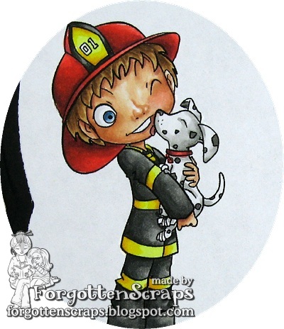
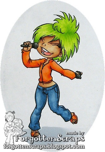
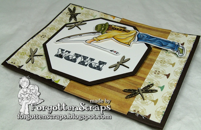
Are you ready for some fun zombie time?!  Simply B Stamps is having a limited digi release of of the Zombie Teen Summer images and I’m bringing them your way for some summer inspiration!!  Well, actually these are the “before” shots of the zombies before they became zombies.  😀 

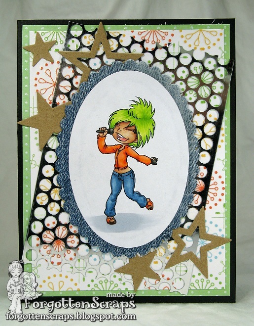
The papers I used are from Cosmo Cricket Salt Air with a dark brown mat over kraft paper.  (I don’t know why but this has been a difficult paper pack to work with but it’s the only water/summer theme I have – so I guess it’s time to go shopping this weekend. Yeah!!  LOL)  I used a various range of diecuts including some from Spellbinders, Stampin Up, and My Favorite Things.  Then I finished off the cards with some Baker’s Twine and a few odds and ends like charms, clocks, clouds, suns, tickets and dew drops.

For these projects, I chose to un-zombie-fy the images before printing them out.  So I removed all the zombie elements such as bones, scars and brains then printed them out.  A couple I merged with other images and created a little scene.  I did this once to the Christmas Teen Scene Zombies and drew in any missing lines.  However, this time, because the images were smaller in size, I didn’t need to do any extra drawing.

 (with Beach Umbrella from Make it Crafty)

This is another gift set that will be perfect as a gift especially as the summer months come around and it starts to get super hot.  I’m more of a winter and cold kind of person so I’m not really looking forward to it.  But we have lots of shade in our backyard and some fans installed over the patio area so maybe this year will be a little more bearable.

(with Tropical Beach from Make it Crafty)

I hope you’ve enjoyed the Zombie Teen Summer inspiration and remember these are available as digi stamps for a limited time at Simply B Stamps.  You can keep them as Zombies or show them reminicing of times past before they were corpses.  He he he

Hatter Hat Stands

Today is a start of a lazy weekend where I have absolutely nothing planned on my calendar!  The shock and awe of it all is amazing!  I finished off my Friday evening settled down to a movie – Julie & Julia – which was making me super hungry for something hearty.  In the movie, I just love it when her sister comes to visit.  LOL  So my card for today is another one I had made for the Hatter scrap party last week as one of the door prizes.

This fun card uses one of the Hatter Hat Stands and just the hat from Emily Rose Hatter from Little Miss Muffet Stamps and combines them for a perfect pair.  The hat stand was stamped on white paper then run through the die cutting machine. To get the hat all by itself, I stamped the top part of Emily Rose Hatter then after coloring it I cut closely around the hat. Then I used dimensionals to pop it up and positioned it on the hat stand.   

For embellishments I used some of my many corduroys buttons, which I have a whole box full, and some turquoise lace ribbon.  I wish I had a ribbon iron that I saw used at a scrap night a while ago – it would have been perfect for this lace that was bunched up.  However, my Mom rescued me and brought over a tiny quilting iron and the smallest ironing board I have ever seen.  It fit perfectly on my work space and I think it might be a better solution to the ribbon iron because I can use it for more things.  Thanks Mom!

That’s the end of this project and about all I can think about.  😀  Later on today I have a surprize Zombie gift set (really, you’ll be super surpized by these Zombies) and tomorrow be sure to come back for a little blog candy!

I’d like to enter this into the following challenges:
Sugar Creek Hollow Challenge #9 – Shabby Chic Mother’s Day
Inspire Me Fridays #56 – Anything Goes (JFF)
Polka Doodles Week #17 – Shabby Chic/Vintage

Fireman Jude

Today’s the day!  Welcome to the Simply B Stamps blog hop for the new releases of the Jude and the Rockers Just for Fun!  Remember to visit the SBS Blog for details on prizes and information on the digi and rubber stamps.

You should have arrived here from the talented LELIA
but if not you can start at the beginning HERE.

Today we’re previewing Fireman Jude and his cute little dalmatian puppy.  This is the perfect image for boy cards whether it’s a birthday, congratulations or just for fun.  And don’t let the fireman outfit fool you on color schemes as he looks perfect in red, black, yellow, orange and tan!

I got my color inspiration from lunch the other day – one of my favorite places for a good sandwich is Firehouse Subs!  I don’t know if you have any in your area but they’re even better than Quiznos and Which Wich.  Mmmm, just makes my mouth water thinking about it.  He he he


Thanks for dropping by and I hope you’ve enjoyed all the inspiration and previews from this week!  I even posted The Paper Project Experiment VIII and updated the main recomendation list.

Your next stop in the hope is the fantastic ALISON!

Rock Star Lilly

Welcome back to another Simply B Stamp preview in the Jude and the Rockers Just for Fun series.  Today we have a fun image… Rock Star Lilly… and I can just image her done in all sorts of wild colors!

For my project I used Nana’s Kitchen paper from DCWV and contrasted it with stars cut out of kraft paper.  Then I used some of that metal sequence ribbon stuff for some shine and contrasted it with some denim fabric to frame the image.  My daughter’s pants had huge holes in the knees and it was time to makes some shorts so waste not want not.  LOL


I had fun coloring Lilly with green hair and bright clothes.  Can you just imagine her rockinng out?  Be sure to visit the SBS Blog for more inspiration and wild colors for this chick and thank you for dropping by.  Tomorrow we’ll have a release blog hop with prizes too so you don’t want to miss out on that.  😀

Payton

Can you believe it’s Thursday already?  I can’t believe I’m off another day this week – where is the time going?!  Today is an inspirational day at Little Miss Muffet Stamps and even though I’m a little late (hay, I’m the boss so it’s ok this time.  LOL), I don’t want to miss out sharing one of my Father’s Day cards this year.  Check it out…

The image I used is Payton from Little Miss Muffet Stamps and is the perfect image for my dad who loves to fish.  In fact, this could possibly have be me when I was a kid which is why it’s perfect for Father’s day.  The dragonfly chippies are from Make it Crafty and the Papa sentiment stamp is from Stampin’ Up.

I don’t remember the paper I used but I thought the wood going horizontal would look a little like a dock and the browns would help the card look more masculine.  I also tried to stay away from curved lines but the circle fans in the decorative paper still help give it a soft look without screaming “feminine.”

If you get a chance make sure to head on over to the Little Miss Muffet Blog to see the design team’s inspiration – it’s a day we all got to play so there are some wonderful ideas!  Thanks for dropping by.  *Hugs

I’d like to enter this into the following challenges:
 Cards for Men Challenge #9 – Texture (wood grain – visual)

The Paper Project – Experiment VIII

I have another post for The Paper Project!  It was an idea I got from iCopic where they had done a similar test and so I wanted to duplicate it with the papers I had on hand for my own tests.

Experiment VIII – Transparency

The purpose of this experiment is to show how transparent the ink is on the paper and if the transparency lightens when more ink is applied.  To do this, I made four bars on the paper each with a different number of strokes that were applied; the more strokes the darker the ink would show until the paper’s saturation level was reached.  The paper was allowed to dry in between each stroke for the greatest effect.

Here’s the breakdown of “The E.”  The top bar is only one stroke, the middle bar has two strokes and the bottom bar has three strokes.  By this time, almost all the papers were completely saturated and were not getting any darker, so I made one final bar vertically on the side using four strokes so it would be easier to compare the other three.

The papers are identified in the Introduction and here are the results:
(Click on the picture for a zoomed look.)

Unfortunately, I have run out of samples of U so it is missing from this test.

There doesn’t seem to be much different in all those “E” letters but knowing if your color will change transparency the more you apply helps with your coloring.  For example, if you want just a hint more of a shadow, a second application of the same color will darken the gradation a little to give you the shadow.  Another example is if you want to touch up an area you will know if you can work in that little spot or if you have to go over the entire area with the color to keep the blending smooth.

Most of the papers became darker after each stroke, however, with my (untrained) eye, I would say that A, C and D stopped having the most effect after the second stroke.  Then ENR, W and X stopped changing after the third stroke.  Which leaves the remaining subject which changed gradation after the fourth stroke.

It’s hard to say which paper is best based off this test, however, I would think that the more stroked the paper could handle then the more ink the paper could hold; and a higher capacity for ink in the paper is usually more helpful when blending several colors.  Therefore, based on this test alone I would recommend B, F, G, H, I, J, K, L, M, O, P, Q, S and T to be my selection of papers.

This project was sponsored by The Greeting Farm who has generously donated a Creepin Kit!  Check out what I made with the packaging by clicking HERE and stay tuned for more samples using this awesome stamp set.  Thank you Jessica and Maria – *HUGS*