Fancy Sunbonnet Winter Snowball

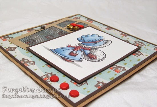
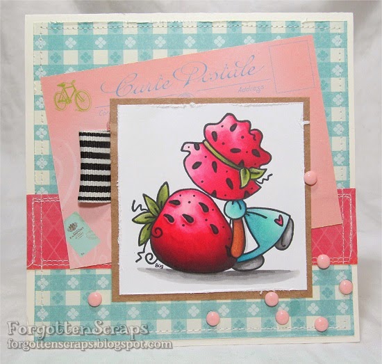
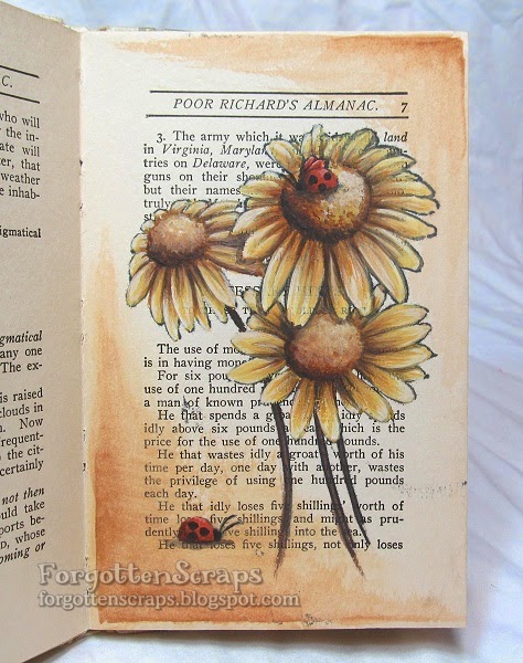
This image should look familiar!  At least you should.  LOL  It’s the same image that I used in my last post but with a minor change – instead of her holding a snowball, this time she’s holding a Christmas bauble.  To do this, all you have to do is draw a square and a curved line to create the hook and top part of the bauble.  Faye had accidentally colored her snowball as such and this was how we fixed it.  LOL  

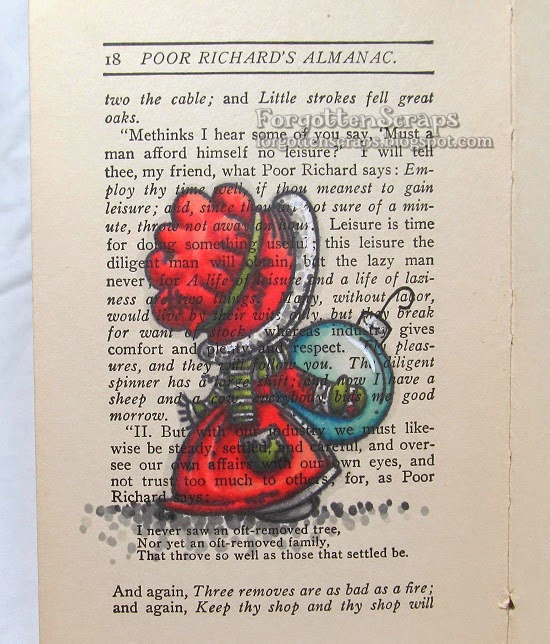
The image I used was Fancy Sunbonnet Winter Snowball from Little Miss Muffet Stamps which was stamped and colored in my travel journal.  This time I colored the image with Marvy Le Plume markers.  Most of the colors were easy to blend, surprisingly, but the red took some extra ink to blend from the darkest to the lightest.  And as a result, the red bled through the paper and showed up on the other side.  I’ve painted it with Gesso and will try to cover it up with another image so we’ll see how that works out.

Fancy Sunbonnet Winter Snowball

It’s never too early to start on those Christmas cards and this one was created for the class I taught at Scrapping Goodtime back in July.  The stamp I used is Fancy Sunbonnet Winter Snowball rubber stamp from Little Miss Muffet Stamps and I also used the Park Glen Metal Door and Screen Door Refills on this project.  On the door I used a jingle bell looking wreath that was on a pin.  I’m not sure what it was called but it looked perfect for the door so I had to use it.  😀  The pin part was tucked under the image layer but it also helps to keep it in place.

The class was focused on the snowball texture and general blending techniques and there was a great group of gals there to share it with.  Thank you to Scrapping Goodtime and for everyone there!  😀

Polka Dot Pals Neva

Check this out!  Well, not too closely but you can still check it out.  LOL  This is Polka Dot Pals Neva from Little Miss Muffet Stamps on a page in my travel journal (aka The Poor Richard’s Almanac book).  I’ve colored this one with Prismacolor pencils which went well for the most part.  However, I had some difficulty with the paper and the colors started to rub off.  You can see that around the left knee and the package ribbon.

One of the things I wanted to try out was a shadow behind the image looking like it’s cast upon the wall.  However, I don’t think it worked very well and I’m not sure why.  I shifted the shadow to the right but perhaps if I had also shifted it down that might have helped.  Something to try on the next one. 😀

Sunbonnet Strawberry Big

Sometimes the project is all about the colors for me and how they work together so I’m pleased at how this project turned out.  I liked the combination of baby blue with pinks on this project.  🙂  The stamp I used is Sunbonnet Strawberry Big rubber stamp from Little Miss Muffet Stamps. The big strawberry gave me a chance to try coloring around the seeds giving the strawberry an edge.  I was hoping the seeds would look more realistic but I think I reversed the shadow on the edge. LOL  Well, I tried and that counts.  😀

I colored this using the Marvy Le Plume markers and used my sewing machine to stitch around the card.  The pink drops are those melty plastic craft beads that I placed in the oven to melt into this shape.  Thanks to Rosemary who pointed me to a tutorial on how to do it, I was able to create a whole bunch.  It was fun and an inexpensive way to get a pile of dew drops to use.

Mushroom Forest

The crazy challenge at Make it Colourful this month is all about an atmosphere perspective… meaning to show the depth of the picture as it fades back into the distance.  Zoe provided with a description, samples and design team inspiration that you can read all about it.  For me, I started with the Mushroom Forest from Make it Crafty and then tried to figure out what I was doing.  LOL

I used the forest example, from the challenge post, and tried to mimic the color of the trees.  Using the back part as the most lightest then coming forward to a darker gray.  But then at the foreground I started to make the mushrooms lighter.  I was using all gray colors knowing that I was going to go back in and use colors.

When I add the colors, I used the most in the foreground and then faded out to not using any at all in the background.  This way I was able to keep the gray colors showing in the background.

Here’s what the image looked like after I had used the Copic markers on it.

I was happy with how the colors turned out but I’m not too happy with how the Prismacolor pencils and the Copic markers blended … or rather…  not blended together. I think it was the paper I was using but the next time I think I’ll stick with one or the other.

Finally I placed my project on a journal page and decorated it.  Thanks for coming by and I hope this helps you in your trial for the challenge this month!  😀

Make it Crafty: 
To see the post on the Make it Crafty page, click HERE to view post.

Many Thanks

This is the first page in my travel journal, which is an old book titled “Poor Richard’s Almanac (Selections)” by Benjamin Franklin and printed around 1937-1940. It’s a small book and perfect for traveling… hence why I’ve been chilling in it while I travel. 🙂

This image is Many Thanks from Stampendous and is suited for the many thanks I’m sending out to Jane for helping me with watercolors! I stamped on the book directly with black ink and colored this one with watercolor tube paints. The paper is thicker than a normal book would be so it handled the water just fine. So far so good. 🙂 I hope to try a variety of things with the book but the best pay is to have fun.