Cordelia the Mermaid

We got something new for you at Make it Crafty… meet Cordelia the Mermaid! If you’re signed up for Zoe’s newsletter you know that this sweet mermaid is available now AND at a discounted rate – so hurry on over and pick her up now! Not yet you say? Well, here is some inspiration to get you motivated…


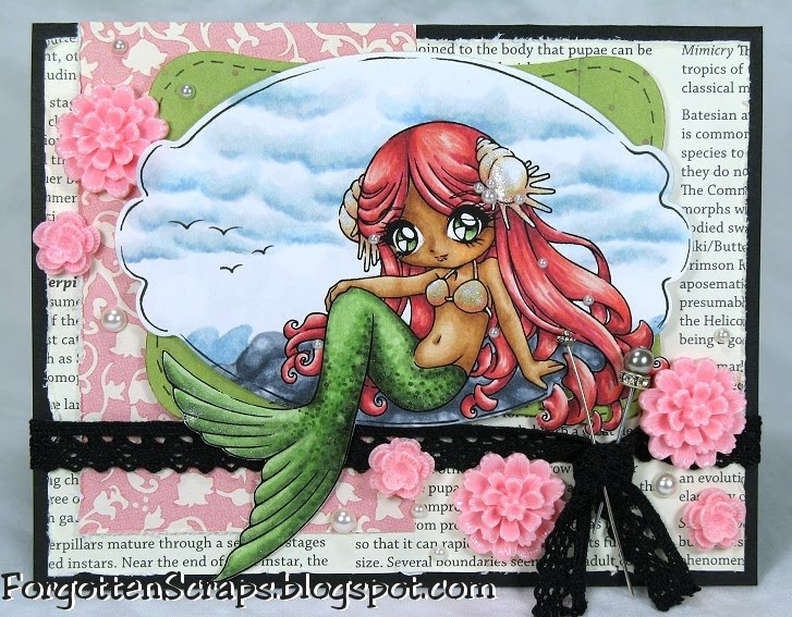
This ‘beaut was so much fun to color with her flowing hair and long tail. On the tail I colored it first and went back in with the Blender marker to give it “splotches” then dotted in the darker areas with the same greens to give it this texture. On her tail, top and seashells I used Smooch Pearlized Accent Ink for some shine.


I had completely different papers selected when I first started coloring but in the end chose to swap out a few to add the black and white for a greater contrast. The flowers are from Stampin’ Up! and looked like water lilies to me. I also added a few small pearls to complete the fantasy look.


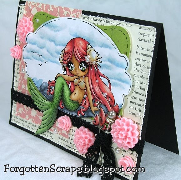
I finally followed Annika’s tutorial for a cloudy sky and loved the results! It’s super easy to do and she outlines the technique so it’s easy to follow. She has a step-by-step guide and a recent video tutorial as well.


Just a reminder, there is no challenge at Make it Colourful this week but we are getting ready for the Mo & Zo’s Carnival Blog Hop on Thursday that you don’t want to miss out on!


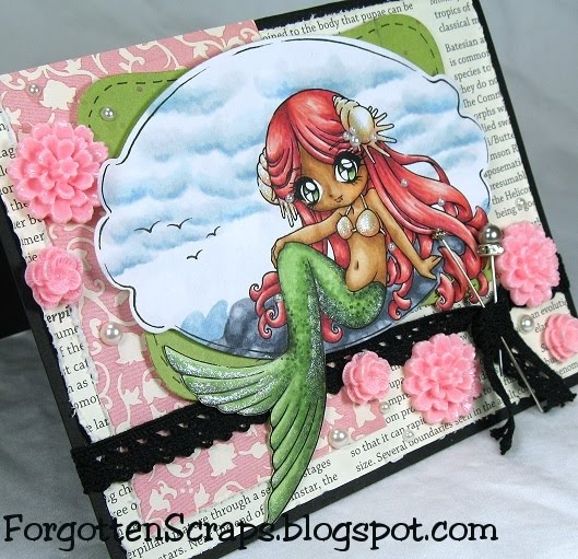
Main Stamp: Cordelia the Mermaid (MiC)
Patterned Paper: scraps
Metal Die: Spellbinders Nestabilities Labels Eight and Labels Ten

Copic Markers colored on Copy Paper:
-skin tone: E000, E00, E21, E33, E23
-pearl: E50, E51, R30, R21
-greens: G40, G82, G85, G99
-blues: 0, B0000, C00, B91, B52
-pinks: R30, R21, R22, R37, R39
-grays: C1, C3, C5

Challenges:
Little Miss Muffet Challenge #7 (Glitter & Shine)
Anything Goes Challenge #38 (Pearls)
A Spoon Full of Sugar Challenge #147 (all creatures)
Tuesday Throwdown Challenge #44 (Sparkle & Bling)
Papertake Weekly Challenge (dimensionals)

Did you know? A pearl is a hard object produced within the soft tissue (specifically the mantle) of a living shelled mollusk. Just like the shell of a mollusk, a pearl is made up of calcium carbonate in minute crystalline form, which has been deposited in concentric layers. The most valuable pearls occur spontaneously in the wild, but they are extremely rare, however, cultured or farmed pearls from pearl oysters make up the majority of those that are currently sold. Pearls that are considered to be of gemstone quality are almost always nacreous and iridescent, wild or cultured, like the interior of the shell that produces them. However, almost all species of shelled mollusks are capable of producing pearls (formerly referred to as “calcareous concretions” by some sources) of lesser shine or less spherical shape.
[Pearl, Wikipedia.org]

The Paper Project – Experiment III

For this test I used the same sheet I colored last time using the little fairy stamp from The Greeting Farm, Neverland. I had actually gone back in to add gray tones to see how a second application of color would work but the image was too small to get any benefit from the test. So moving right along to the next one…

Experiment III – Blending Out Colors

The purpose of this experiment is to use the Blender marker and find out how much color can be removed. I used the lower right corner of each square where I could work out three colors at once … peaches, blues and reds.

To help expedite the process I used three droplets of Blender ink refill. Yes, I said three for that little area! After each drop I would work in the excess ink with the Blender marker before adding the next drop. If anything was to be removed, this would do the trick!

The papers are identified in the Introduction and here are the results:
(Click on the picture for a zoomed look.)
 

Overall this was a great test and I noticed the effects with the first drop. By time I got to the third drop, I didn’t see any additional benefit compared to the second drop but kept the test the same for all samples. In general I found that most of the paper fit into three categories… (1) the colors would only get pushed around, (2) some colors would be blended out, or lastly, (3) nothing really happened.

It is easy to spot which ones are which. For example, in papers where the colors are pushed around you’ll notice a nice pinkish circle in the are I worked in. To demonstrate this, I think the worst ones are B, C, K, S and V.

Unfortunately, none of the papers were able to remove ALL of the colors. I wish one of them had, however, the ones I think did average were A, D, E, F, G, H, I, J, L, O, P, Q, R, T, W and X. Overall, I think J and X performed the best in this test and should receive an extra gold star.

As for the third category, I didn’t see much happening on M and especially N and U. I promise I didn’t skip those. ;D

Finally, I thought it was interesting to see what was happening on the back side of the paper. These squares are adhered on their top edges with glue onto a sheet of card stock. (If your curious, I used a full sheet of R for the base on which I applied all the test squares onto.)

The papers are identified in the Introduction and here is the backside:

(Click on the picture for a zoomed look.)

Three drops of ink is a lot for this small area and you can see how each of them worked its way towards the back. It was interesting that they all looked the same except for A, B, C, D, U and X which only just began to show up; and N which never even made it to the back of it’s own layer.

The colors which were being removed were E000, E11, R43, R46, R59, B21 and V12.

That concludes this test and I’m off to replenish my Blender ink refill. ;D But before I leave, are you developing a preference yet? Which ones do you think is best?

James at the Carnival

Welcome to the carnival! Well, at least, the carnival on a card. ;D I put together this project as an eclectic conglomeration as if it was a box full of memories filled with trinkets and mementos. I used James at the Carnival from Mo Manning and Candy Cart from Make it Crafty.


Some of the embellishments are items scattered around my desk, such as the tickets, paperclip and bottle cap. Although most of them are new items I found when I knew carnival images were coming out! This particular style is more rustic and antique which was a new style that was fun to work with.


Looks like “James” has already won his prize and settling down for some lunch. And what’s a carnival with out a candy cart filled with some Salt Water Taffy? Hmmm, my favorite! I was even lucky enough to find some faux candy in the craft store the other day and had to add it to the card.


Here’s a better view of the Candy Cart and I’ve seen Tilda sitting on it the other day – it was cute. A fun part of using these new Carnival images as it allows me to work on new color combination and this black/gold/red one has been fun.


This was just a little preview of what is to come next week! Grab the badge from the sidebar and mark down in your calendars for next Thursday…. Mo & Zo’s Carnival is coming to town!! (That’s Mo Manning and Make it Crafty coming together with the perfect combination of characters and scenery that you won’t want to miss out on!) 😀 Check out the announcement…


Main Stamp: James at the Carnival (MO) and Candy Cart (MiC)
Patterned Paper: le Cirque (Graphic45)
Chipboard: Love Heart Swirls (MiC)
Metal Die: Spellbinders Nestabilities Classic Diamonds

Copic Markers colored on Copy Paper:
-skin tone: E000, E00, E11, E13, R11, R12
-browns: E42, E43, E44, E47
-reds: R21, R22, R24, R29, E09
-yellows: Y11, Y32, Y35, YR24
-greens: G20, YG63, YG67, G28
-blues: BG72, B91, B93, B97
-grays: W2, W4, W6, W8

Did you know?The National Oceanic and Atmospheric Administration (NOAA) is a scientific agency within the United States Department of Commerce focused on the conditions of the oceans and the atmosphere. NOAA warns of dangerous weather, charts seas and skies, guides the use and protection of ocean and coastal resources, and conducts research to improve understanding and stewardship of the environment. In addition to its civilian employees, NOAA research and operations are supported by 300 uniformed service members who make up the NOAA Commissioned Officer Corps.
[National Oceanic and Atmospheric Administration, Wikipedia.org]

Monster Sweet Tooth

Welcome to the next Little Miss Muffet Challenge and theme this time is Glitter and Shine! For my shine I covered the lollipops with lacquer with a nice thick coating. The glitter comes in on the angel wing chipboard where I covered it using a pearl color, an Adirondack Acrylic Paint Dabbers, and then I added Sticklets Glitter Glue to give it some details.


This was my first time using the Martha Stewart border punch and thanks to my friend on another group I just “had” to have it. I also used Arabella‘s fabulous idea of googly eyes on the monster – it cracks me up!


DT Challenge: Little Miss Muffet Challenge #7 (glitter or shine)

Challenges:
Designed to Delight Kidding Around Challenge (for kids)
Catch the Bug Challenges (four or more layers)
Little Claire’s Challenge #4 (Spring – lots ‘o candy)
Totally Gorjuss Challenge #75 (fluffy)

Main Stamp: Monster Sweet Tooth (LMMS)
Patterned Paper: Schoolbound (DCWV)
Chipboard: Love Heart Swirls (MiC)
Metal Die: Spellbinders Nestabilities Labels Ten
Copic Markers colored on Copy Paper (unknown colors)

Did you know? The Celtic brooch, more properly called the penannular brooch, and its closely related type, the pseudo-penannular brooch, are types of brooch clothes fasteners, often rather large. Beginning as utilitarian fasteners in the Iron Age and Roman period, they are especially associated with the highly ornate brooches produced in precious metal for the elites of Ireland and Scotland from about 700 to 900, which are popularly known as Celtic brooches or similar terms. They are the most significant objects in high-quality secular metalwork from Early Medieval Celtic art, or Insular art, as art historians prefer to call it. The type continued in simpler forms such as the thistle brooch into the 11th century, during what is often known as the Viking Age in Ireland and Scotland.
[Celtic Brooch, Wikipedia.org]

Steampunk Gang Grace

On this card I wanted to try out coloring large areas of fabric so I printed out this Simply Betty Stamps image extra large and went to town! It was perfect, she has a long skirt with plenty of folds to work with. I also took this opporunity to use some freebies that were generously sent my way. ;D


Here’s a close up of the skirt. I used the basic YG color range of YG91-YG99 and worked from the darkest color the lightest. Then I went back in and added some of the darker colors that were blended out.


Main Stamp: Steampunk Gang Grace (SBS)
Patterned Paper: Vintage (CM)
Metal Die: Spellbinders Nestabilities Eight

Copic Markers colored on Copy Paper:
-skin tone: E000, E00, E11, E13, R12, R14
-hair: E53, E55, E57, E59
-browns: E25, E27, E29
-creams: E50, E51, E53
-reds: R52, R35, R39
-oranges: Y32, Y38
-greens: YG91, YG93, YG95, YG97, YG99

Did you know? Puppetry is a form of theatre or performance which involves the manipulation of puppets. It is very ancient, and is believed to have originated 30,000 years BC. Puppetry takes many forms but they all share the process of animating inanimate performing objects. Puppetry is used in almost all human societies both as an entertainment – in performance – and ceremonially in rituals and celebrations such as carnivals.
[Puppetry, Wikipedia.org]

Tips, Tricks & Techniques 0x022

Ever wonder what the difference is between all the Copic gray colors? My friend Ruby had the same question and I decided it would be fun to have a side-by-side comparison! So here it is using four of the new Suger ‘n Spice Dolls from Little Miss Muffet Stamps.


So which color is which? Starting from the top left and going clockwise here are colors used, colored on Copy Paper:

Pepper: C00, C1, C3, C5, C7, C9
Peppermint: 0, N1, N3, N5, N7, N9
Nutmeg: T0, T1, T3, T5, T7, T9
Cinnamon: W00, W1, W3, W5, W7, W8

The top two are the cool-tone grays and the lower two are the warm-tone grays. I have found uses for each of them and select my gray-tone based on other colors on the card. However with that said, my favorite is C tones for metal and W tones for black.