

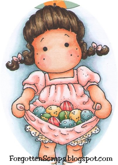
 Happy Easter everyone! Today I’m using a fun new stamp, Tilda with Eggs in her Apron, given to me from a friend Maria – thanks Maria! 😀 This was a fun Tilda to color and I ended up making monogrammed tags for the Easter Baskets … and I was able to refrain from adding a nose and mouth on Tilda this time. LOL
The purpose of this experiment is to show any paper can be effectively used for coloring as long as you know the individual paper’s attributes. For those starting off and worried about finding the “perfect” paper right away, then worry no more and start out with something convenient and readily available.

For this test I used three of the paper samples and colored the images using the same techniques. I started with the darkest color then blended up to the lightest color. They were all colored with the same markers except for Tilda’s hair.
I didn’t want you to be confused with the monogram above so here are the three papers used along with their assigned letter:
- K. Georgia-Pacific Copy & Print Paper 20# (standard printer paper)
- P. X-Press It Blending Card Bright White 92#
- Q. Make ‘it’ Colour Blending Card 250 gsm
Below you can compare these images side-by-side and see close up areas of the shoes and eggs, as well as a full view of all three tags.
(Click on the picture for a zoomed look.)
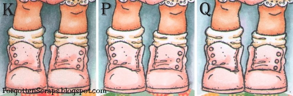


My techniques changed depending on the paper I used. For example, when coloring on K I had to use quick light strokes to keep the bleeding maintained. Even so, when looking at the eggs, you’ll notice the edges are not as clean and it looks slightly more blurry than in P or Q. However, this problem isn’t as noticeable in larger areas such as the shoes.
When coloring on P and Q, I often went back in with the darker colors to keep the depth. I didn’t need to do this with K, however, there were other advantages to P and Q that K doesn’t have. For example, I could take my time blending and come back with additional colors building layer upon layers much easier.
For the purpose of this test, P and Q didn’t have very many differences. However, in some areas that already had a lot of ink, I noticed when I applied a wet layer on top of a dry layer the texture was a little different and became grainy.
Lastly, you’ll notice that K is so thin I should have used an additional white layer before placing it on the card so the decorative papers wouldn’t show through.
 I’d like to enter in the following Easter themed challenges:
4 Crafty Chicks Challenge #34
Craft Your Days Away Challenge #18
Scrappy Frogs Hoppy Easter Challenge
Sweet Stampin Challenges
Main Stamp: Tilda with Eggs in her Apron (Mag)
Patterned Paper: Togetherness (CC)
Metal Die: Spellbinders Nestabilities Labels 8, Spellbinders Nestabilities Labels 17, and Magnolia Doohickey Vintage Lace
Copic Markers:
-skin tone: E000, E00, E11, R11, R12
-hair: E50, E51, E53, E55; E43, E4, E47, E49
-clothes: R000, R00, R11 R12, E50, E51, E53
-eggs: R11, R12, R14, R17, BG70, BG72, BG75, YG61, YG63, YG67, YR30, YR31, Y35
-background: BG72, C3, BG11, C1, BV31, BG70, 0

Super cute Easter images! Thanks for the \”info\” on coloring too! Thanks for entering them at 4 Crafty Chicks this week – Happy Easter!
LikeLike
Super cute Easter images! Thanks for the \”info\” on coloring too! Thanks for entering them at 4 Crafty Chicks this week – Happy Easter!
LikeLike
Wow such cute cards! I love them! Thanks so much for hopping around with us at DYSU! Good Luck!
LikeLike
Your coloring is just fabby! I need to learn how to do this! Like Jo I just love the images and what you did with them. Thanks for sharing this with us at 4 Crafty Chicks. Happy Easter.
LikeLike
great tutorial on using copicscute tags with such lovely coloursthanks for joining the DYSU challenge this weekhugsMiranda
LikeLike
Thanks for the info on using copics…am waiting for mine to arrive in the post. Great blog! I'm new to blogging and just getting started, so glad I found yours.hugsEllyxx
LikeLike
I read all your samples with lots of interest! Thanks heaps for taking the time out to show us too! Debbie xx
LikeLike
Very interesting reading, and super work. Thank you for joining us this week at Sweet Stamping, see you again we hope. Debbiexx
LikeLike
A very interesting read, thanks for sharing. Lovely Easter images. hugs Sharon
LikeLike
A very interesting read, thanks for sharing. Lovely Easter images. hugs Sharon
LikeLike
This is great Barbara! When I first got copics all I had was printer paper and I found it worked okay, but you had to be light handed. All three cards look fabulous your colouring is stunning! I love colours you have used for Tilda!Arabella
LikeLike
Beautiful card, thanks so much for sharing and explaining so well the difference in papersLouise 🙂
LikeLike
Thank you sooooo much for this posting, being \”new\” to Copic markers, it was a great help for me.Luv the Tilda Easter image, adorable. Barb in Texas
LikeLike
Thanks so much again for all your work comparing these papers. These tags are fabulous and I'm so happy you're having fun with the stamp. Let me say it again ~ U ROCK!!Hugs,Ree
LikeLike
Gorgeous cards.Thanks for sharing with us at CYDA.xxx
LikeLike
Gorgeous card and great tip. Thanks for sharing :o)Hugs,Cabio
LikeLike
Hey there 🙂 Thank you so much for sharing your lovely project with us and joining our DYSU Easter Blog Hop 2011! Hope you keep on stacking up with us! Hugs Janna :)PS: please make sure to attend the DT blog hop to get the correct theme 🙂
LikeLike
this is fab!! Great tutorial on colouring!! Thanks for joining us this week at Sweet Stampin.Fix
LikeLike
AMAZING!! I read about your experiment on the TSG newletter. This is amazing information!!
LikeLike
AMAZING!! I read about your experiment on the TSG newletter. This is amazing information!!
LikeLike
That would drive me insane if the DP showed through. Good to know.
LikeLike
WOW WOW and WOW, each image looks stunning it must have taken you a long long time to do, so thank you and another to bookmark for me, hugs Pops x
LikeLike