MiC Alice in Wonderland Release

It’s time for the Make it Crafty to pour a round of drinks at the super special tea party celebrations! Not only are we celebrating the magical release of Alice in Wonderland, but Make it Crafty has turned 3! All thanks to YOU, the incredible artists and the amazing Make it Crafty team!

Let’s dance around from chair to chair, sipping a drink, eating a cake, shrinking then growing with excitement as you watch the entertainment unfold before your eyes. Be careful not to miss the hidden words as you’ll need to collect them along the way and string them all together to form a quote. Simply enter the quote at the end of the hop for a chance to win!

Hopefully you’ve found your way from TRUDIE
but if you’ve just skipped a chair or two you might want to start back at Zoe’s Blog.  
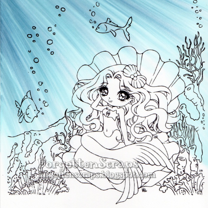
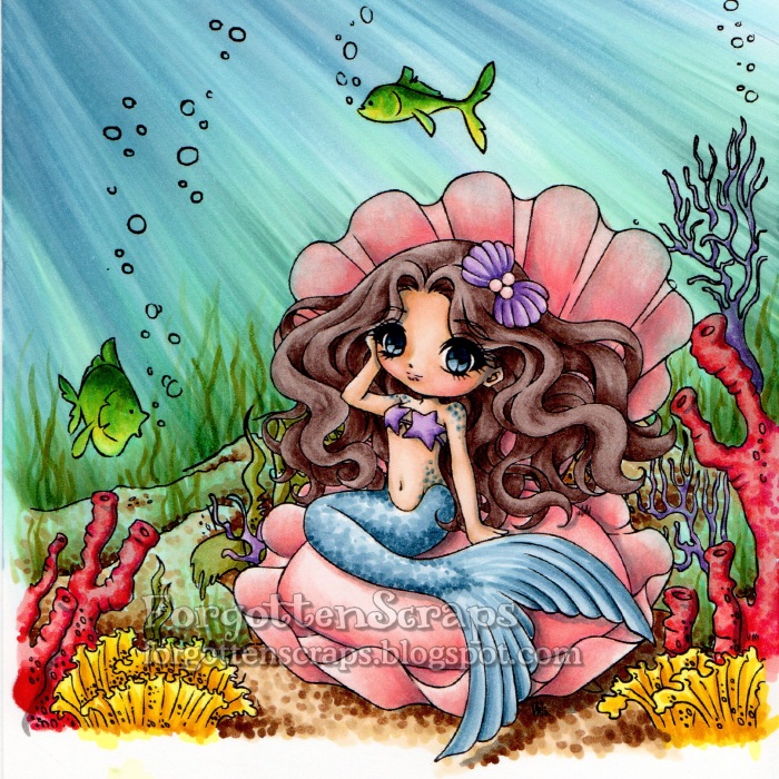
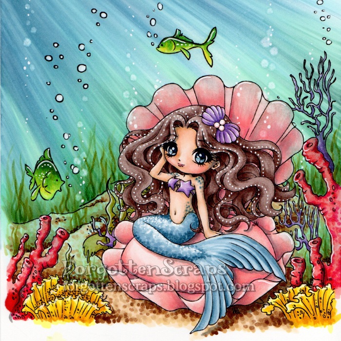
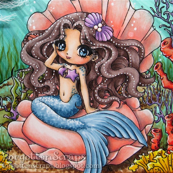
For my project I’ve used three of the newest images and composed a page in my art journal.  It’s been a while since I added a page in there and these kinds of releases are perfect for that.  😀  The images I used are Alice, Hidden Hole and the Chesire Cat.  Many of the embellishments are from Zoe herself (thank you!) and my favorite by far are the gumnut thingies on the lower left side.  I only had three and wish I hadn’t used them up so quickly since those are they’re surprisingly a rarity here in Texas.  Zoe… you need to send me more!  LOL
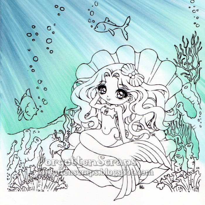
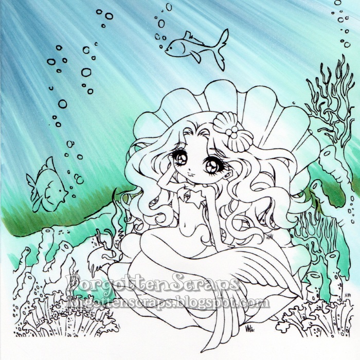
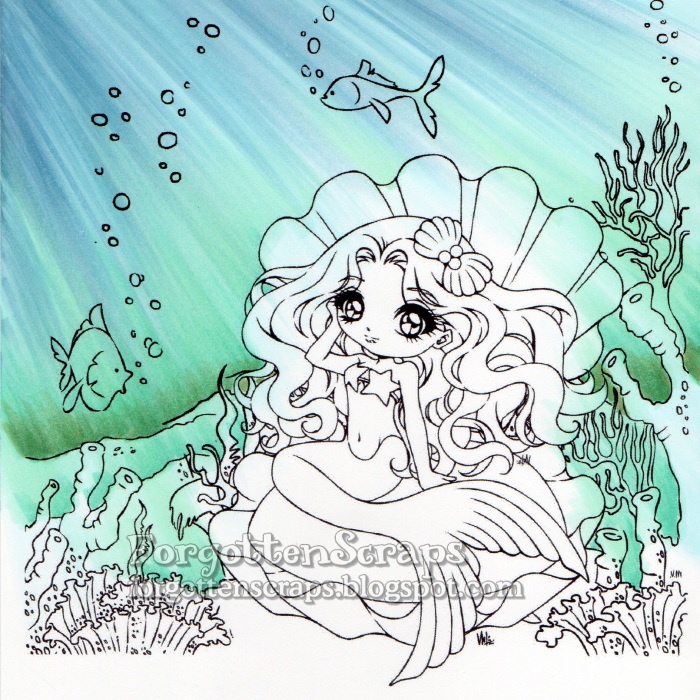
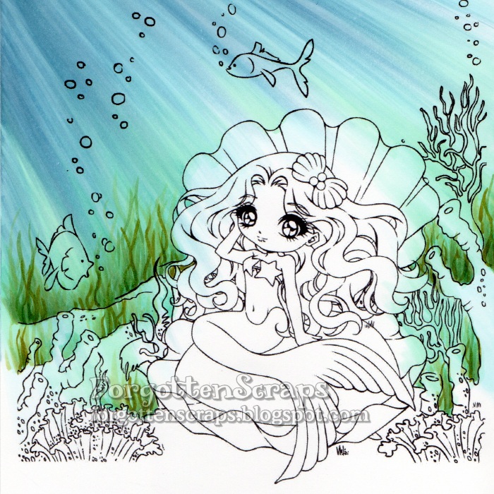
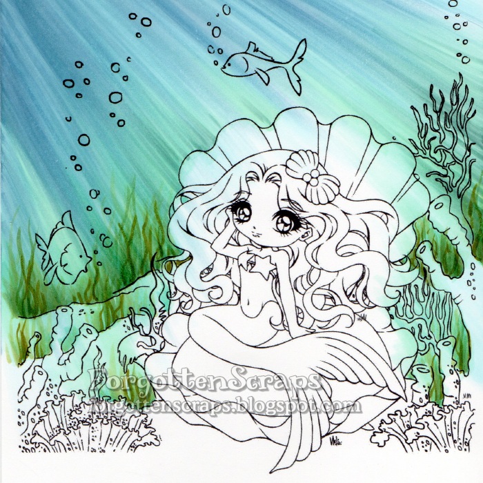
Now for the best part of this post… a small tutorial on coloring the tree.  Now, mind you, this isn’t a tutorial on “how to color,” rather it a breakdown of how each color is applied.  (For a small giggle regarding tutorials, click HERE and see “How to Draw The Tick.”)
For the tree, I used much the same technique as coloring hair.  The colors I used are Copic E57, E55, E41, E44 and E47 and each panel shows how that color was applied.  I started with a mid-tone brown and worked my way up to the lightest color. Then to add more depth, I went back to a mid-tone brown and finally a dark brown for the darkest areas.
There are many different ways to color this tree especially when you get down to the knotty parts.  I wasn’t sure what to do with them myself until the fourth color!  I thought if a tree like this is going to have a large hole into Wonderland, then a small concave area would be fitting.  You can also fill the area around with all grass or all wood… it’s quiet the versatile little tree.  
The fun doesn’t stop here and if you head over to JENN’s blog
she’ll be sure to treat you with even more fabulous inspiration!

Siren of Pearls

Howdy folks!  Today (well actually a couple days ago) was my day on the Make it Crafty Blog to post something and and I’m here to welcome you back to another underwater tutorial.  This one uses the same steps as the last one, but with a different image, it might give you a different perspective too!  For this project I merged a few images together from the fabulous Make it Crafty store and grabbed one of the gorgeous mermaids to play with… Siren of Pearls.  All the colors and images are listed below in case you wanted to jot those down.

Step 1 – On this image, the sun will be shining into the water from the upper left corner and I start coloring the rays using B52.  Sometimes it helps me to put an object at the top corner so the angle of the rays radiate in a natural curvature.  Once the first layer of color is applied then I’ll remove the object and remember to be consistent on the direction of the rays. For each stroke of the marker, I use the side of the brush tip and always start outside the range of the image then drag in the direction of the ray with a quick motion.

Step 2 – Add darker rays with B93. When coloring an underwater scene like this, I like to start with the ocean background first.  That way I don’t have to worry about being precise and if I make a huge mistake then I can always start over without loosing too much.

Step 3 – I continued to add rays using B00, B93 and B52 until most of the ocean is colored.  It’s okay if the colors are bleeding into the rest of the image since I can either remove most of the color later with a Blender marker.  Plus having some of the blue in the rest of the image adds an overall underwater feel.

Step 4 – Now I change direction of coloring to start from the sea floor and use BG11 and BG15 to color up using the same technique.

Step 5 & 6 – Continue to darken the lower ocean with BG15 and G85 then blend in with BG11 and G00.  I like to pull the greens from the bottom up into the blues but not all the way to the top.  The darkest part is at the horizon of the image but I also add a little bit of color at each ridge in the seafloor.

Step 7 – I return back to add just a little more color using the original colors, B00, B93 and B52.

Step 8 – In this step I add seaweed much the same way I would color grass on another image; the difference being seaweed is more of a wavy line and a lot taller.  Clusters of seaweed are colored in using YG93, YG97, G85, G82 and G40.

Step 9 – At this point I’m able to look at the overall effect of the ocean and usually add a bit more color where I think it’s needed until it’s finished.  For this image, I added a touch of G21 and BG72 then blended a little with BG11.

Step 10 – I colored the rest of the image using a variety of bright colors.  Since the little fish were mostly colored already from the ocean technique, I used the Blender marker to remove a lot of it before coloring them.  I also brought in a little texture by using dots on the seafloor and the mermaids tail.

Step 11 – Once everything is colored, I can go back in with the Blender marker to create bubbles and use a white gel pen to add other highlights.  The pearls in the hair was a technique I learned from Daria (http://daria-pn.blogspot.com/) and loved the effect.

Step 12 – The final step is to trim around the image and place it on the card and embellish it.  Since the image takes up most of the card area, I clustered my embellishments in one area and left the rest of the card as-is.  Of course the scene looks great without embellishments too but I wanted to experiment with the Fancy Ribbon Sliders chipboard embellishments.  😀

Copic Colors:
Sea Floor (B00, B93, B52, BG11, BG15, G85, G21, BG72, G21)
Seaweed (YG93, YG97, G85, G82, G40)
Coral (R02, R05, R08, R29; V12, V15, V17; and Y06, Y18, YR23, YR24)
Fish (FYG1, Y06, Y18, BG57, BG09)
Sea Floor (E51, E53, E55, E57, E59)
Clam Shell (R83, R22, R21, R12, R11, R000)
Mermaid Skin (E31, E30, E21, E00, E000, R12, R11, BV23, E04)
Mermaid Tail (B91, B93, B95, B97, B99)
Mermaid Hair (E71, E74, E77, E79)
Shadows (T3, T4, T5)
Make it Crafty Products:

I’d like to enter this into the following challenges:
Fresh Brewed June Challenge – “Mermaids, etc”
Bastel-Traum Challenge – “Water”
Natalie and Amy Challenge #10 – “Fantasy”

Update: I was selected the gold winner at Bastel-Traum Challenge!

Clouds Tutorial

This is my week at the Make it Crafty store blog to share a tutorial and I chose to do clouds – it’s a quick and easy tutorial on how to color two different kinds of clouds.  For these samples I used Copic markers and the numbers are listed in the graphics next to each step.  There are many different types of clouds but I’ve taken these two styles and broke it down into four easy steps.

For the shape of cloud, I’ve used the B00 marker to outline the general shape of the clouds.  I like to draw in all my clouds in the sky on the first step then I can go back and blend in the colors one at a time.  This helps me to know how far I can blend each color before I should fade to white.  In this example I started with the darker colors and worked up to the lightest.  Depending on what paper you use, you might want to go back and reuse some of those colors to get a good smooth blending.  However, with these lighter colors, most of the papers will do fine.

This other example takes a different approach and is helpful when you only want a few clouds in the sky.  You can also take your time and color in the background of the sky first – that will be helpful especially if you wanted a gradual color change such as a sunset.  The background can also be left blank (such as the image above with the hat).  For this technique you also want to make sure you have refilled your Blender marker which will make the last step easier than if you were working with a dry marker tip.

In this example, I also start with the darker colors and work my way up to the lighter ones.  You can also add other colors like purple to make it more colorful.  Once I have the shape of the cloud all colored in, then I used the Blender marker to push out the colors in the center.  This creates a nice fluffy white cloud and you can go back with the Blender marker multiple times until you get it white.  However, make sure to let the paper dry in between applications which will help keep your cloud shapes in tact.

 The nice thing about clouds is almost every project can use them …
so grab your current project, a few colors and give it a try!  😀 
I hope this tutorial helps you with your next project and thanks for coming by today! 

Fancy Marci

Remember the skin tone step-by-step guide I did a couple days ago using a La-La Land Craft image?  We’ll, as promised I finally put her on a card and wanted to share it with you this weekend.  To see the tutorial just click HERE and that even shows all the Copic colors I used on this sweetie.   Check out my finished project which is both perfect for Valentines and spring…

Isn’t she just adorable!  The images I used are Fancy Marci from La-La Land Crafts and That’s the Ticket stamp and punch from Stampin’ Up! The dragonfly chipboard embellishments are from Make it Crafty in a set called Dragonflies (of course!  LOL).

For the hexagon aspect, I used a beehive stencil and sprayed Iridescent Spray & Sparkle over the background.  (Thank you Ruby!!)  The light reflects on it and really adds an interesting element.  I’ve also colored the chipboard dragonflies and covered the wings with pink Stickles.

  
QUESTION: Some of you may be wondering if coloring Marci with a facial personality is allowed – and the ANSWER is: YES of course!!  The terms of use state no altering of the image so I’ve deliberately left the line art alone and printed the image the way it downloaded – nothing was change.  Now I can safely color using only Copic markers and some “mad coloring skills.”  Also check the other awesome examples on the La-La Land Crafts Blog that show fantastic ways to use your coloring!  Such as plaids, fuzzy texture, camouflage, hair strands and fabric folds – there so much you can do with your Copics and that’s what makes them so fun!!

I’d like to enter this into the following challenges:
Crafty Ribbons Challenge #38 – Anything with Ribbon
Copic Marker Europe – Anything with Copic
Make it Monday Linking #126 – Anything Goes
Oozak Challenge #11 – Anything Goes with Favorite Color (Pink/Brown)
Stamp and Create February Challenge – Spring

Update: I was a chosen winner for this project at 7 Kids College Fund!

Fancy Marci

Good morning!  In light of Black History Month I thought I would share a combination of skin tones using my Copic markers and give a step-by-step on how to use them.  For this image I went with a dark brown skin tone and you might be surprised at what colors I used for blush!  This image is Fancy Marci from La-La Land Crafts and I’ll make a card with her later on this week and share it once it’s finished.

Update: See the finished project HERE.  😀

Because the LLLC images come with a pupil, I started out coloring the iris so Marci could be watching me color.  Plus it also helped me to define the areas I should not color with the skin tone.  From the bottom going up, I added the colors listed on the side – starting with the darkest colors and working my way up to the lightest.

Then for blush and her lips, instead of using pink, I prefer to use a slightly brown-ish or orange-ish color which blends better with the brown – in this case it was R02 and E04.  Lastly, shadows were given with W5 and W6.  The colors for the dress were selected by glancing at my stack of Valentine papers on my desk so that’s a pretty sure guess at what theme the finished card will look like!  LOL  Until then, enjoy and hope this color combination helps you figure out your next project.  ;D

Witchy Wanda

Surprise!! For the Make it Crafty Store Blog I have a small coloring project that I have shamelessly back dated and posted for your enjoyment!!  Having two days a month to post projects you’d think that would be no problem – but alas sometimes they sneak up on me and I’m swamped with “life” that I just don’t get around to it.  However, the days are still there, blank with no post, empty and calling out to me, taunting and teasing my OCD urges that I try so hard to suppress!  Yes I’m afraid that is what has happened and for better or worse I just can’t resist the urge any longer and must fill the void!!  LOL

So “today” I have found an image that I had colored long ago which I haven’t shared yet… this is Witchy Wanda from Make it Crafty.  One of my main goals while coloring this image was to give her more color than the traditional black with black Halloween colors that are associated with witches.  So I started with giving her red hair then the green naturally followed as a complementary color.  Then for additional color I added the white to “accessories” and finished off her wardrobe with black. This gave me several colors to work with which was certain to achieve my goal.  However, with so many colors it is sometimes hard to determine where and what to color!!  That’s when I try to rely on a tricolor rule and hope it works out in the end.

I’m not sure if the Tricolor Rule is an official artsy term but it sure helps me a bunch especially for smaller images that I want to use many colors.  Here’s how I think of it… when looking at the image I try to pick out three areas of a triangle to use the same color on.  These would be features that are about the same size and would have the same level of focus drawn to them.  For example, in this I have the hat, bow and boots in black; another example would be the white and my triangle would be the peakos and her two gloves.   Some that are not so obvious is the green being the bow on the hat, the larger skirt area and the top part of her dress; and even her skin helps create another triangle with her two shoulders and her face.

It’s a mess to see the image with all those triangles but with the six triangles showing it helps to visualize the concept better.  When it works out, it’s a great way to disperse the colors around the image and it helps me decide what colors should go where.  Hopefully this gives you some ideas for when you’re stuck on your next image and can’t decide how to color it.  If so, I’m glad it worked out and that I could share this little tip.  😀  Good luck!