Roxi Sprite

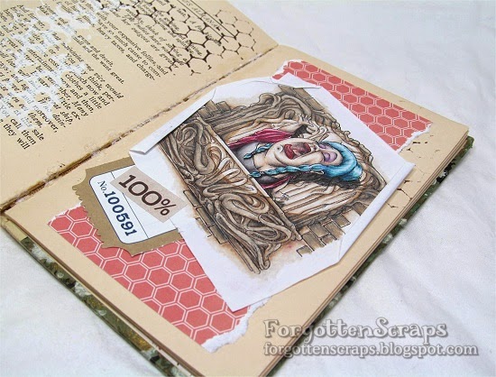
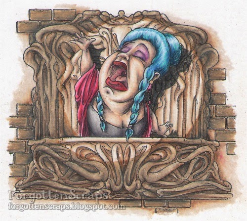
The challenge this month at Make it Colourful is”Two-tone Monochromatic and Abstract Background.”  It’s a mouthful but it’s nothing to be afraid of.  The gist of the challenge is to use two colors and color your image, one on each side them blend them together.  I choose to work on this scene and each object is blended this way.  The images I used are Roxi Sprite and Hideaway Castle from Make it Crafty.

I chose red and blue and wanted to create n eerie scene but then after it was all colored, poor Roxie Sprite was lost.  It was a good thing I went for the background first so I decided Roxie should be a white ghost.  I also colored the sky black which helped to make her stand out more than the scene.

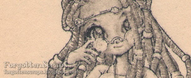
Here’s a close up of Roxie which shows how simple I kept the coloring.  I used C5, C3 plus a little R12.   Then to draw in the attention, I gave her glowing eyes.

Thanks for dropping by and hope you have a wonderful week!
Make it Crafty:
To see the post on the Make it Crafty page, click HERE to view post.

Soprano Opera Signer

It’s finally over!!  Right?  LOL  I’ve listened and put this gal in my project journal and can safely say it’s complete.  I started this project a long time ago even though I wasn’t sure what the end product would look like.  The scene was created using the Paris Elements Digit Collection where I wanted to be creative in creating a balcony for the Soprano Opera Singer to ring out the final scene. 

Once the scene was created, I carried it along with me until I had few moments and started to color it on one of my travels and used Prismacolor Pencils because they were easy to tote.  If you’ve followed along in the Make it Crafty Facebook group then you’ll already know that I started with the skin and wasn’t too sure about the colors.  However, I pressed on and finished the Opera Singer complete.

Once that was complete then I worked on the background but used the wrong color and the whole image looked washed out.  I was about to give up but form suggestion from you, I worked on the spotlight and a drop shadow.  That seemed to help fix the color problem and created a fun effect too; and with more support from you, I went ahead and affixed it to my traveling journal.

Here’s what the image looked like as a scanned image where I think the colors are more true to life.
Thanks for dropping by and hope you have a wonderful week!
Make it Crafty:
To see the post on the Make it Crafty page, click HERE to view post.

Desiree

At the beginning of my travel journal I have a couple of blank pages to work with and this is one of them.  I stamped Desiree from Make it Crafty in black ink then colored it with a No.2 pencil.  It was the only thing I had with me at the moment and I haven’t actually colored a grey scale image for long a while.  By the way, I’m loving the MiC rubber stamps because I can use them on old books like this where a digital image can’t “go.”  😀

There are a few areas that I would have like to spend more time on, especially in getting more depth and shadows.  However, the No.2 pencil was a bit too hard for this old paper and after a few layers of coloring the paper would start to rub off.  So I had to call it quits before I damaged the paper too much.  I think it will be enough once I am able to get more pages finished in the book and will probably stand on it’s own nicely.

Thanks for dropping by and hope you have a wonderful week!
Make it Crafty:
To see the post on the Make it Crafty page, click HERE to view post.

Mushroom Forest

The crazy challenge at Make it Colourful this month is all about an atmosphere perspective… meaning to show the depth of the picture as it fades back into the distance.  Zoe provided with a description, samples and design team inspiration that you can read all about it.  For me, I started with the Mushroom Forest from Make it Crafty and then tried to figure out what I was doing.  LOL

I used the forest example, from the challenge post, and tried to mimic the color of the trees.  Using the back part as the most lightest then coming forward to a darker gray.  But then at the foreground I started to make the mushrooms lighter.  I was using all gray colors knowing that I was going to go back in and use colors.

When I add the colors, I used the most in the foreground and then faded out to not using any at all in the background.  This way I was able to keep the gray colors showing in the background.

Here’s what the image looked like after I had used the Copic markers on it.

I was happy with how the colors turned out but I’m not too happy with how the Prismacolor pencils and the Copic markers blended … or rather…  not blended together. I think it was the paper I was using but the next time I think I’ll stick with one or the other.

Finally I placed my project on a journal page and decorated it.  Thanks for coming by and I hope this helps you in your trial for the challenge this month!  😀

Make it Crafty: 
To see the post on the Make it Crafty page, click HERE to view post.

Tress Winking

This is one of the most recent page I’ve colored in my travel journal but is the first one to be shown on my blog.  The stamps I used are Tress Winking and Spring Swing from Make it Crafty, both rubber stamps available at Little Miss Muffet Stamps.  I stamped then masked Tress Winking first before stamping the Spring Swing.  However, I wasn’t able to match up the swing very well so she was floating.  LOL  But I added some extra width to the swing so now she sits well.

Make it Crafty:
To see the post on the Make it Crafty page, click HERE to view post.

Tress Joyful

It’s another fun challenge at Make it Colourful and I’ve created this project as inspiration.  I’ve used Tress Joyful from Make it Crafty (and available at Little Miss Muffet Stamps in rubber) along with the Happy Tabs Sentiment set (which comes with chipboard accessories as a bonus!) 

The EASY challenge is to color shades of Blonde Hair and I used the Copic colors YR23, 31, 30, E53, 51 and E23.  The HARD challenge is to color folds in clothing and Zoe’s new tutorial is perfect to get your started!