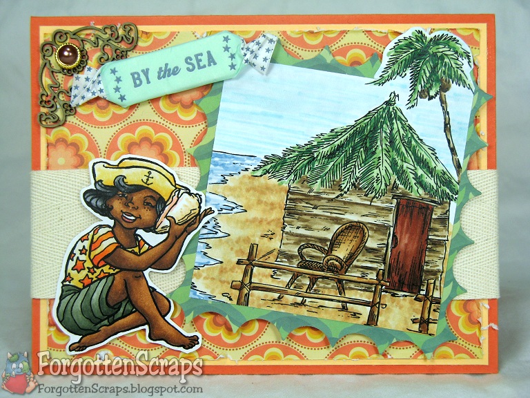
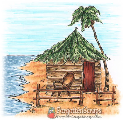
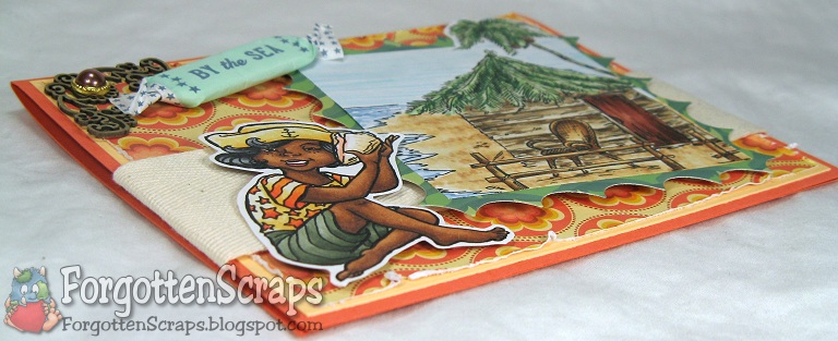
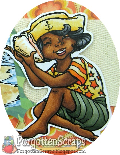
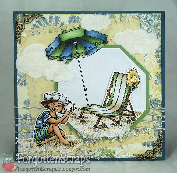
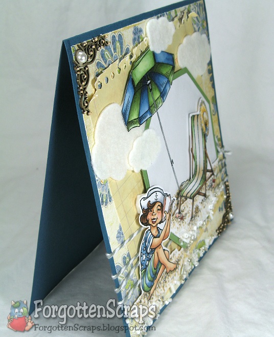
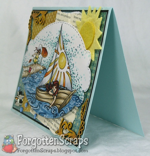
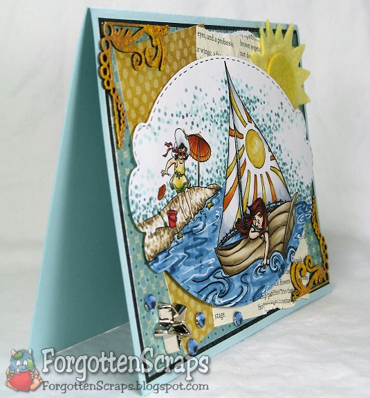
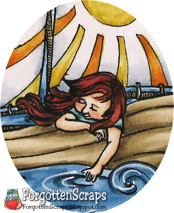
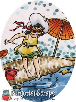
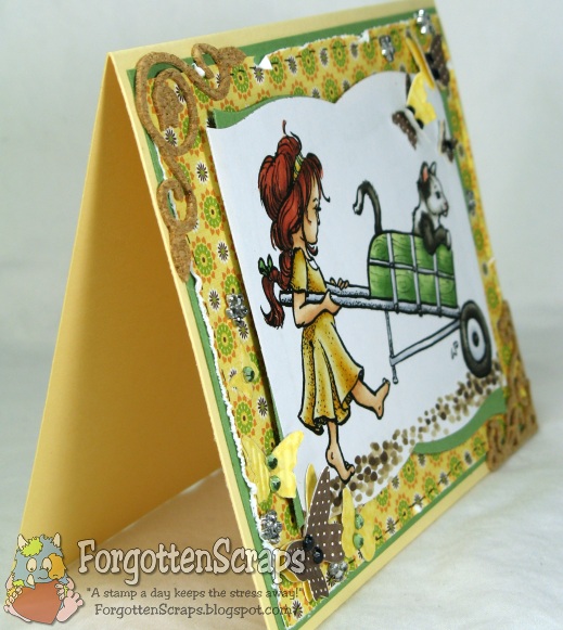
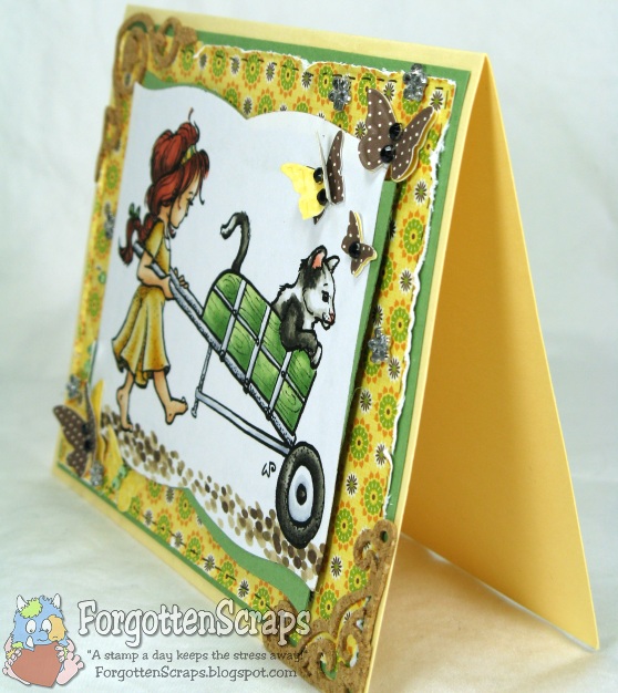
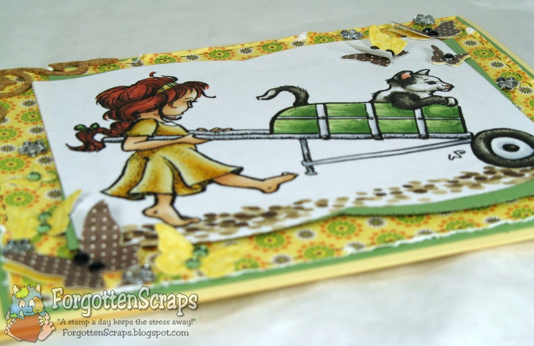
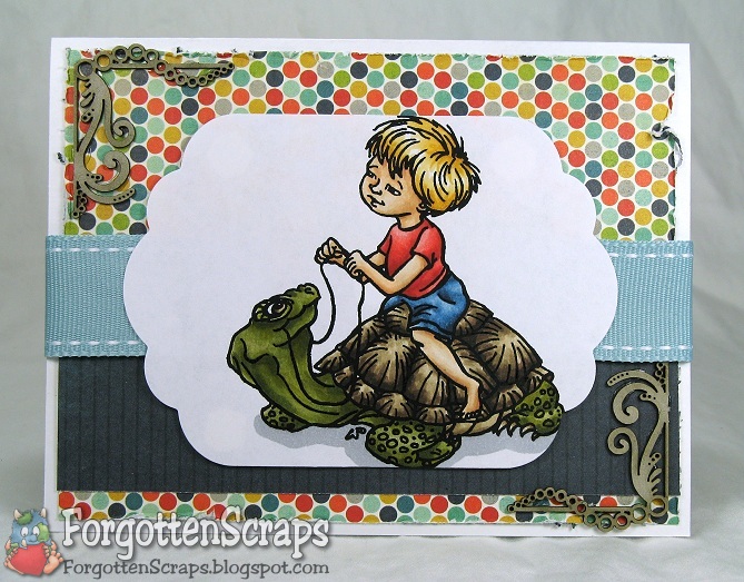
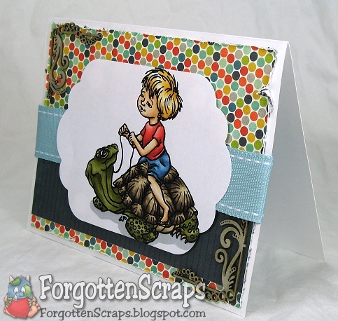
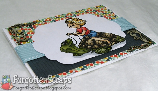
All of my projects lately certainly show that summer is on it’s way and this one is no exception! Welcome to another scene at the beach. 😀 This one features a new image from Love to Stamp, called Shellphone, and two new images from Make it Crafty, Beach Chair and Beach Umbrella.

Finding a color scheme that works for the beach and is also inspiring to me has been a challenge. On this card, however, I scrapped the ideas that I had to use themed paper and went with a traditional floral, of all things. ;D But it had the colors I wanted and was covered up enough to look like interesting swirls. Yep, those are swirls… NOT flowers! He he he

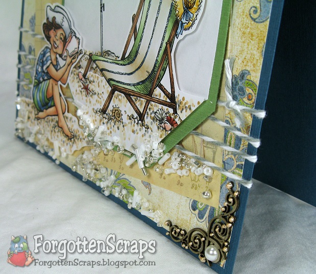
I couldn’t help myself and added a few of my favorite embellishments… felt clouds and laser cut chipboard embellishments… but you may have already noticed! LOL I also added some of my new Baker’s Twine, which unfortunately, has been a rare occasion that a twine color will actually coordinate. I should have gotten more neutral colors to work with. :-,

As a final touch I added a bunch of glue at the bottom of the card and spilled out a container of mixed beads; I let it dry the tapped off the excess lose beads. It was an idea I have been seing lately with clear micropearls or even sand so I had to give it a go. Hope I’ve inspired you today!
Lastly, don’t forget about the blog candy and challenge going on over at the Little Darling Challenge Blog.

 Main Stamp: Shellphone (LTS), Beach Umbrella and Beach Chair (MiC)
Patterned Paper: scraps
Chipboard: Swirly Corners (MiC)
Metal Die: Spellbinders Nestabilities Octagon
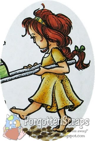
Copic Markers colored on Copy Paper:
-skin tone: E00, E21, E11, E13, R11, R12, E04, R24
-browns: E40, E411, E31; E23, E57, E59; E50, E53, E55, N4, T6
-yellows: YR21, YR24
-greens: G40, G12, G82, G85
-blues: B91, B93, B97
-pinks: R11, R12
-grays: C1, C3
 Did you know? A beachcomber is someone who “combs” (or searches) the beach, and the intertidal zone in general, looking for things of value, interest or utility. The first appearance of the word “beachcombers” in print was in Herman Melville’s Omoo (1847). It described a population of Europeans who lived in South Pacific islands, “combing” the beach and nearby water for flotsam, jetsam, or anything else they could use or trade. The vast majority of beachcombers however, were simply unemployed sailors like Herman Melville in Typee, or Harry Franck in the book Vagabonding Around the World.After enduring a voyage of danger and hardship, it was not uncommon for a few whalemen to desert a ship when it arrived in Tahiti or the Marquesas and reside, at least for a while, in the South Sea islands of Polynesia. If another beachcomber was ready to take his place in order to get home, the captain might let the disgruntled crewman go; otherwise, the captain would offer the natives a reward to find and return the deserter, and deduct the reward, plus interest, from the deserter’s pay.
[Beachcombing, Wikipedia.org]


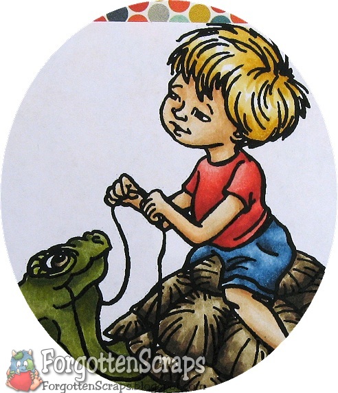 DT Preview: Love to Stamp Little Darlings Release II