Love Birds

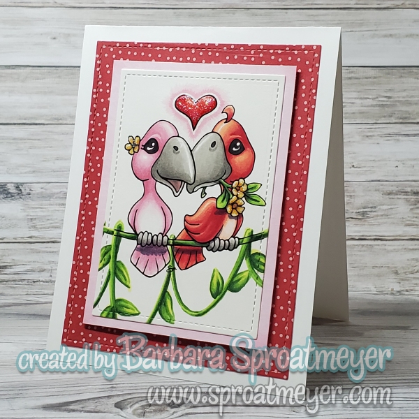
These little Love Birds couldn’t help but steal my heart today. I colored them in classic Valentine hues—soft pinks, warm reds, and sweet touches of romance—then added a trailing green vine to give the whole scene a fresh pop of life. Something about that extra green makes the love feel like it’s growing.

This project features the Love Birds from Sproatmeyer Stamps paired with metal dies from Whimsy Stamps, and they were such a joy to work with. Do you prefer sticking to traditional Valentine colors, or do you like adding unexpected pops of color to your projects?

Duck with Balloon

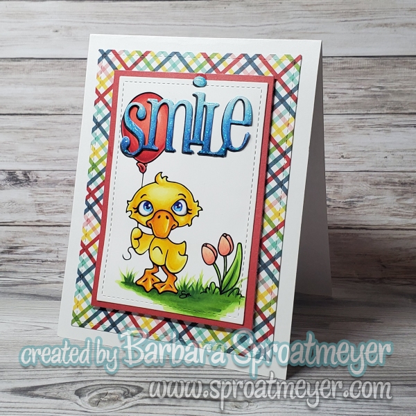
Today’s card features the Duck with Balloon from Sproatmeyer Stamps. I stamped the image, colored it in, and kept the overall design simple and the same framing I’ve done on all my cards recently. For the sentiment, I chose “Smile”, which fits the image without taking attention away from it and balances the focal point. I used metal dies from Whimsy Stamps to create a laying with stitching details..

I like how the colors turned out on this card—they’re bright without being overdone and work well with the simple design. I have this image colored again but I think it’s terrible. I’ll have to work up the courage to show the 3rd one – but at a later date. Until then…

Thanks for stopping by.

Unicorn Rearing

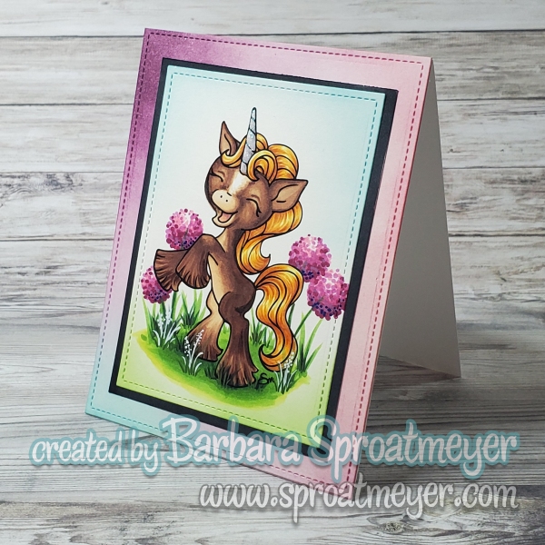
Today’s card features the Unicorn Rearing digital stamp, and this time I decided to change things up a bit. Instead of the rainbow palette I used last time, I colored this beauty in more traditional horse tones. I love how the softer, realistic colors give the image a completely different feel while still keeping that magical unicorn charm.

The Unicorn Rearing digital stamp is available from Sproatmeyer Stamps and is currently offered at an introductory discount—perfect if you’ve had your eye on it! To finish the card, I paired the image with metal dies from Whimsy Stamps, which added just the right amount of detail and elegance to the overall design.

It’s always fun to revisit the same image with a new color scheme and see how it transforms the final project. Thanks for stopping by, and I hope this inspires you to try something different with your coloring too!

Frolicking Fennec Fox

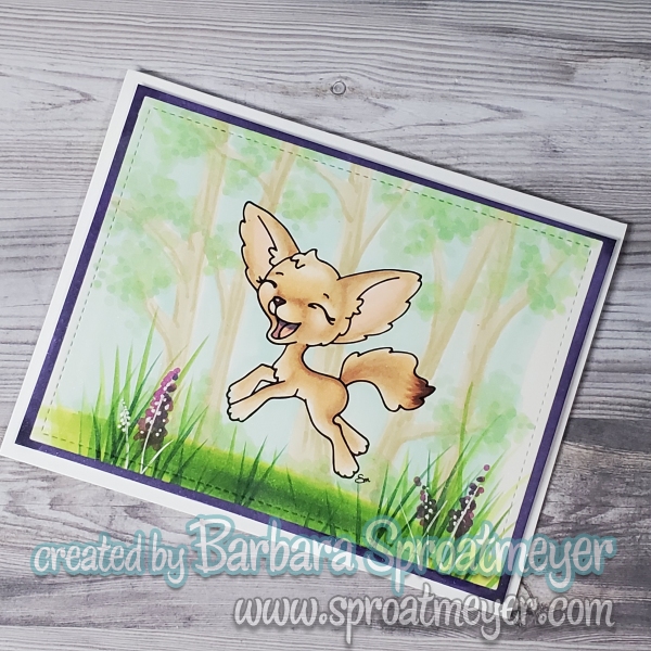
I’m happy to share a new illustrated stamp that is now available in the shop: Frolicking Fennec Fox.

This piece began as a simple drawing inspired by the playful nature and distinctive features of real Fennec foxes. For the coloring, I chose light cream tones typical of a Fennec fox’s natural fur. These soft colors help maintain a gentle, airy feel while emphasizing the movement in the illustration.

The background was added at the last minute, using light and subtle colors so the fox would remain the focal point. The intention was to provide just enough context without competing with the main subject.

Frolicking Fennec Fox is now available at Sproatmeyer Stamps. For a limited introductory time, all products are offered at a new price point of $3.00.

Thank you for supporting my artwork and creative process.

Skunk Love

I’m excited to share that new animal images are now at Sproatmeyer Stamps. This release includes several cute animals, including two brand-new skunks that pair perfectly together.

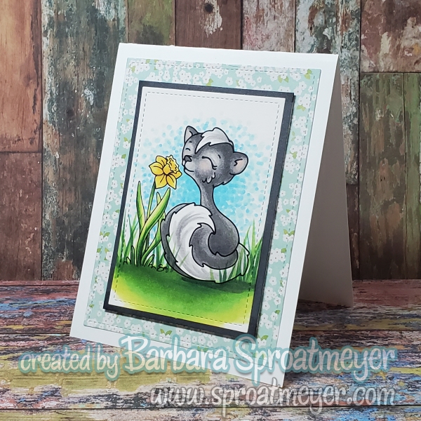
When the skunks are combined, they create a sweet Valentine-style image called Skunk Love; shown below. To celebrate, I’m offering this special image for free to my readers and followers when you add all three skunk images to your cart. The discount is automatic as long as all three are in your cart: Skunk Love, Shy Skunk and Skunk with Daffodil.

In addition, to help get the shop started, all stamps are 25% off as an introductory offer. It’s a great time to explore the new images, build your collection, and save while you do it. If you’re getting ready for Valentine projects or simply love adorable animal art, grab the new animal images, and enjoy coloring some Valentine’s cards.

Polka Dot Pals Gemma Let’s Party – Coloring Scene

Polka Dot Pals stamps are still available at Whimsy Stamps and this one is a perfect celebration scene! The digital stamp was printed in a soft light gray, creating a gentle foundation that allows the rest of the design to shine without feeling overwhelming. The overall color scheme of gray with a hint of purple adds just the right amount of sophistication and charm.

What I love most about this image is how versatile it is. And let’s talk about the balloons—because I absolutely adore them. They bring so much life and movement to the image, instantly giving it a celebratory feel. This is one of those images I keep coming back to; I’ve colored it several times, and each time it feels fresh and inspiring. No matter how often I work with it, the balloons always make me smile.