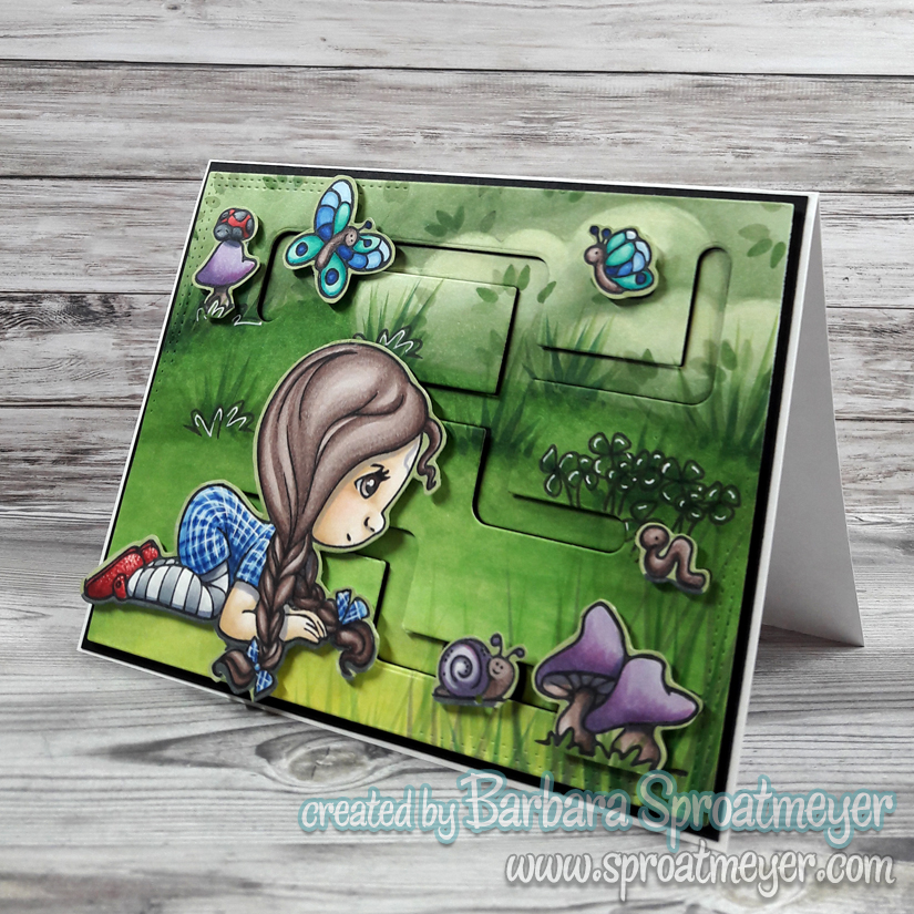
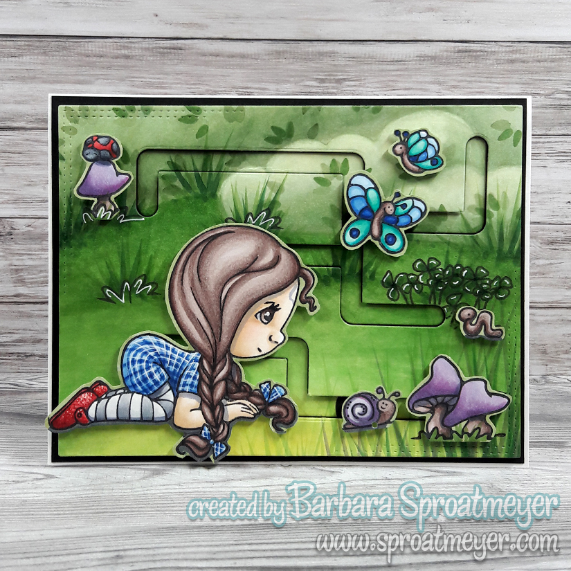
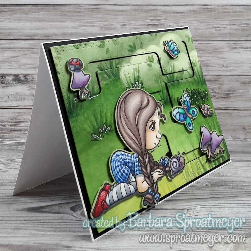
I don’t think we’re in Kansas anymore. Nope, I went outside and it still looks and feels like Texas. However, I still had the feeling I should color up Polka Dot Pals Vera as Dorothy from the Wizard of Oz featuring blue plaid prints and ruby red slippers from the iconic movie. She was fun to color.
Since Polka Dot Pals Verawas taking a closer look at the world below, I colored the background without a blue sky. I added details like grass, clover and leaves on the bushes. After it was colored, I die cut the maze out using the Slide On Over Maze Die and the Card Builder Windows Die.
When coloring, I kept to the cool colors of green, blue and purple so that it would feel uniformed in theme. I wanted the girl to stand out the most too and her shoes help draw your attention as well. The mechanics of the card use the maze die and then the butterfly can be moved around the top track and the snail can be moved around the lower part of the track.
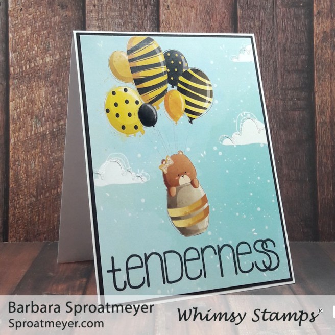
Sometimes designer papers are too cute to cover up and that was the case for this page. Instead of covering it with an image, I decided to stamp on a sentiment, add some glitter glue, and call it good. I think it will make an adorable baby card for someone.
The glitter glue was used on the clouds and the bow to give a little sparkle. However, this didn’t need much so I stopped there. I could have used a stitched-border die and a few gems, which would also be cute, but I like that it was a fast and simple card to put together.
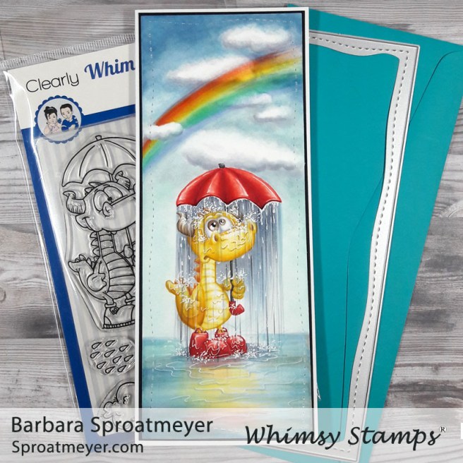
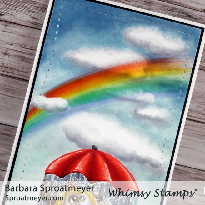
This stamp is titled “Dragon Water Fun” but I’m not so sure how much Dudley is having here. Maybe it’s that time of month again? (Sure, Dudley can be a girl!) Or maybe it’s a reflection of how we feel sometimes when everyone around us is happy; our personal trials of life. Either way, it was an idea that came to my mind as soon as I saw the stamp and I knew I had to color it. Because everyday can’t be all rainbows and unicorns even when they’re visible.
Aside from raining inside the umbrella, there are a few other changes I made to the Dragon Water Fun stamp through creative color placement. That’s where I color what I want and ignore the lines of the stamp. The face was my starting point and I took away the smile and added a different mouth; the eyes were next and I colored them larger and looking up. Lastly, the shoes were changed to rain boots instead of sneakers.
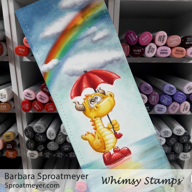
After the dragon was colored, I did the water and the sky. I was nervous about the rain and water effects so I saved those for last. The water on the ground was colored using horizontal strokes. I pulled in the yellow and red colors to give the illusion of a reflection in water.
Before I went crazy, I made sure to take a picture just in case it didn’t turn out. This sat on my desk for a while until I mustered up the courage to proceed. I first added the rain with horizontal coloring. Then I went in with a white pen to add the water and splashing effects.
I’ve stepped outside of the box and jumped into Slimline cards featuring this image, Polka Dot Pals Kezia. Meaning, instead of using my normal size card of 4.25×5.5″ and a standard C6 size greeting envelope, I’m trying out the slimline size of 3.5×8.5″ and a No 9 size return envelope. Sound confusing? Maybe not but learning to adapt to the new size was still a learning curve for me.
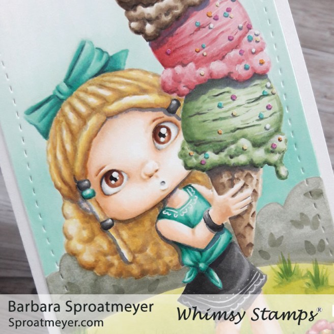
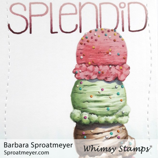
The image I used was Polka Dot Pals Kezia and I added the face from Polka Dot Pals Mason. The ice cream from the original stamp was not inked up which allowed me to draw in a tall stack of ice cream. More details on that below. I also used Polka Dot Pals Syeda for the flowers and bow in her hair and Polka Dot Pals Khadija for the sentiment.
What’s a Slimline die? These are cards that are narrower and longer that fits into a business envelope instead of a greeting card envelope. So how does it work? Denise from Whimsy Stamps put it simply and said: “use and 8.5 x 11 paper cut to 8.5 x 7 and fold in half. Then you can use the left over piece for die cutting or coloring.” That wasn’t so bad and it worked out perfectly. You can see how the diecut was used to cut out the paper that was layered on top of the folded card. You’ll find other styles of Slimline dies at Whimsy Stamps.
Since the card was longer than I normally work, I wanted to emphasize that with a tall scoop of ice cream. I have a tin with strawberry scented ice cream stickers and thought that would be perfect to use and they were about the same size. So the top scoop on this cone is the actual sticker. I fussy cut around the scoop then I drew and colored in the other scoops to match. The hardest part for me was trying to match the style of the sticker.
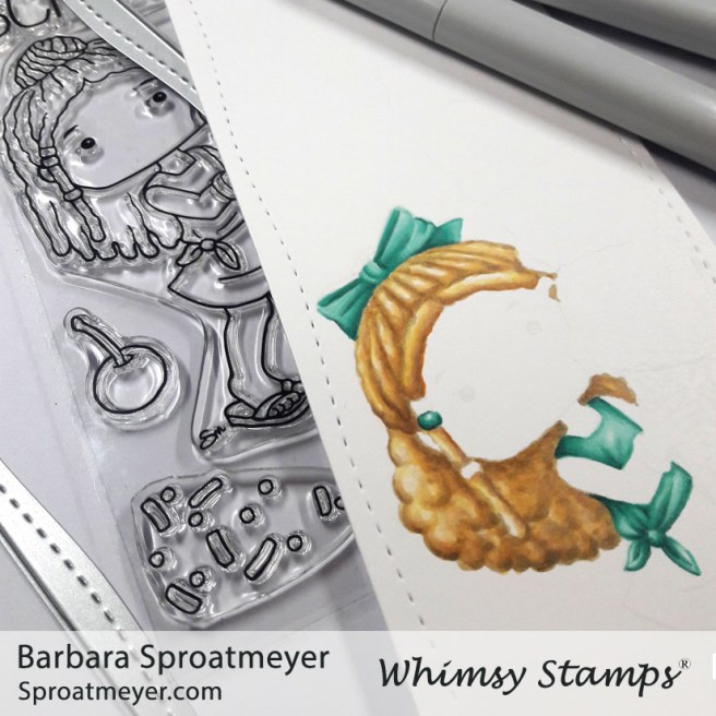
The ice cream was not the only thing I changed on this stamp. Here’s a work in progress photo which shows Polka Dot Pals Kezia up close. She is stamped in a light colored ink so I could use creative color placement to change her hairstyle. The top part I kept as cornrows but I replaced the bun with a bow and the lower locks with thick curly hair.
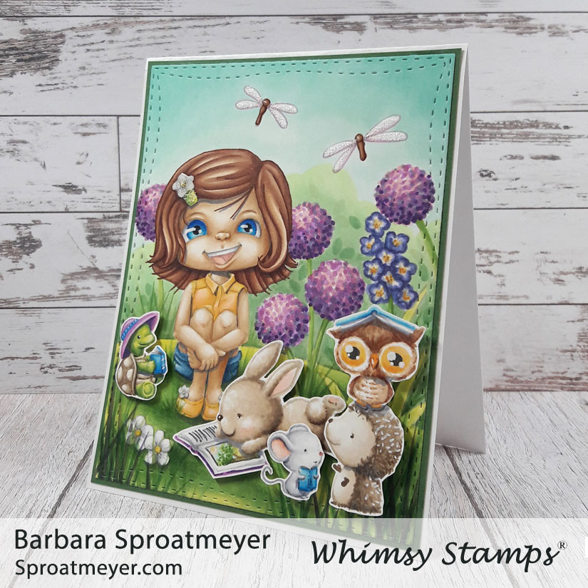
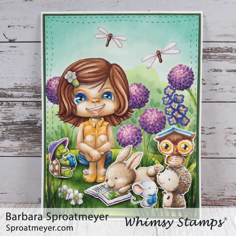
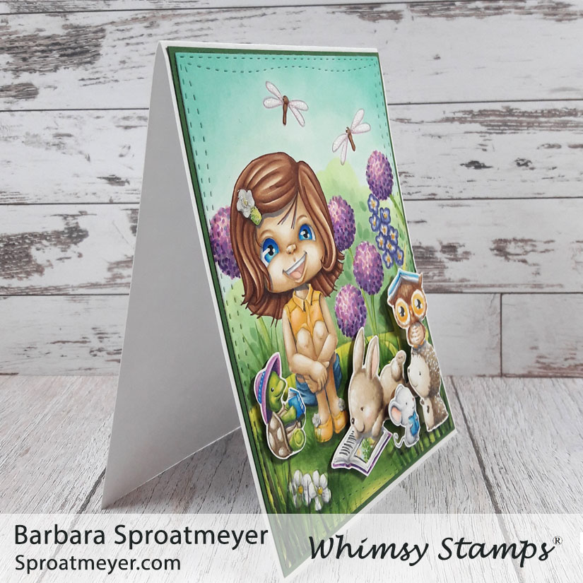
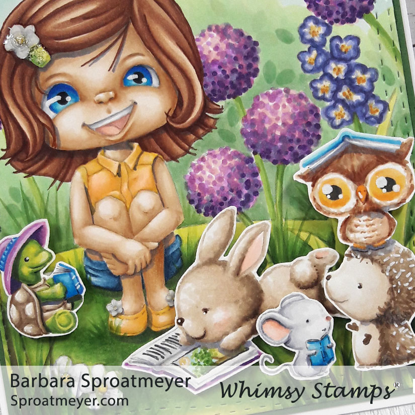
It’s story time! I’m back with an updated version of this digital coloring scene. This is Polka Dot Pals Brooke Reflecting Scene from Whimsy Stamps and I added a bunch of critters from Purple Onion Designs.
I originally spotted the turtle reading and had to buy a few more to fill out the grouping. I wanted a “conversation” of book readers but many of the ones I bought weren’t sized the same. However, these seemed to fit well and I even added book on top of the owl to fit in more with the theme.
Details on the digital coloring scene and how I colored the background can be found on this post HERE.
I like that I was able to take this digital coloring scene and “mix it up” by adding more stamps to it. I used foam tape to pop them up and give the card a little dimension.
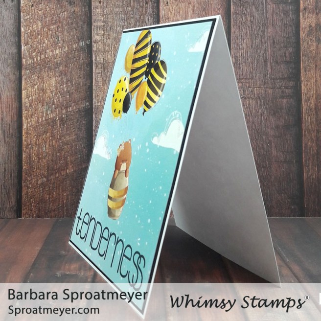
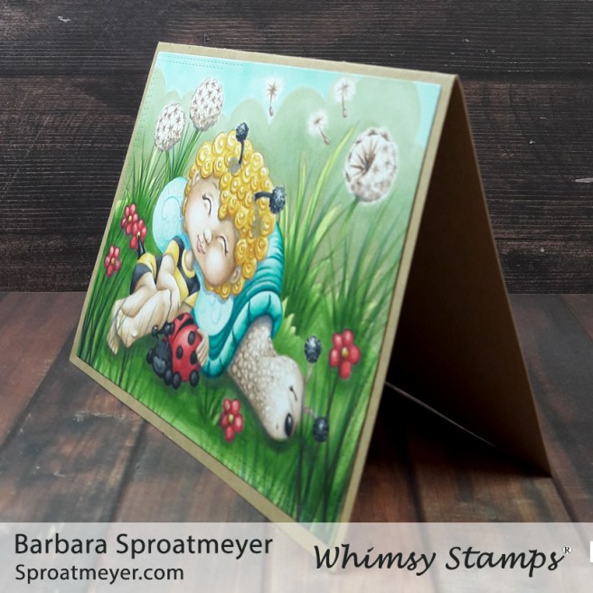
Looks like it’s time for a nap for this little bee and her friends. This Polka Dot Pals Zara Fairy Dreams Scene and is one of the newest digital coloring scenes released this week at Whimsy Stamps. With this project, I tried to use some inspiration from Annabel and her amazing work with snails and curly hair!
I knew there was going to be a lot of green on here so I wanted to pick colors that would stand out especially since the girl was going to be in black and white. I felt that I couldn’t get away from the traditional yellow/black and red/black for the bugs and went with it. I added turquoise and tans to coordinate and hopefully calm them down. They’re sleeping so I suppose it worked. Ha
The flowers in the background, I chose to color as dandelions blown by the wind. So I guessed at what that would look like but added some seeds floating to make it easier to identify them. I think that worked and it was fun to add some details through creative color placement.