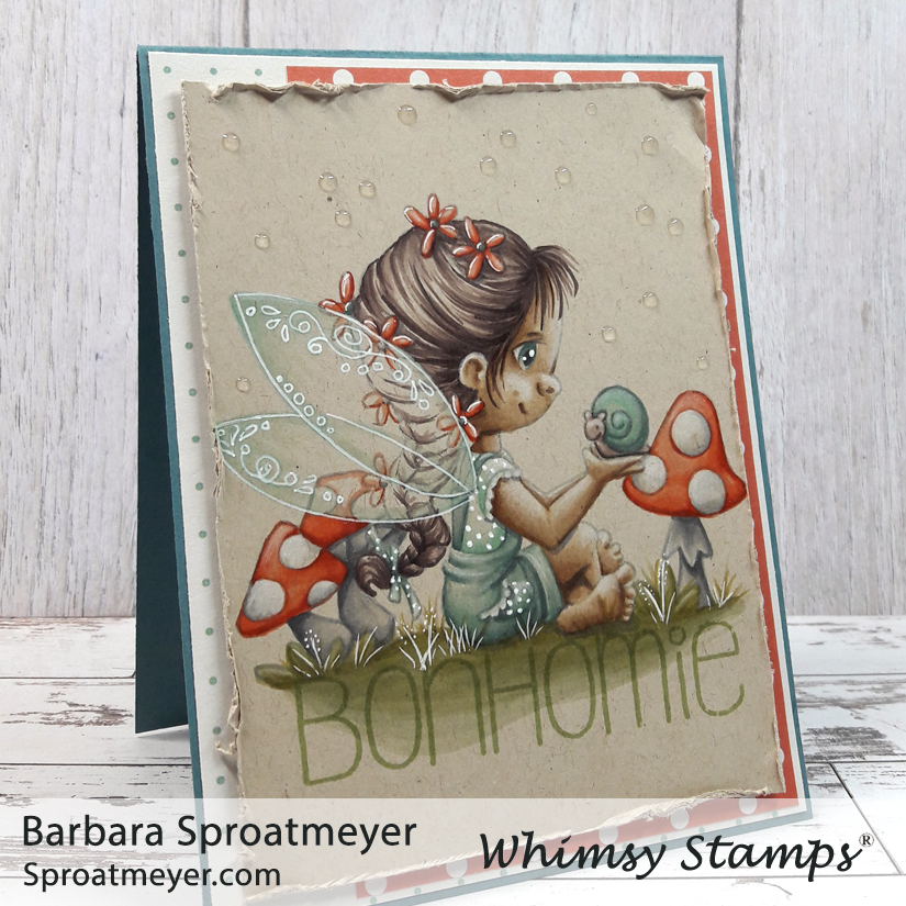
Ready for another Polka Dot Pals scene? This one is using Polka Dot Pals Imogen as the center piece and colored on Neenah Desert Storm paper with Copic markers. I’m really enjoying this look so I’ll be doing a lot more. Plus I might look into other colors – do you know of any to recommend?
Most of the elements on this card are from the Polka Dot Pals Imogen set, including the sentiment. The wings were added from the Polka Dot Pals Kadija set. The sentiment was stamped in green so I could create a ground for her to sit on – I wanted it to be there but not to stand out more than the character. Bonhomie, by the way, means a cheerful friendliness. (Pronounced like bon-a-me.)
On the finished card, I used Nuvo Crystal Drops, Morning Dew, to give the idea of fireflies or fairy dust in the air – you know, all that sparkling magic that happens around fairies – yea, I wanted that to happen here too.
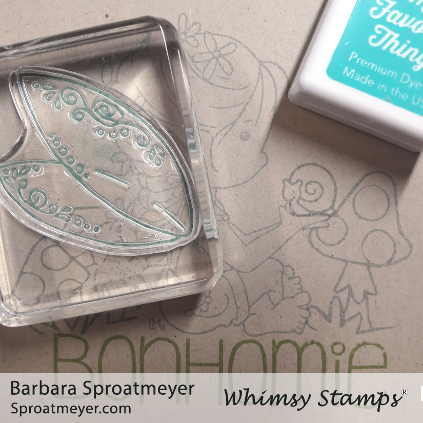
I stamped the wings in blue ink then colored them lightly with Copic Markers. To get the final result, I outlined them with a white gel pen. This shows the scene being created and below you can see the how the image started out – especially on the face where so much details was added.
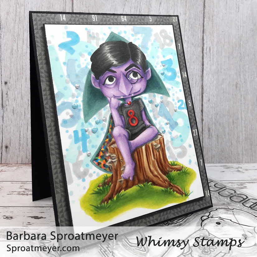
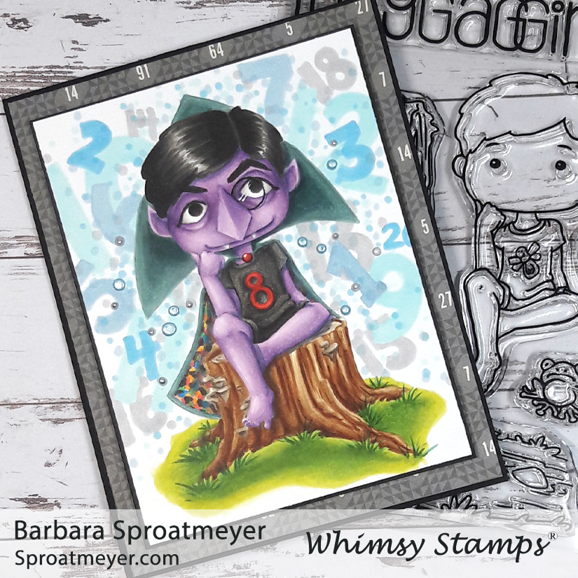
Move over Chef, there’s a new Count in town! Here’s another example of Extreme Creative Color Placement on Polka Dot Pals Harley and this time he’s come out as Count von Count. “I am the Count. They call me the Count because I love to count things”
This was a challenge to color a Polka Dot Pals character as a Muppet – HERE is the Swedish Chef and Jennifer colored Animal HERE. We used Polka Dot Pals Harley on all these modifications.
Someone had asked if I could do a tutorial on faces and this one is as good as any. So scroll down and follow along as I color Count von Count.
I start with one of the lighter colors and map out the shadows. This allows me to see what it would look like without investing in the placement. The lighter color can be blended out.
I think jump into the darkest color and start laying down the shadows. IN this example, I realized I didn’t want as much dark as I had originally colored with the lightest color so you can still see a lot of that showing through.
Here I moved to a medium tone and started blending between the darkest color and this medium color. For this example, I’m only using three colors so I’ll be going back and forth between the lightest, medium and darkest colors.
I felt I had blended too much of the darkest color out so I went back in and added some on the areas I really wanted dark. I went back and forth between the darkest and medium colors until I was happy with the depth and blending. Then I started adding the lightest color and blending out the hard line between the two colors.
Here shows what it looks like when I’m finished with the lightest color. As you notice there are some areas that are not colored at all. By leaving some white, this will give me an extra tone and a better highlight on the image. I leave this for the last and then color the area ONCE with the lightest color. Then very lightly blend in any harsh lines.
Lately I’ve been saving the nose for the last and this simple shape made it easy to do so. I colored it quickly and now I can move on to the eyes, monocle and hair. At the moment, this is the same technique I use for all the faces that I color. Hope it’s something that has helped you out.
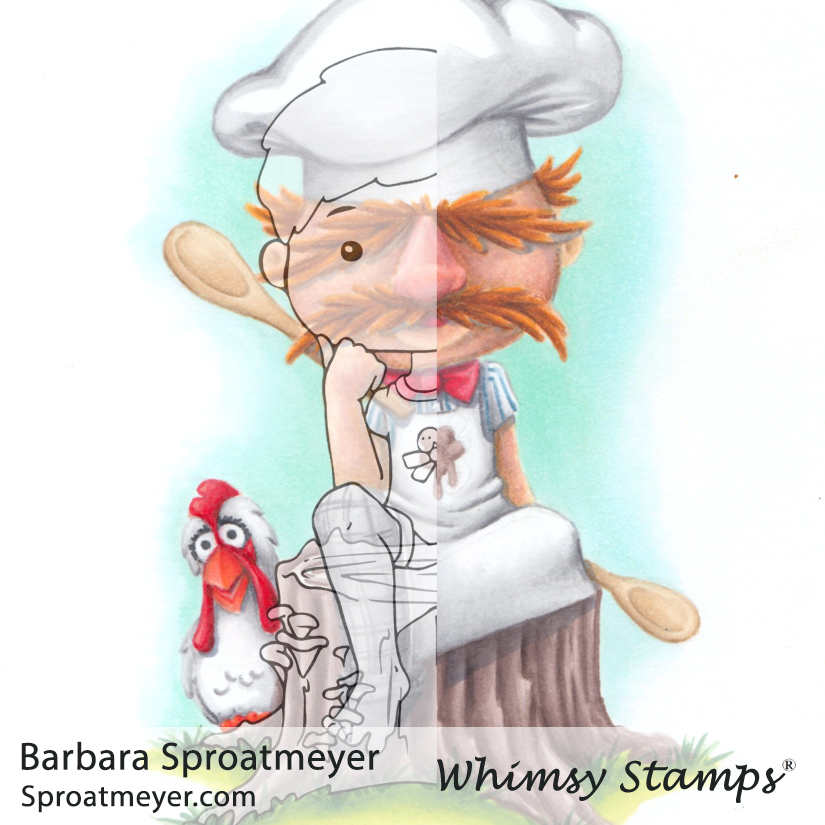
Polka Dot Pals Harley is a hardcore character and also one that has many faces, literally! This is a challenge I did with Jennifer Dove to color a Muppets character using Polka Dot Pals Harley clear stamp. She went with Animal and I chose the Swedish Chef. This is considered extreme creative color placement.
Visit Jennifer’s Animal post HERE. (and a hug thank you to her for the inspiration, wood grain paper, and much more!)
This is always a fun thing to see – the original image layered over the colored image. You can see how much was changed from his head to his toes. Below is what the actual clear stamp looks like:
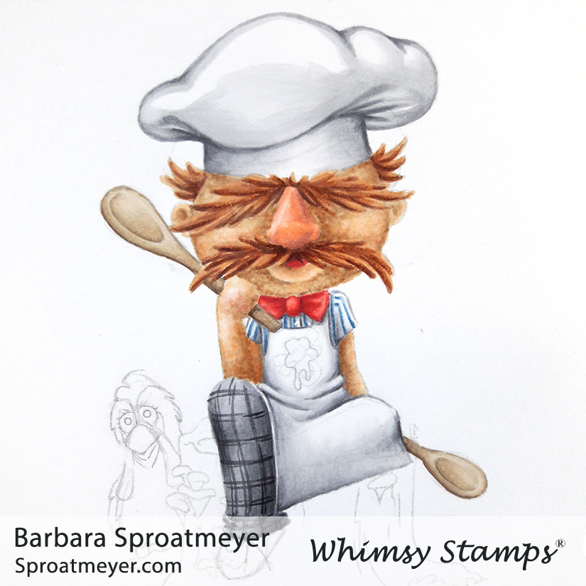
I first started with a lightly stamped image and sketched in my details. The face would be the important part and the eye placement worked well for my character. The hat, however, was a challenge to think through. I decided to taper the head and have the hair be hidden within the hat. You’ll notice the shadow I have is actually the top of the hair outline. I also pulled down the chin so there wasn’t a neck anymore.
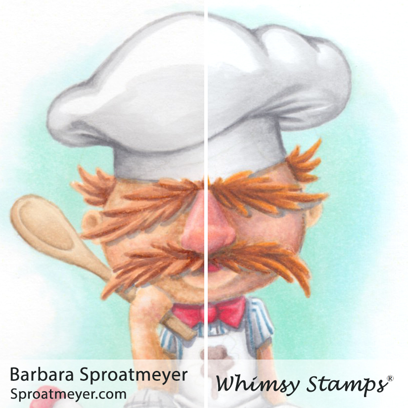
Next was all about the coloring. I tried to get some texture in the face to match the Muppet but half way through my markers got all gummy so I had to stop. I would fix that later with colored pencils but for now, the face and hair will have to stand out badly.
After the image was colored (you’ll see the finished one below), I came back in to fix the face and hair with the colored pencils. As you can see, on the right is Copic only and you can see how gummy it got. The right side is smoothed out with the colored pencils on top.
Here’s the finished one – “Börk börk börk.” When I colored the stump, I decided to ignore the mushroom details since I already had plenty of details in the image itself.
Finally a challenge wouldn’t be as fun if there wasn’t an accomplice! Pop on over to Jennifer‘s site to see details on Animal. “I want to eat drums!”
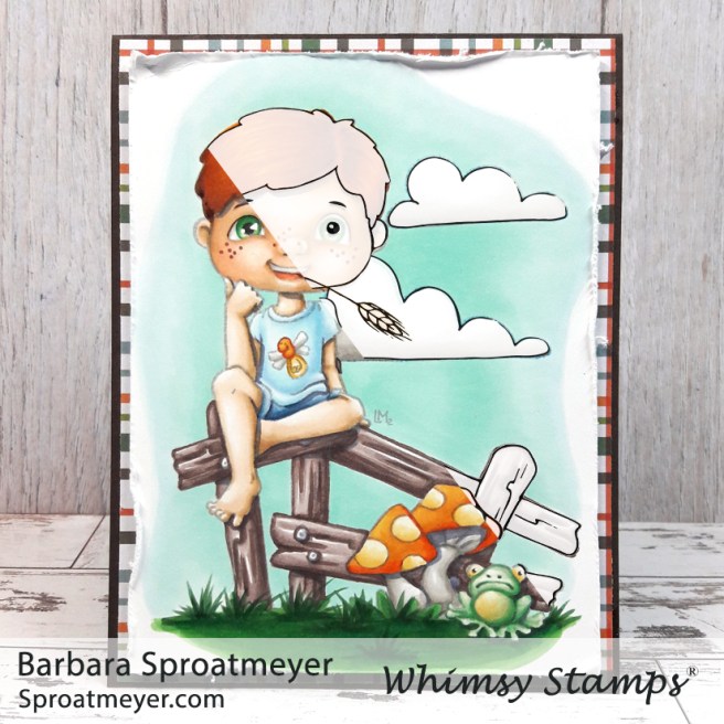
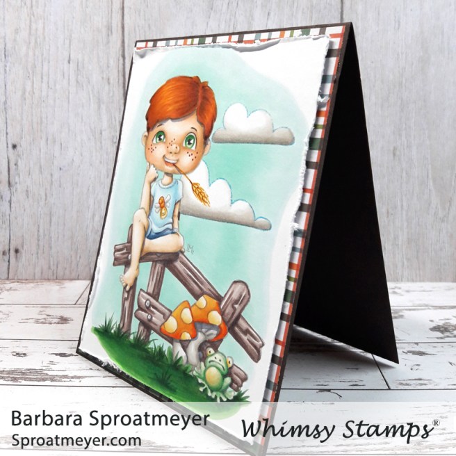
New releases are at Whimsy Stamps for the month of March and this is one of them – Polka Dot Pals Harley. I created this scene using a few of the other Polka Dot Pals sets as well: Polka Dot Pals Fern, Polka Dot Pals Imogen and Polka Dot Pals Syeda. It’s just so fun to mix and match these sets and I often have them all out on the coloring desk for me to use.
So which sets did all the elements come from? Polka Dot Pals Harley and the frog are the main characters. Then I used the fence from Polka Dot Pals Fern and nestled Harley in-between the two fence posts. From Polka Dot Pals Imogen, I used the mushroom stamp. Then the clouds and hay straw are from Polka Dot Pals Syeda. For this scene, I colored my own face and then added the freckles from Polka Dot Pals Fern.
This scene was actually created by my youngest daughter who wanted to color along with me. This is her coloring and I think she did a great job. But most importantly, we had fun together.
I like to show the before and after coloring, especially of the faces, to show how much character can be added. Harley started out with two dots for eyes and a strand of straw.
Here’s a close up of his face. I wanted to go for a crooked smirk so it looked like he was smiling but also chomping down on that strand of straw so it wouldn’t slip out of his mouth.
These are the supplies that I used on my project:
Paper: Make it Crafty Blending Cardstock Park Lane Paperie Woodland
March is an awesome month but it’s also awesome because there is a new release at Whimsy Stamps featuring two new Polka Dot Pal boy characters! For my sample today, I used Polka Dot Pals Raden, with a few elements from Polka Dot Pals Imogen, and Path in The Woods for the background.
I first colored the Path in the Woods so I could see how much green I could use on the rest of the image and not be too washed out. I settled for adding just a little green on the shirt to help harmonize the two images together.
The Path in the Woods by Dustin Pike is going to be an awesome stamp to use for many themes. Even though it took a while to color it with the dots method, I can’t wait to use it again.
I had tried to add Nivo Crystal Drops to the glasses but was a bit shy about how much I added so it didn’t go on as smooth as I had liked. Then I tried to speed up the drying time with the heat gun – and well, let’s say you don’t want to do that either unless you want a bubbled look. I smoothed it out as much as possible and that was that. Lesson learned.
Here you can see a side by side of the coloring on Polka Dot Pals Raden before and after. I added the glasses from the Polka Dot Pals Fern stamp. Then I colored in my own face without using an Add-on Face from another set.
The fallen tree log in this set has four different options for how you want the end of the stump to look like. I chose to go with the eyes and make the log hollowed out – who know what critters are lurking in there but I think Polka Dot Pals Raden is about to find out.
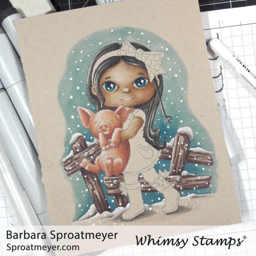
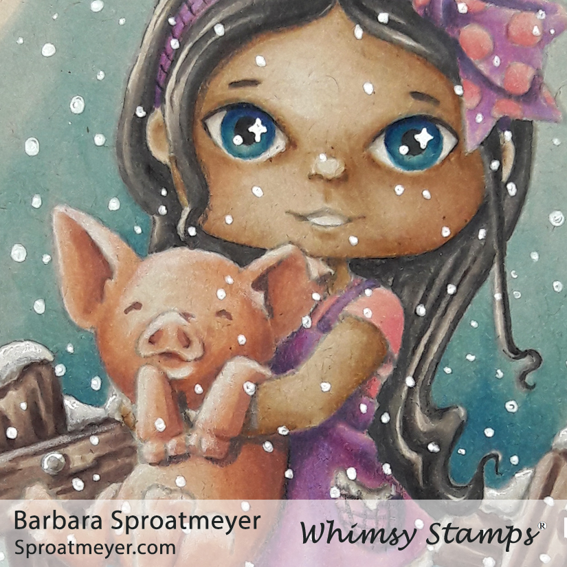
Welcome back! Today I want to share another card I created using the Neenah Desert Storm paper with Copic Markers. This one uses the character and face from Polka Dot Pals Syeda with the fence element from Polka Dot Pals Fern. Using a non-white color for the paper options is ideal for snowy backgrounds and I was eager to give this a try.
I had colored this image before so I started with my favorite part and colored the piglet. After that I thought I’d get started on the snow which meant I needed to color the fence. Not stopping there, I added the blue background and then jumped right into adding the snowflakes. I’d normally leave the background until last but I was eager to define the snow on the fence – that meant I had to color both of those areas. Then it was just too tempting not to add the snow.
I contemplated on what colors to do Syeda’s clothes and settled on pinks and purples. However, in hindsight I wish I had done blues and greens or just blues with neutral colors. I think it would have fit the snowy theme better and allow the piglet and background features to stand out more.
I kept the card simple and used a blue to coordinate with the background. I think because I had snow, I could have added a white card base but the black helped bring out Syeda’s hair and boot features so I stuck with that.
These are the Copic Markers I used: E04, R12 (piglet) E70, 71, 74, 77 (fence) T0, 2, 3, 4, 5, 7 B12, 14, 06, 08 (sky) E000, 30, 31, 35, R12 (skin) V000, 04, 15, 17 R11, 13, 14 plus white gel pen and white colored pencil