Jumbo Birthday Snails

Here’s the full project of my latest Jumbo Birthday Snails from Little Miss Muffet Stamps.  I colored just the top half of the stamp and cut it out to focus on the top two buddies.  This idea was from Jennifer as she said it was large enough that surely we could use a portion for a standard size card – and she was right! 

I used some Creative Color Placement on this stamp and had some fun.  It wouldn’t have been as easy on the smaller stamp so this size afforded some creativity.  From the top, I tried to make the snail look like he was wearing glasses.  Then this snail can either be colored with a nose or without . . . last time I did without so this time I colored a nose.  🙂  Then the second snail was given a nose, as well, and also a cheesy grin by adding teeth to the smile area.  It think he’s so cute!  Lastly, the third snail, which you can only see a portion, was colored black to look like a rock. 

I then put the rest of the card together using stuff from on my desk, in hopes to clean my desk up a bit.  I’m not so sure it worked, but I do like how the card turned out.  He he he.  Hope you like it too and thanks for stopping by my blog today.

Jumbo Birthday Snails

I finally finished it!  This is Jumbo Birthday Snails (which is a jumbo version of Belated Birthday Snails) from Little Miss Muffet Stamps – if you’ve been on Facebook, you might have seen my back story.  I had sent this image in to get a stamp created but it was in the middle of the night.  So when the magnesium plate came back, we discovered that I had accidentally ordered it at six inches large.  Whoops!  That was twice the size to was really suppose to be.  LOL.

What else was there to do, but to color it up?  So I stamped a couple extra and got a few others involved.  Then I preceded to grab my markers and this is what I came up with . . .

I wanted to go for a realistic whimsical look so I looked at snail photos to get an idea of the shell and snail.  The middle snail didn’t fit in this theme so I tried to make it look like it was covered with a blanket.  Then the streamers were widened and the background was suppose to look like distant foliage.  Lastly the ground was colored to look like a tree branch – at least, I hoped that’s what the looks like.

Here are some detailed shots…

The card measures 6.5″ square so it will have to be one that I personally deliver or something.  LOL.  My daughter also wanted to color one, so this is her project and what she did with the stamp . . .

Grandpa’s Calendar

I’ve created a project for the challenge that is starting up today at Little Miss Muffet Challenges.  The theme is “One for the Boys” and I’ve used Grandpa’s Calendar for this project.  I had fun coloring this one and wanted to try coloring grandpa with big huge eyes behind those magnifying glasses.  LOL.  I think he looks adorable.  :).  It felt good to get the colors out and with school starting again, I hope to get them out again.  Thanks for stopping by and have a great week! 

Sunbonnet Fire Truck

I have a boy card to share today and enjoyed putting this one together.  I wanted to use the Say What? and Mini Alpha & Numbers diecuts from CC Designs so I picked a smaller image to use.  This one worked well and I could put it more on the side of the card. 

I used Sunbonnet Fire Truck from Little Miss Muffet Stamps and colored him in bright reds and oranges.  I didn’t have any papers that matched but I think I found a good compromise with these subtle colors.  Lastly I grabbed some of my red/black/white twine and wrapped it up for a finished look.  Hope you like it and enjoy!

For those who want a good laugh… 
this was shared with me the other day and I about busted a gut!  

Grandpa Fishing

I think this is going to be a project that you’re going to love… at least I know I do! The image is a new release at Little Miss Muffet Stamps, Grandpa Fishing, and a fun one to color too.  But the best part about the card is the background.  My daughter was using her new watercolor paints and colored this picture for me.  I then brought out the black pen and defined the image, colored Grandpa Fishing, and then placed him on this card.

I also used a the Say What? die and Mini Alphabet & Numbers die for the sentiment.  Then I used some Make it Crafty dragonflies and there it all is.

Thanks for coming by today and now I’ll send you over to the Little Miss Muffet Stamps store to check out the New Releases.  Enjoy some shopping!

Technicolored Theodore

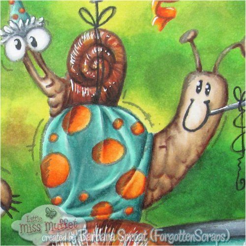
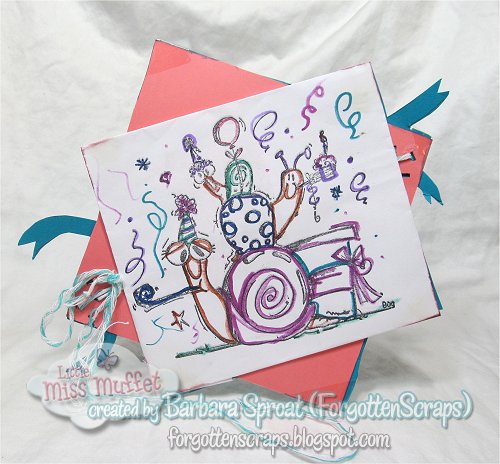
I tried out a bit of retail therapy this week and ended up with the new Spectrum Noir Aqua markers on my desk.  Anyone who knows me would already guess that I bought the whole set!  Just because I’m methodical about my coloring rainbows… as you can see with my custom color chart.  This was my third attempt and I but finally came up with one that I could live with.

Now that the collection is complete and my color chart is sorted out, I need to figure out how to use them.  Easy-peasy, right?  Wow, was I wrong.  Looks like I need to figure out the right kind of paper to use.  So far I’ve tried five types…

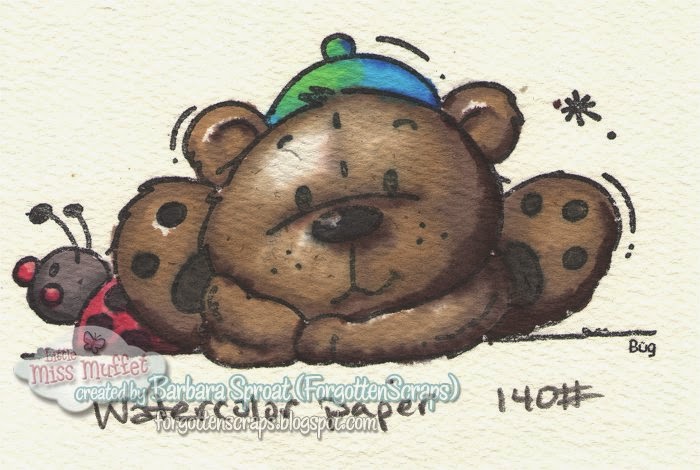
Take I – Watercolor Paper 140#.  First I tried watercolor paper but it was so absorbent that it sucked the ink up so fast that I couldn’t reactivate it with water.  Even tried putting water down first but then I started to get a crystallized effect as the ink quickly spread through the paper.  I still wasn’t able to blend afterwards with a brush.  However, marker on top of marker did ok as long as the color were close – for example the darker brown wouldn’t mix with the light brown but the two light browns would mix with each other.


Take II – Georgia Pacific White 110#.  Next I tried using regular card paper from Walmart.  However, there was even less of a chance of blending on this paper no matter what I did.  The paper soon warped and disintegrated.

Take III – Curious Metallic Cryogen White 89#.  This time I grabbed something that I knew could hold a lot of ink which is what I also use for my Copic markers.  I was able to layer color on color multiple times, however, I couldn’t reactivate the inks with water.  As long as I was using more marker then I could push the colors around and blend more.  Still not the watercolor effect I was looking for and there aren’t that many light colors to make this work for all images.

Take IV – Gina K. Pure Luxury Pure White 120#.  Next I brought out the heavy guns and tried a really thick card paper.  I could layer as much as I wanted on this paper but blending was difficult.  Also any water I added was thwarted by the paper as it sucked it up.  Although the bonus this paper had was it didn’t matter how wet it got, the inks wouldn’t bleed outside of their designated zones.

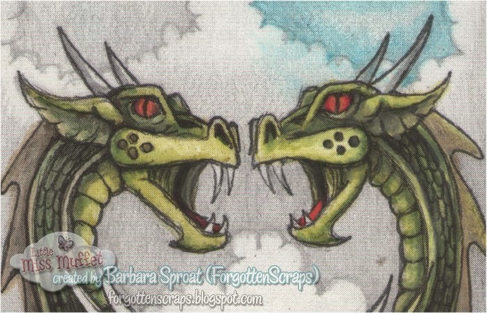
Take V – Semi-Gloss Card.  As a final attempt I decided to try a semi-gloss card paper.  The only thing I had handy was a black and white dragon bookmark.  When attempting to use the brush and watercolor brush on the clouds, it wouldn’t move around and I ended up wiping away most of it.  However, just a whim, I tried the fine point and started coloring the dragons.  I was surprised to see that the fine point on the semi-gloss paper would actually blend!  Not the watercolor effect I was looking for but I was at least able to blend satisfactorily.

I have no idea what I’m going to try next but perhaps some more retail therapy might be involved.  Stay tuned and maybe the next project will be successful.