Three Stars Matchboxes

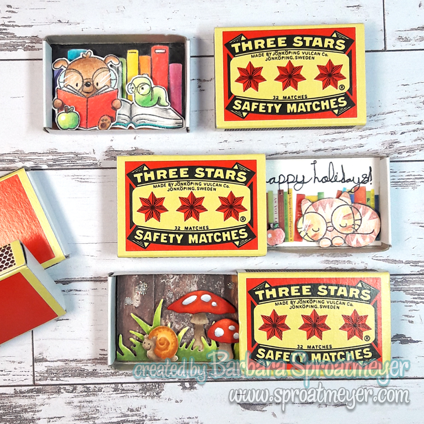
I’ve been collecting a match boxes and specifically like to look for vintage or unique ones at antique stores or flea markets. There are not very many but occasionally I’ll spot one for a good price. I even found a small vintage pill box that I’m excited to use one day. I would like to create small scenes in them like a world of their own but I’m afraid I’d ruin them in the process. So I decided to buy some to practice with and spotted this interesting brand on Amazon: Swedish Three Stars Safety Matches.

In these boxes are just paper scenes but that’s a good place to start. My first one was the snail with mushrooms. I used die cuts from Whimsy Stamps and the snail is from Polka Dot Pals Imogen set. The other two use stamps from Mama Elephant called Bookworm. My daughter gave me a box of colored pencils so we sat down and colored together – she did the cat one and I did the dog. Other supplies were used as well and are all listed below.

Here are the supplies used:

(top: dog and worm)
Swedish Three Stars Safety Matches
Paper Mill Curious Metallic Cryogen White Cardstock
Mama Elephant Bookworm clear set
Cra-Z-art Colored Pencils, 72 Count

(middle: cat)
Swedish Three Stars Safety Matches
Paper Mill Curious Metallic Cryogen White Cardstock
Mama Elephant Bookworm clear set
Cra-Z-art Colored Pencils, 72 Count
MT Washi Masking Tape – Books

(bottom: snail)
Swedish Three Stars Safety Matches
Hammermill Premium Color Copy 100lb
Copic Sketch Markers
Polka Dot Pals Imogen clear set (snail)
No-See All Season Tree die set (mushrooms and grass)
Ranger Stickles Glitter Glue – Diamond

Wyanet (Beautiful)

I’ve had my eye on this cutie for a while and was thrilled to be able to color her up. This is Wyanet (Beautiful) from Whimsy Stamps and in the background is Path in the Woods, also by Whimsy Stamps. I thought with her sitting on the cliff ledge she would be perfect to look over all of the forest.

One of my favorite things was coloring the Path in the Woods with a river instead of a path. This was an idea I saw from Megan who was the guest designer at Whimsy. It was a brilliant idea and added some versatility to the background stamp. When coloring the background, I tried it differently from my last one but not quite as happy with the foliage as I wanted to be so I think that’s a challenge to try it again… and find another way. Any suggestions?

Here are the supplies I used:

Miscellaneous:
Paper Mill Curious Metallic Cryogen White Cardstock
Gina K Designs Amalgam Ink – Whisper
Make it Crafty Chipboard Embellishments

Whimsy Stamps:
Wyanet (Beautiful)
Path in the Woods

Copic Markers:
B00, 91, 45, 97 (river)
W3, 4, 5, 7 (rocks)
G24, YG13, 63, G17, 14, 29, YG21 (forest)
BG15, E30 35, 57 (sky and signs)
Y18, YR16, R05, 29 (fish on signs)
E000, 30, 31, 33, R12 (skin)
E21, 25, 27, 49, C0, 3 (eyes)
E50, 51, 53, 42, 43, 44, 47 (clothes)
BG11, 23, 07 (jewelry)
YR21, 16, 18 (clothes accents)
T8, 7, 5, 4 (hair)
BV23 (shadow)

Strawberry Panda

I’ve been poking around this weekend and felted this Strawberry Panda. It was a kit I ordered from Amazon over a year ago so it was about time I got to it.

I started with the head and when I realized it wasn’t going to look exactly like the picture, then I allowed myself a few more alterations – the main one being that this panda sits and has a mushroom hat instead of a strawberry hat. I couldn’t understand why the strawberry had white seeds so I made the white spots larger and now it’s a mushroom. I also made the white seeds black on the strawberry bag. It was a fun little project.
Zoinks – I see some stray strands. I’ll probably poke on ’em a tad bit more or look for my scissors.

Polka Dot Pals Imogen

Ready for another Polka Dot Pals scene? This one is using Polka Dot Pals Imogen as the center piece and colored on Neenah Desert Storm paper with Copic markers. I’m really enjoying this look so I’ll be doing a lot more. Plus I might look into other colors – do you know of any to recommend?

Most of the elements on this card are from the Polka Dot Pals Imogen set, including the sentiment. The wings were added from the Polka Dot Pals Kadija set. The sentiment was stamped in green so I could create a ground for her to sit on – I wanted it to be there but not to stand out more than the character. Bonhomie, by the way, means a cheerful friendliness. (Pronounced like bon-a-me.)
On the finished card, I used Nuvo Crystal Drops, Morning Dew, to give the idea of fireflies or fairy dust in the air – you know, all that sparkling magic that happens around fairies – yea, I wanted that to happen here too.
I stamped the wings in blue ink then colored them lightly with Copic Markers. To get the final result, I outlined them with a white gel pen. This shows the scene being created and below you can see the how the image started out – especially on the face where so much details was added.

Here are the supplies I used on this card:

Papers:
Neenah Desert Sand Cardstock
Park Lane Paperie Woodland

Whimsy Stamps:
Polka Dot Pals Imogen
Polka Dot Pals Kadja

Copic Markers:
E30, 31, 35
E70, 71, 74, 77
R02, 05, YR09
YG95, 93, 61
BG11, 72, 75, 34
N1, 3, 4, 5, 8

Extras:
Nuvo Crystal Drops Morning Dew

Dare to Dream

For this project, my daughter rolled the dice and selected a stamp an older stamp from the shelves. Literally, we have two dice that help us pick from my stash and use some of my old favorites. This one is Dare to Dream by Whiff of Joy.

This was daughter #1. We colored side by side and she chose the papers then colors. It was fun and she is learning a lot with the Copic markers. I suppose this means I have to share them more often.
She chose to keep to just the coloring but I proceeded to make a quick card out of mine using the paper she chose and a few embellishments to round it out.

Here are the supplies used on my card:

Papers:
Hammermill Premium Color Copy 100lb
WeR Memory Keepers North Pole

Stamp:
Dare to Dream by Whiff of Joy

Copic Colors:
BG10, 11, B12, BG72
C1, 3, BV23
E71, 74, 77, 79
E31, 30, 000, RV95, RV12
R22, 46
YG21, 23, 67

Polka Dot Pals Harley

Move over Chef, there’s a new Count in town! Here’s another example of Extreme Creative Color Placement on Polka Dot Pals Harley and this time he’s come out as Count von Count. “I am the Count. They call me the Count because I love to count things”

This was a challenge to color a Polka Dot Pals character as a Muppet – HERE is the Swedish Chef and Jennifer colored Animal HERE. We used Polka Dot Pals Harley on all these modifications.

Someone had asked if I could do a tutorial on faces and this one is as good as any. So scroll down and follow along as I color Count von Count.
I start with one of the lighter colors and map out the shadows. This allows me to see what it would look like without investing in the placement. The lighter color can be blended out.
I think jump into the darkest color and start laying down the shadows. IN this example, I realized I didn’t want as much dark as I had originally colored with the lightest color so you can still see a lot of that showing through.
Here I moved to a medium tone and started blending between the darkest color and this medium color. For this example, I’m only using three colors so I’ll be going back and forth between the lightest, medium and darkest colors.
I felt I had blended too much of the darkest color out so I went back in and added some on the areas I really wanted dark. I went back and forth between the darkest and medium colors until I was happy with the depth and blending. Then I started adding the lightest color and blending out the hard line between the two colors.
Here shows what it looks like when I’m finished with the lightest color. As you notice there are some areas that are not colored at all. By leaving some white, this will give me an extra tone and a better highlight on the image. I leave this for the last and then color the area ONCE with the lightest color. Then very lightly blend in any harsh lines.
Lately I’ve been saving the nose for the last and this simple shape made it easy to do so. I colored it quickly and now I can move on to the eyes, monocle and hair. At the moment, this is the same technique I use for all the faces that I color. Hope it’s something that has helped you out.

Here are the supplies I used on my card.

Papers:
Hammermill Premium Color Copy 100lb
Echo Park Jack & Jill

Whimsy Stamp:
Polka Dot Pals Harley

Copic Markers:
BG72, 75, 78 (cape)
R02, 24, YR16, Y35, YG09, B16, W7, 5 (inside cape)
R24, 27, 59 (shirt details)
W3, 5, 7, 8, BV23, T7
E31, 35, 37, 39 (mushrooms)
E42, 43, 44 (stump)
YG21, 23, 25, 67, G17 (grass)
V12, 15, 17 (skin)
B00, 12, 91, T1 (background)

Embellishments:
Liquid Pearls