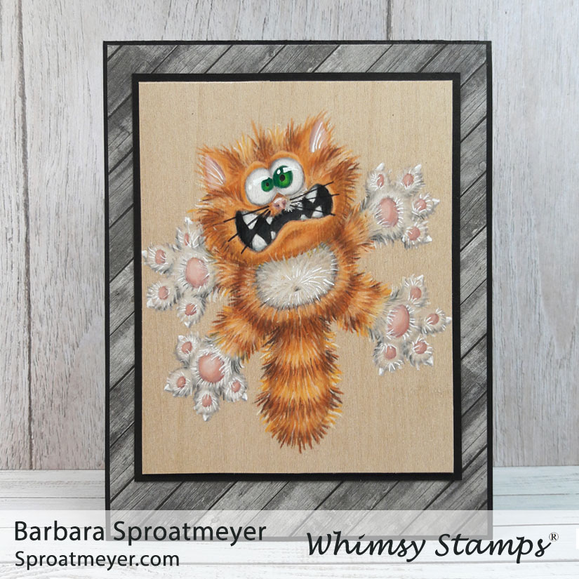
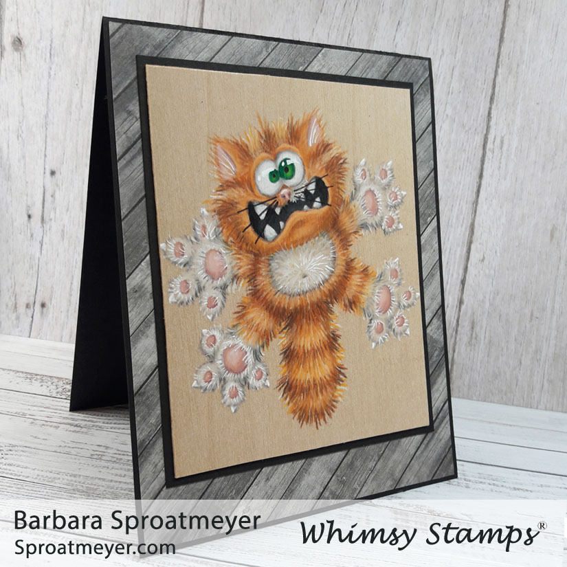
I’ve been studying Annabel Haines‘ style on fur because she does an incredible job. In fact, she does amazing on all her projects with added textures and details. So over the years, I’ve been working up the courage to give it a try. I practice here and there but this was the first time I’ve gone full furry on an image. It was good first attempt but I still have more to learn. The image I used was a retired Scaredy Cat rubber stamp which is now available in the Going Catty clear set by Whimsy Stamps.
Annabel has a fur coloring tutorial which shows step by step on how she colors the fur. It’s a great tutorial and is a lot easier than how I did mine. Plus hers turns out better so take your tips from her. 😀
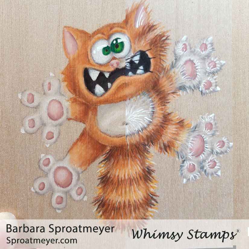
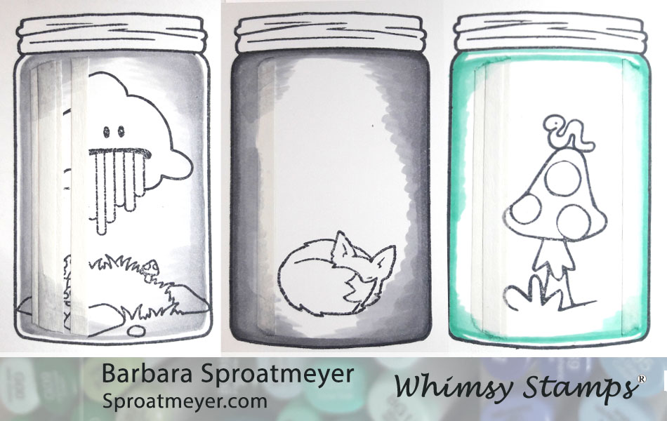
For those who were looking for an eye tutorial on the dragon… well, here it is. Even though this is with colored pencils and not markers, the idea is the same. (1) First, the image’s eyes are usually white (if stamping on white paper) or you should color them white. (2) Then, since eye are not actually pure white, I add shading around the edges to make them look found. On a person, I add shading going from top down. But on this image, and the dragon image, I really wanted the eyes to bulge so I went with a round shape for shading. (3) Next is to color the irides. I like to have some dark at the top and light nearer the bottom. For this image and the dragon, I chose to have one large and one small. (4) The final step is to add black for the pupils and white for the highlight.
My coloring plan was to lay down a base of color for the cat, which you can see on the left side, then add all the fur texture, which you can see on the right. It worked ok but after having so much color down with the pencils, it was very difficult to get a sharp noticeable line for the fur. In some areas, especially the lightest and white areas, it didn’t look like I was adding any coloring at all. For the white, I decided to add more details with the white gel pen. Did it work? Eh, I’m not sure.
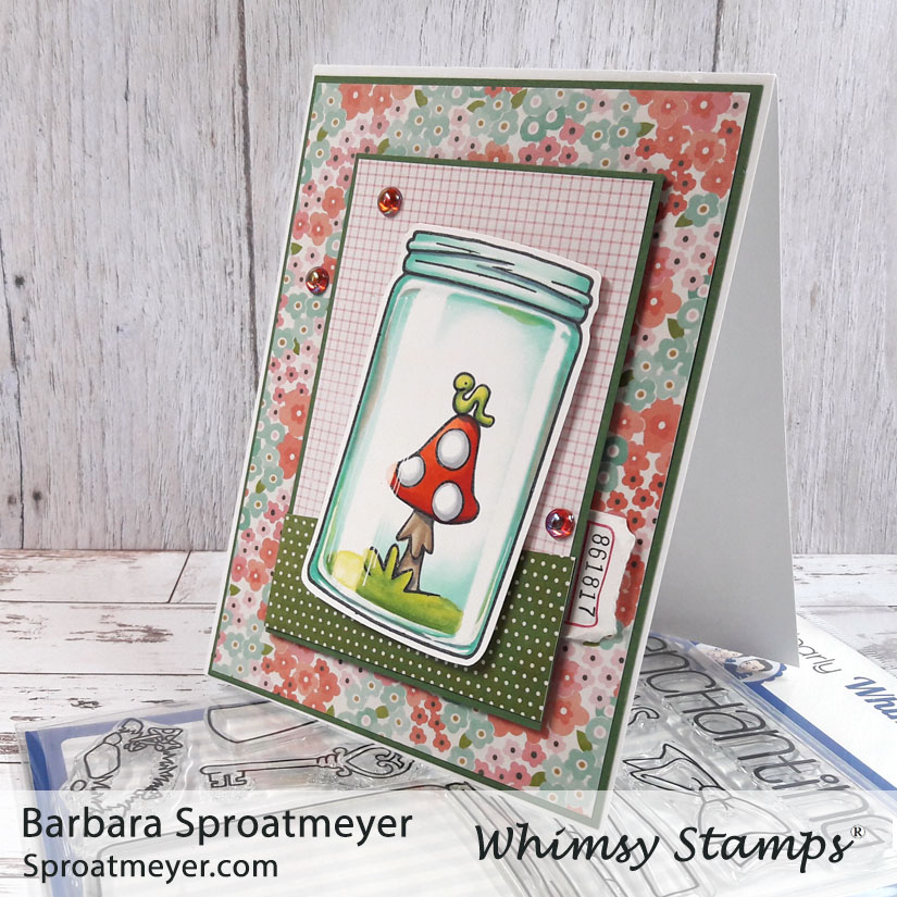
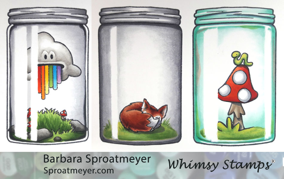
Here is the last jar for this week, using the Atlas Jar Coloring Tutorial posted earlier this week. On this project, I used the Atlas Jar clear set from Whimsy Stamps and used elements from the Polka Dot Pals Imogen set to fill it. What makes this jar unique is the color is different from the rest being a blue glass instead of gray. Also, added color to the sidewalls of the jar give this one a bit more character.
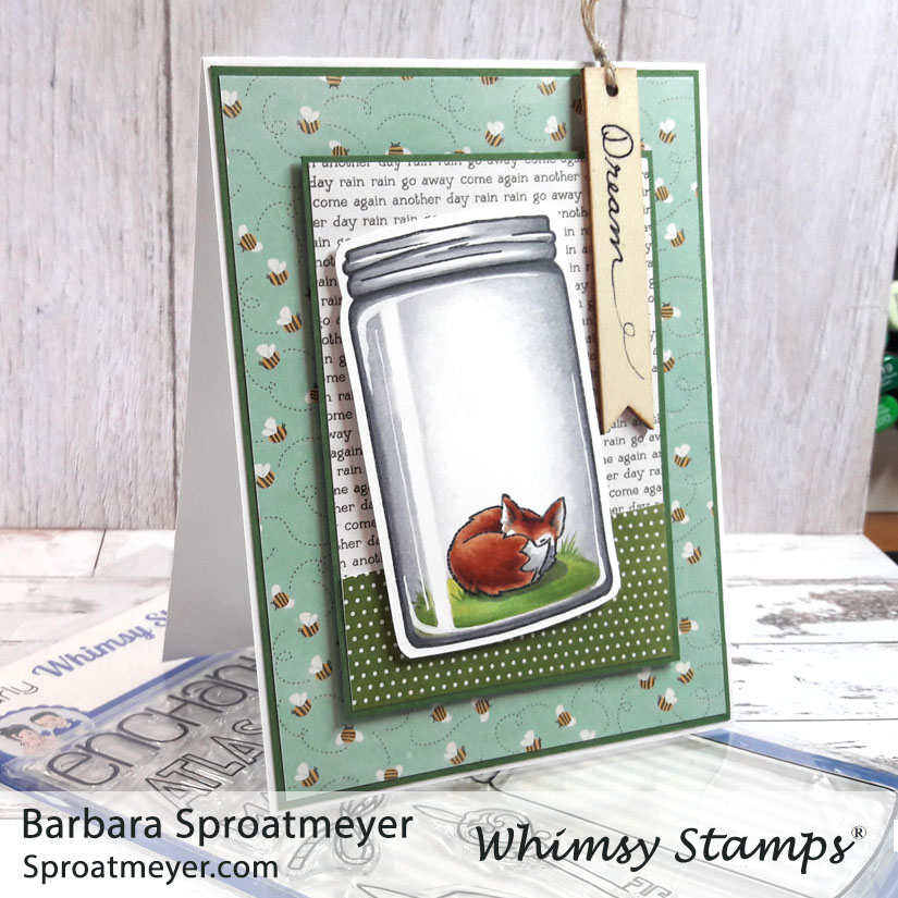
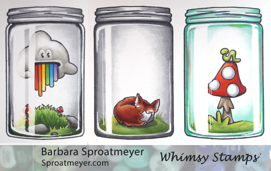
This is another jar I colored using the Atlas Jar Coloring Tutorial that was posted earlier this week. I’ve used the Atlas Jar clear set from Whimsy Stamps and the fox is an element from the Polka Dot Pals Raden set. What makes this one unique is that the coloring the jar goes all the way to the edges which means the glass walls aren’t extremely thick. Also, I used electronics on this one to make some fireflies appear – just push the little fox.
This jar was colored using the Atlas Jar Coloring Tutorial posted previously this week. I used the Atlas Jar clear set from Whimsy Stamps and filled it with elements from the Polka Dot Pals Atlas set. What makes this jar unique is the appearance of thick glass walls with variations in shading around it – plus the contents, of course.
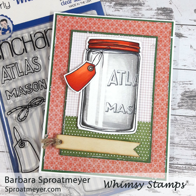
This is one of the cards I created using the Atlas Jar Coloring Tutorial I posted earlier this week. I’ve used the Atlas Jar clear stamp from Whimsy Stamps. What makes this project unique is the red lid, tag and the “Atlas Mason” words also stamped on the jar.
I don’t know why I put TWO tags on there for an empty jar. It sure would be ironic if I sent an empty jar with a blank sentiment. So do you have any suggestions to write on these tags?
I’ve been able to create a tutorial to share on how to color a jar. This tutorial uses the Atlas Jar from Whimsy Stamps plus a few more elements from the Polka Dot Pals line that fill the jars. This is the smaller of the two jars available at Whimsy Stamps, the other is Mason Jar and is large enough to fit a character inside.
There’s a lot of tips so you can get the CliffNotes version and look at the pictures or stick with me and read the unabridged version. I’ll be posting cards I’ve made with these on different days.
Important things to keep in mind – I found that the jar concept can be simplified, which is what I’m showing here, but this is just the beginning. I think that creating different shapes around the edges with shadows and highlights adds visual interest and makes each jar unique. Adding colors around the edges too also makes them fun. So once you get the concept down, be sure to experiment with each new jar that you color.
STEP 1: Stamp the Atlas Jar first, then lay down a masking for the highlight. I used Post-It Notes Cover Up Tape that is 1/6″ wide. I arranged the jar’s reflection differently on each jar. The main reflection, and largest reflection, should be on the same side that your light source is coming from.
STEP 2: Leave the mask for the next few steps and begin by stamping your scene inside the jar on top of the mask. If the ink rubs off the masking easily then you will need to replace it with clean masking. I tapered the masking ends on the jars at an angle to help with the highlighting later on in the tutorial. I did this just by tearing it but you scissors would be a good tool too.
STEP 3: Take your darkest color to draw a ring around the jar. You can choose to leave a white reflection on the sides, top and/or bottom, or none at all. This white part between the jar edge and your coloring would indicate how thick your jar is and where more light would reflect through. In my example, the left one has that thick glass look and the right one has a thicker bottom and top. The colors I used in this step are N3 in the right, the middle is N5 and the last uses BG23.
STEP 4: Use a lighter color and start blending from the outside in. I made sort of an oval shape around the center with my blending to help the jar look roundish. The masking is still there so make sure not to hesitate in that area when you color otherwise the color will seep in through the underside of the paper. In this example I used N2, N3 and BG11.
STEP 5: Now use the lightest color and blend it out smooth. I used N1, N1 and BG10. You can also use the Colorless Blender 0 to help with the blending.
STEP 6: This is an optional step. I found that my darkest colors were blended out too much for my preference so I went back in and added the darkest color around the edges again.
STEP 7: Color the rest of the image. Again, be careful not to linger around the masked area or the ink will bleed through and your reflection will no longer be white.
STEP 8: This is also an optional step but a fun one to add. On this step you can adjust the jar as needed – you can add darker areas, shading more, shadows under the jar top or even colors reflected on the side wall. After this step, coloring with Copic Markers on the jar is done.
STEP 9: Remove the masking. Don’t you wish all steps could be that easy? You can see that the blue bleed a little on the right jar, top right. I like that shape so I’m going to keep it there.
STEP 10: Now is the time to add some white so grab your gel pen, gouache, Dr. Ph. Martin’s or whatever white you like to use. This is where I round out the highlight and add a few other reflections in the glass. Some things you want to keep in mind is that the white reflection of the jar would cover the image. If the white spot over your image is too “bright” then you can color in a faded version to help make it one cohesive image inside the jar. I did that on the left one.
NOTE: Each of these jars is a little different so I encourage you to play around with the elements – the color of the jar, the thickness of the jar (like the left jar, would have white between the edge and the jar’s contents, the shading), the jar’s reflections and also the shapes around the jar’s edges will all make your own jar unique and interesting.